Adding kerning is one of the very most tedious tasks in developing a font, if it is done well. It is also the final major production task in type design.
As I am finishing this stage on the Regular style of my Kickstarter typefaceCristoforo, and about to send updated fonts to my backers, I find myself needing to explain what this kerning business is, anyway. So I thought I would post something here for general public consumption, and point to it from my latest Kickstarter update.
In fonts, each glyph is placed in a slot with a certain amount of space allocated to it, which generally includes white space on either side. The total horizontal space allocated to a glyph is its “advance width.” The distances between the furthest extent of each side of the glyph and the ends of the allocated space are the “sidebearings”—which can even be negative numbers, if part of a glyph sticks into a neighboring space.
In high-end type design, spacing is an especially complex art and craft. But many junk fonts don’t even get the basics right, and that is easily detected. Decent spacing is consistent, and follows certain general principles about shapes. Consistency means the “same” elements should get the same space across different glyphs, and similar elements spaced similarly. So the left sidebearings of OCGQ and the right sidebearing of D are all usually either the same or very close.
Designing even spacing is about keeping a relatively consistent amount of white space between letters. In a typical sans serif font, a letter like O only needs 50–60% as much in the way of sidebearings as an H. Something like a T or a V might have sidebearings at or close to zero. Lowercase letters are generally spaced slightly closer than their cap brethren.
Inconsistent treatment of sidebearings makes this geometric sans serif typeface less useful. (click for full-res image)Consistent and reasonable (if uninspired) spacing in a sans serif font. (Click for full-res image.)
The word “kerning” can refer to any of three things:
noun: data in a font that adjusts spacing for particular letter combinations.
verb: the act of creating such data
verb: when setting text, the act of adjusting space between particular letters in text. This is an operation done by a typesetter in text setting software, and is not a font editing operation. Also, not to be confused with tracking, which is adjusting the overall spacing of a block or range of text all at once.
For purposes of this article, I’m concerned with the first two definitions: kerning data built into fonts, and how to create that data. We’ll get to the “how” later, first let’s talk about the “what.”
It’s critical that the basic spacing be done well in any font, but for particularly difficult combinations, the font should also contain built-in kerning (which can help avoid the need for the end user to do manual kerning). Kerning is a set of adjustments to the default spacing for specific troublesome letter combinations, so as to deal with fact that, without intervention, “AV” will be set too far apart, or that in some fonts “f)” will make the top terminal of the f collide with the parenthesis. Vast amounts of kerning are not always a necessity for a well-made font, but if there is no kerning, or if it does not deal with common situations like “LT” and “To”. . . then there is something wrong.
Making Kerning
In the “old days” prior to about 10–15 years ago, kerning was done by defining pairs and adjusting the spacing. So combinations such as To and Te would be separate pairs, as would VA and WA. This was a pain, but still manageable as long as fonts still only have <256 glyphs per font, although some would end up with thousands of kerning pairs, and some apps would break (in different and interesting ways) when working with very large amounts of kerning data.
But it is not unusual for an OpenType font to have a thousand glyphs or more. Cristoforo Regular has 1324 glyphs now. Luckily, OpenType allows for “class kerning,” in which glyphs can be grouped into classes, and then the classes are kerned instead of individual glyphs.
So the first thing to do is to define those kerning classes! I spent days on and off just doing that for Cristoforo Regular. Some of them only apply when the class is on the left, some when the class is on the right, and a few apply to either side. I had 96 kerning classes before I started kerning. I made a few additions and deletions during the process, and am sitting with 101 right now, with 632 distinct adjustments between classes (the class equivalent of “kern pairs”). Probably a week or more of work, if it was full time.
Here’s the display of classes in FontLab Studio 5.1.4. Most of my classes for Cristoforo have anywhere from 4–30 glyphs, but some have just one or two, and the largest has 84.
The left listing has all the classes, along with whether they are left side, right side, or both. The selected class is a left side class, composed of capital letters with round left sides, such as CGOQ. (Click for full size image.)
Getting the class definitions right is critical. If a glyph is missed out, it doesn’t get kerned. If a glyph appears in two left-side or two right-side classes, it causes an error that means that a bunch of the kerning will never be applied when the font is used. (FontLab Studio warns appropriately, but debugging can take a while.)
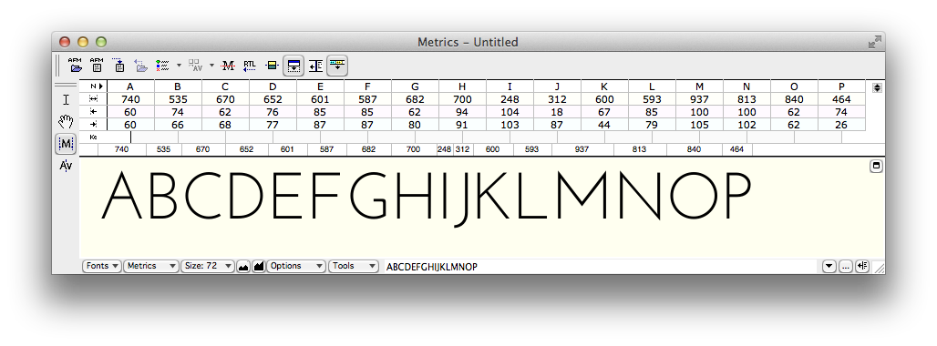
Here is how the spacing can be viewed with arbitrary strings of text in the metrics window. At the moment the effect of kerning is not being shown.
FontLab Studio metrics window showing advance widths and sidebearings for unkerned text. (Click for full size image.)
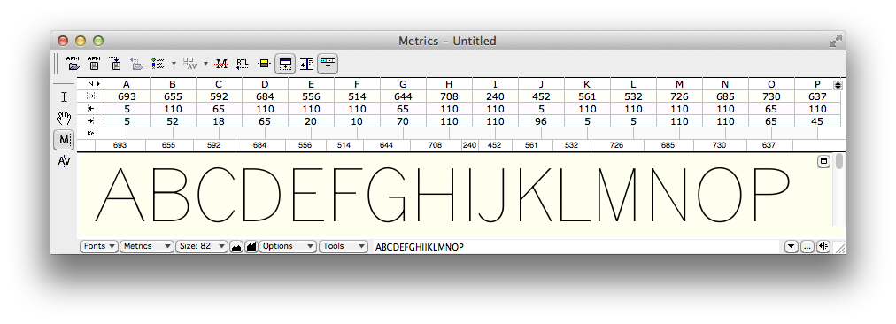
Below you can see the same text only with kerning applied.
Effects of kerning are shown. The metrics listing above the text only shows those pairs for which both members are considered the primary exemplar; other combinations are often kerned as a result of class membership. (Click for full size image.)
The next version, below, highlights the points where kerning is happening. Mostly kerning makes the combinations closer together, except the “e.” combination, where the period has to be moved a smidge further away.
FontLab Studio metrics window showing advance widths and sidebearings for unkerned text. (click for full size)
Application Support
Most graphics and publishing apps simply use the kerning data in the font by default. You have to do something special to avoid it or get different results. This is true of Photoshop, InDesign, Illustrator, and QuarkXPress.
The Adobe apps refer to the kerning built into the font as “Metrics” kerning, as opposed to no kerning or Adobe’s automatic “Optical” kerning. In a well-made font Metrics kerning produces the best results, but even then Optical kerning can be handy for combinations the type designer missed, or situations that can’t be handled by kerning built into the font (such as kerning between different font sizes or two entirely distinct fonts).
Even WordPerfect, back around 1990, had kerning on by default, if I remember correctly. But not Microsoft Office.
Microsoft Word has allowed you to turn on kerning pretty much forever, it just defaults to being off. To turn it on, in recent versions, go to Format > Font or hit Ctrl-D (Cmd-D on Mac). You’ll get a big dialog. Select the “Advanced” tab.
Then in the top “Character Spacing” section, check the box that says “Kerning for Fonts.” The default is to set kerning on for 12 point and above, but you can reduce it—I generally set it to 1 point because I want kerning on all the time. Unless I am writing an article about kerning I never want it off.
Kerning dialog in Microsoft Word 2011 for Mac (Word 2010 for Windows is similar)
PowerPoint has more recently started supporting kerning. In more recent versions, go to Format > Font or hit Ctrl-T (Cmd-T on Mac). In the resulting dialog select the “Character Spacing” tab. Then check the “Kerning for fonts” option.
Kerning dialog in Microsoft PowerPoint 2011 for Mac (PowerPoint 2010 for Windows is similar)
So that’s all you need to know to use and appreciate kerning!
NOTE: About 1/4 of the text of this post is borrowed from my article “Know If a font Sucks,” currently in press for the March–April issue of Communication Arts.
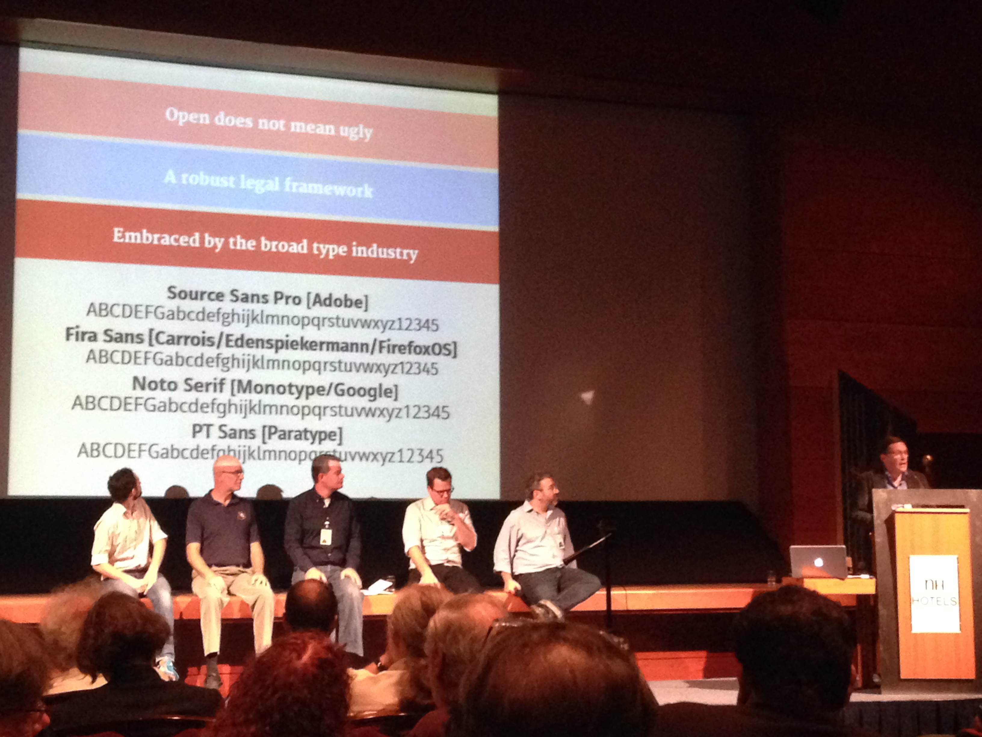
I am writing this from the ATypI conference 2013 in Amsterdam. I hosted a panel on free fonts on the first opening day (Wednesday) of the pre-conference two-tracked discussion, and Victor Gaultney of SIL International did the same on Friday. The panels and discussions around them brought up a bunch of issues, and I wanted to share my thoughts. Note that this is something of a live post, and subject to clarifications and additions, though I think my main positions are pretty set.
Victor Gaultney of SIL International hosted a panel on free fonts at ATypI Amsterdam 2013. Left to right: Dave Crossland, David Lemon (Adobe fonts), David Kuettel (Google), Greg Veen (Typekit, Edge web fonts), Eben Sorkin.
Threat, or Menace?
I don’t think free fonts are evil. If anybody has that misperception about my thinking, it’s my own darn fault for entitling my panel “Free fonts: threat or menace?” I intended it as a joke, a bit of a deliberate incitement to get people talking/thinking, and perhaps poking gentle fun at the not-unusual anti-free attitudes in the type design community. I got the “threat or menace” part from old comic books, in which crusading newspaper publisher J. Jonah Jameson is writing crazy anti-Spider-Man newspaper headlines, but apparently it goes back even further.
Of course free fonts are at least mostly a good thing for people who use fonts. Who doesn’t like free? For hobbyists and casual font users, they are certainly a good thing. For professional users who are passionate about quality, it is less clear, as if free fonts have a negative impact on average quality or continued availability of new, quality fonts, then it may not be all good for them.
Gratis vs Libre
There are two overlapping but distinct kinds of free fonts; it is worth distinguishing them.
“Libre” fonts are those which post few if any restrictions on what the user or acquirer can do with them. They are generally “open source” and can be bundled with either commercial or open source software. Although it is allowed to charge for them, it is also allowed to redistribute them for free, so it is hard to sell them effectively. Most of the really high-end free fonts made by professional type designers are released under libre licenses.
“Free as in beer” or “gratis” fonts are those for which there is no charge. Many of them still have licensing restrictions on what one can do with them, such as only allowing non-commercial use, or restricting modifications.
Most of the “free fonts” in the world are gratis rather than libre, but the biggest growth lately has been in libre fonts. Sites such as “dafont” feature many gratis fonts that are not libre, but also some libre fonts.
Sometimes a type designer or foundry will make some members of a larger family available gratis. Often they will be less useful styles, but whether it’s the regular and the bold or just the black italic, giving away some styles as a teaser for the rest of the family seems like a special case. This has worked well for some designers (e.g. Jos Buivenga / exljbris with his Museo families). Some have seen less result.
Quality vs Free Fonts
I am pretty harsh about font quality. Most of the fonts I have made have never shipped, because my conceptions of quality early on outstripped my ability to execute at that quality level. So I will be the first to say that there are plenty of commercial fonts that suck. Easily 30–40% of commercial fonts leave me thoroughly unimpressed. If you look at libre fonts, and use the Google Fonts collection as your baseline, maybe 65% of those fonts suck. If you just look at all free fonts on dafont, maybe 95% of those fonts stink.
Why is that?
Well, most of the people who are capable of making high quality fonts have some serious training, and/or a fair bit of experience. The people who are at a stage of their career where they are interested in making stuff and willing and able to give it away are mostly younger people just starting out, or people just beginning to get really into type design. On average they have a lot less experience and skill.
Also, polishing a font until it is really good is a whole lot of extra work and a lot less fun than the earlier stages of the design process. Frankly, it’s the 80/20 rule, only with type it is more like 90/10 or 95/5. Most of the quality improvement won’t be immediately/consciously noticed by most potential users, especially in the new growth area of the web where would-be end users are generally less typographically savvy.
I should be clear that when I say “quality” I am not talking about matters of mere taste. There are objective aspects of font quality. For example, in spacing a typical sans serif, if the cap H and N have straight sides, and the white space (sidebearings) allocated to the left and right sides of the cap H are significantly different values, and those in turn differ from the sidebearings of the cap N, then the font is simply badly made.
One of my perennial arguments with the folks at Google is about the fact that they didn’t have a very high quality bar at all, and let in an awful lot of fonts that I would say are simply crap or at least substandard, at an objective level. Some of the folks on the Google side of the fence say that they are simply giving their users free choice and that if one of the fonts I consider to be junk becomes popular, then that’s evidence that it was actually “good.” I don’t have much patience for this line of argument. I think that Google is abandoning what it ought to see as a responsibility to be a gatekeeper not of taste, but of quality. It is not hard to find the expertise to deal with these things.
(2025 update: as I wrote back in 2020 when revisiting this issue, what surprised me is that Google and others actually did revise and improve many of these fonts over time! They said they could, but did I really expect it to happen? Nope. I was wrong. Sure, many still have quality issues. But between many new libre fonts made to higher standards, and improvements to old ones, the quality has really improved. For a more recent take on this, see my 2020 article “Fontocalypse Now”)
Money for Free Fonts?
Most of the solid quality libre fonts were actually commissioned works, or done in-house by a big company. In either case, somebody with deep pockets had a need or desire for a new open source font, They expected to make money in some other way, and were willing to pay usual professional wages for the development of fonts that met their needs. But these well-paid professional fonts are a minority of all libre fonts.
Google has offered a bounty on libre fonts, but according to Bruno Maag in the discussion here at ATypI, it amounts to some $2000 per font. He suggests a basic three-member family takes about 400 hours to create, and that hence Google is paying $15 an hour for type design, and that isn’t a livable wage. Bruno’s angry outburst about this garnered applause from a significant chunk of the audience.
Of course, the audience here at ATypI in Amsterdam is an audience of middle-class and better westerners, to whom $15/hr is not a real living wage. But in much of the world that is a pretty decent wage, especially for a student or somebody in the earlier stages of their career.
But I expect there is no reason to think that Google or any other specific company will continue to pay for new libre font development at the same rate that new commercial fonts have been being made in the past. If the money to be made in creating libre (and other free fonts) is less than what we had before, it’s possible that the total amount of money will go down, and the impact of libre and gratis fonts on the demand for retail fonts matters.
Eben Sorkin has suggested that for popular libre fonts he has designed, people are starting to ask about paying for customizations, additions and modifications. He thinks he can make sufficient money off of this to make it worthwhile, and that this may be a viable model for everyone.
I am not entirely convinced this will be the reality for the “average” type designer from a wealthy country. Maybe. If not, the development of the bulk of libre fonts will tend to be more of an activity for people from less wealthy countries, and/or done by less experienced type designers.
Some libre or gratis fonts can raise development money on Kickstarter or some similar crowdfunding source. This is challenging, and doesn’t work for all projects. It also requires a different skill set in terms of social connections and marketing to be successful. Unfortunately, many type designers don’t want to have to sell themselves, their story and their projects in that way. (Though arguably it is an important skill for traditional retail proprietary fonts as well!)
David Kuettel of Google responded to Bruno Maag’s outburst with a lengthy and partly evasive response, which basically amounted to “we want to see type designers get paid, and we haven’t worked out the model by which this happens. First we need to finish sorting out various technical and practical issues, and once we iron those out, we will be able to come up with a better model to pay for the fonts.”
I am not excited by this response that wants the type designers to do all their work up front and just trust that sooner or later a model will spontaneously break out that allows them to make money. In the future. With different fonts, as I don’t believe that for the existing libre fonts (that were made before that magical future), Google or anybody else is likely to start paying additional revenue that they don’t have to.
Although interest in using type is growing, growing even faster is the supply of people trying to design it. There are more and more serious college and university programs teaching type design. The loose anarcho-syndicalist Crafting Type collective (which I am a member of) teaches three-day type design workshops to beginners, which while not turning out master type designers certainly gets them past the level of the average gratis typeface, perhaps to the level of the average libre typeface. But (in my estimation) having so many people interested in trying to design type means that supply of type designers is outpacing demand, which is creating another source of downward pressure on prices/wages.
Impact of Gratis & Libre on Commercial Fonts?
There are a number of different theories about the impact of more and more free fonts on the income made from retail font licensing.
(1) One theory is that free fonts will have little or no impact. For the most part they are of poor quality. The people who want to distinguish their work have always been willing to pay and always will be, because being different and distinctive and using quality fonts is of value to them. The people who would use the free fonts would never have bought retail font licenses anyway.
(2) Another theory is that free fonts increase the awareness of fonts in general and help stoke demand, and that as this new audience gets more sophisticated some of them will gradually get more and more interested in commercial alternatives to free fonts.
(3) Some folks believe that just like fonts bundled with apps, free fonts will decrease the total demand for retail fonts. Any demand they create will be outstripped by the demand they satisfy. Some users will not become sophisticated enough to prefer better typefaces, while others will simply choose from the higher-quality free fonts they can find, which appear to only be a growing category.
Personally, I actually buy all three of these theories to some degree. I think there is a core demand (1) that will never go away. But I think the portion of that demand that is truly immutable is a small part of the total market for fonts. I do think that making free fonts available will increase awareness of fonts (2), but I am politely skeptical that any resulting increase in paid font licensing will surpass the decrease due to free fonts substituting for paid fonts (3).
Of course, even if I am right about that mix, that doesn’t say what happens to the total money being spent on fonts. Some people will commission libre fonts, or Google may continue to pay a bounty on the ones they want to see made. My guess is that the total amount of money going into the pockets of type designers is more likely to decrease than increase, but I can’t swear that’s what will happen. But even if the total amount of money going to type designers goes up, I am pretty sure that more people will be doing it and the average $/hr compensation will go down. Mind you, even if so, these economic shifts will not happen overnight.
Result?
I actually hope that some of my projections and guesses are wrong, because of course I would like to see more money ending up in the pockets of type designers. But even if my predictions and guesses are all correct, I don’t see free fonts as bad, exactly. Having more fonts available for free to the average user is still a good thing for the end user. The percentage of new fonts that are of what I think of as high quality may go down (compared to the old proprietary world), but the total numbers of all kinds will only increase. Existing quality fonts won’t go away, even if the average quality of new fonts is lower.
While the changes may be “bad” for many first-world type designers, including people I know personally, I don’t see anything horribly wrong with there being more work for people who have less money, and to whom $15/hr is a good wage. Although I like the idea of everybody in the developing world having the same level of affluence that professionals do in the west, realistically this doesn’t happen overnight. Wages in developing countries increase over time. The changes I foresee in type design economics are part of that shift, even at wages that we would consider potentially exploitive here in the USA. I don’t like the idea of type designers making only $15/hr, and I fear that it won’t get the level of quality and care that I would like to see, but at least that’s not a sweatshop wage. If we were talking $5/hr it would be different.
For those of us (mostly first-world type designers) for whom the coming shift is not a Good Thing, it may be a saddening change. But I think change is inevitable, and all the players involved are going to do what makes sense for them at the time. A company like Adobe making a couple of open source typefaces is not due to some huge change in their corporate ideology or thinking: it just became beneficial to them to create a few open source fonts due to their other business interests. Similarly other type designers are going to do what is right for them (as well as they can judge). If that makes for more free fonts and lower income levels for the average pre-existing type designer, that’s not some evil conspiracy, just change and life.
[Revised twice on 13 October 2013, first to add more on font quality, second to discuss free fonts as a promo for bigger families. Revised 14 October 2013 to clarify wording on free and libre some more, and clarify sweatshop wage position. Later revisions for grammar. Revised again 16 August 2015 to clarify a couple of sentences about economics and wages.]
I had so much fun doing this in Portland, that I am again joining Dave Crossland (pending sufficient registrations) to teach a 2-day intro type design workshop in New York City at Columbia University’s School of Journalism, July 20–21.
We have essentially a loose anarcho-syndicalist collective, organized by Dave under the “Crafting Type” banner. Doing this in a tag-team format turns out to be amazingly effective and fun. Dave comes from a very different perspective than I do in some respects, but we share our love of type and type design. Students really benefit from a variety of viewpoints and expertise.
The Singapore Crafting Type workshop is July 17–19, being taught by Eben Sorkin and Octavio Pardo. They too are knowledgeable instructors with varying perspectives, and it should be a great opportunity!
Here again is some of my own work:
Hypatia Sans poster on Adobe’s site, click for high-res PDF.
Yes, that really is me trying to debate the Bush National Guard Memos with Dan Rather on Reddit.
There are a zillion posts in that thread, so he may never see my comment, and has every excuse to ignore it if he does. I wish I could get him to come out to one of my “Font Detective” talks that covers that case, preferably the one in NYC that is more open-ended. But if not, the talk at SXSW in Austin a week later.
In a funny coincidence, it turns out that Mr Rather currently has two main residences, one in NYC, and one in Austin. So you would think the odds would be good that he could come to one of the talks, if he wished.
[EDIT: I believe this is solved, though I won’t have time to reach 100% certainty until much later today. The current leading candidate is Swiss 721 Medium, horizontally squished, as demonstrated by Florian Hardwig.]
Sometimes even a font detective can use help. Particularly when running out of time….
At the bottom of this post are some samples from a document, a legal notice printed as a classified ad.
Here are the rewards if you give me an ID by 6 pm Pacific time, Friday Feb 8, 2013. If you are the first to give me a definite read on what font is used in this document, I will pay you $200! If you are the first to give me the right lead without definitive proof (for example, you name a couple of typefaces, and I investigate and one of them is it) then I will give you $100. I can pay by PayPal or personal check.
Why a reward? Well, I’m getting paid for my time and effort in the case, so why not share that? Plus I hope to motivate some folks to assist. 🙂
Half the above reward is available for an ID after the above deadline, but before 6 pm Pacific time, Sunday Feb 10.
So what is the story here? Many of you have heard of my various “font detective” work; cases where I have been called on as a font expert to investigate the authenticity of a document or some typographic issue that drives a legal case. This is one of those cases.
Right now I am in the depths of two cases. The one I am writing about involves a document that is set in something like Helvetica Condensed (but not actually, of course). Although the actual issues in question are elsewhere, identifying the font would be an immensely helpful piece of the puzzle for me.
Looking carefully at the font, I have noted that it is a highly condensed sans serif, in the same general style as Helvetica Condensed. Part or all of that horizontal compression may have been achieved by means of simply squishing the type horizontally to fit more in. The letterforms have some distortion that is typical of that kind of artificial condensation.
Typefaces I have tested that did not seem to match: Helvetica, Helvetica Condensed, Helvetica Neue, Helvetica Neue Condensed, Swiss 721, Swiss 721 Condensed, Pragmatica, Pragmatica Condensed, Nimbus Sans, Nimbus Sans Condensed.
I have an entire document at 2400 dpi, but the file is huge. Several chunks are available here for download, and if you’re somebody I know/trust I will share the full document for you to download.
All files are in PNG format unless otherwise specified. The type is roughly 5.5 or 6 pt high, and the entire text block is about 6.5 inches wide (
I am joining Dave Crossland and other type designers (depending on registration levels) to teach a 3-day intro type design workshop here in Portland at the Pacific Northwest College of Art (PNCA). I am really looking forward to this, even if I don’t know that I can live up to the hype from the initial teaser post about it. But I love type, and I have spent a lot of time thinking about how to teach the basics of type design. I am looking forward to helping do that in a workshop environment, and doing so with other instructors so we can divide up the material, and even dynamically discuss things in front of the class. Dave comes from a very different perspective than I do in some respects, but we share our love of type and type design.
Thanks to Paul Platosh at PNCA for helping make this happen!
Here is some of my own work:
Hypatia Sans poster on Adobe’s site, click for high-res PDF.
Friends of Speakers (like me) Save 15%! WEBVISIONSNEWYORK + FONTDETECTIVE
Feb 27th – March 1st
Theater for the New City
WebVisions explores the future of web and mobile design, technology, user experience and business strategy with an all-star lineup of visionary speakers, including author, filmmaker and futurist Douglas Rushkoff, Ethan Nicolle, creator of Axe Cop and Jason Kunesh from the Obama for America campaign! Oh, and also me. 🙂
The event kicks off with a full day of workshops followed by special evening events, including my “Font Detective: Extra Bold” talk about cases of forged documents (sponsored by AIGA). And of course, two days of sessions, keynotes and panels, including my talk “Typography is the New Black.”
The “Font Detective: Extra Bold” talk sold out in Chicago, and it will be a much shorter version at SXSW a week later, so this is your best opportunity to come hear some really fun stuff. The Chicago audience refused to even take a bathroom break when given the option to hear more cases instead, so I gather people find it pretty compelling. Or maybe Chicagoans just have unnaturally strong bladders.
To receive the conference discounts, click the link “Enter promotional code” by the Order Now button and enter the code “DOGOODERY”
Register online at http://wvnyc-2013.eventbrite.com/#
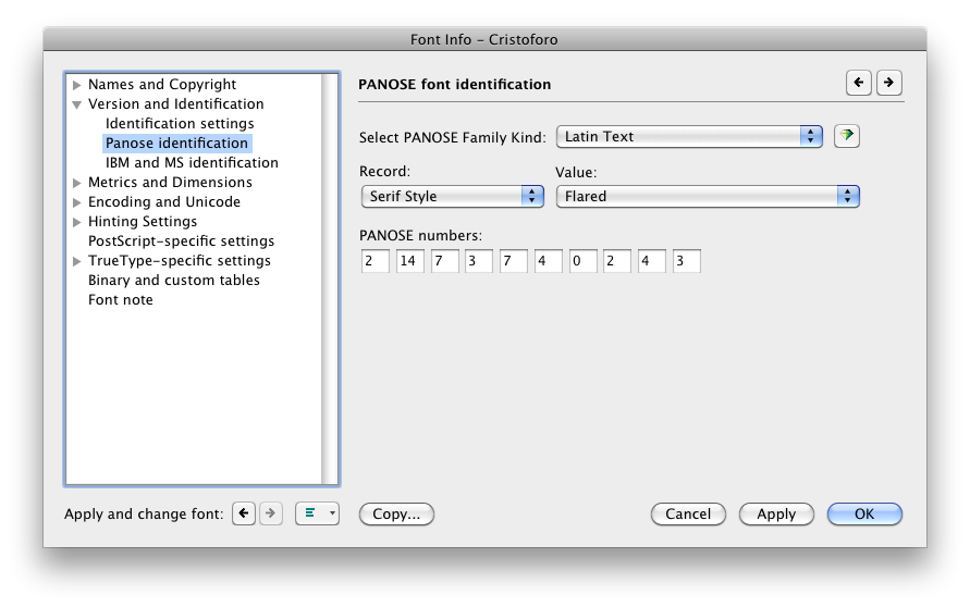
For a long time I thought of the PANOSE numbers in fonts as only used for things like font matching, without any practical impact in most day-to-day use of fonts. I am reminded this week of how dangerously wrong that belief is.
For those who are unfamiliar with it, the PANOSE number of a font is a chunk of metadata that describes the font with a sequence of digits, an encapsulated description. Here’s the PANOSE section in FontLab Studio’s Font Info pane.
PANOSE settings in FontLab Studio 5 (click for full size)
This week, for the second time in the past 15 years, I discovered a WIndows font bug caused by improper PANOSE numbers in fonts, which I had never heard of before.
The first bug was simple: if you set the appropriate PANOSE digit to say the font is monospaced, Windows will ignore the actual advance widths in the font and treat every glyph as having the same advance width. This means that you had better not set the PANOSE to monospaced unless the font is utterly and completely monospaced. This may seem simple, but consider that some supposedly-monospaced fonts still have ligatures. If, say, the fi ligature is to have a different width than the i by itself, then the font is not truly monospaced and setting the PANOSE to monospaced will mess up that glyph’s advance width (at least, in many Windows applications, though not most Adobe apps).
If my understanding is correct, the new bug is also simple: if you have a style-linked family such as a regular and an italic, the general PANOSE class had better be the same for every family member, or else Windows will get very confused. In my case, the regular was of the “Latin Decorative” class and the very early build of the italic was “Latin Text” (because I hadn’t bothered developing the PANOSE number yet for the italic). Some very odd symptoms occurred for a user with an existing document in Word 2010 on Windows 7.
This is also a lesson in font testing. Even something as simple as coordinating family members for Windows, a mostly well-understood area, and one in which I have considerable expertise, can fail for unknown reasons. There is no substitute for actual testing in apps: this issue was not identified by Adobe’s fabulous CompareFamily test tool, probably because they had never encountered it. I had used the italic by itself in Word on Windows, and both the fonts together in Creative Suite apps, and all was well. That was simply insufficient.
Definitely a major error on my part. Certainly, this was not a final release, but even a pre-alpha build released to my Kickstarter backers, as the new italic was, should behave more reliably than this one did.
Some screen shots and info on the font production process posted as an update on my Kickstarter page, including some thoughts on why ATF called it “American Italic” instead of “Columbus Italic,” the transition to standard type alignment around 1900, and illustrating good vs bad curves.
OpenType / PostScript font support killed in many apps (FIXED Dec 20, 2012)
(UPDATED repeatedly, first with more details and then because of the Dec 20 fix.)
Was it Fontmageddon? For users who use fonts in some applications (see below), Windows security update KB2753842 of Dec 11, 2012, caused more harm than good. Luckily MS got it fixed and re-released it nine days later. The current version of the patch does NOT have the problem, and can be installed over the original release to fix the problem caused by the original.
Kudos to Microsoft for fixing it quickly and including interested outside parties in testing it. I was able to seed Extensis tech support manager Romeo Fahl with the fixed patch, so we participated in helping verify it worked.
WHATTHEBADPATCHDID
(1) installing the update breaks some very tiny number of fonts at the system level and for all apps, including potentially malicious fonts. That’s what it was supposed to do. BUTALSO….
(2) with the original version of the update, for certain apps text set in all PostScript Type 1 (.pfb/.pfm) and OpenType CFF (.oft) fonts became invisible. This can even affect font menus when the app has a WYSIWYG font menu.
FIXINGTHEPROBLEM
Installing the revised version (2.0) of the patch from Microsoft will fix the problem caused by the original release.
If your computer is part of a domain administered centrally by an IT team, you should alert them that the issue is fixed, so they can decide whether to roll it out now that the patch is safer.
PROGRAMMERDETAILS
The apps that were especially affected are those that use the GetGlyphOutline() API to grab font outlines of PostScript fonts (both Type 1 pfb/pfm fonts, and OpenType CFF .otf fonts). With the bad version of the patch, that API no longer returned the memory size needed to get the curves, but instead returned a bogus value of zero. This effectively renders some apps unable to render the glyph on screen. At least, at 15 points and higher.
I gather there are other APIs apps can use, but that GetGlyphOutline() works all the way back to XP, unlike the alternatives.
AFFECTEDOSVERSIONSANDSOFTWARE
I strongly suspect that in many more applications than those listed, “convert to curves” functions will fail or result in lost text. I also suspect that in most cases where a current version of an application is affected, so are older versions not listed. What we know is that affected OSes and apps included:
Windows: All desktop and server versions of Windows from XP to Windows 8, it seems.
PowerPoint, but only in presentation mode (an especially dangerous failure, as a user might think things were fine… until they tried to do an actual presentation)
QuarkXPress 7, 8, 9.5 (but only affects fonts at 15 pts and larger)
CorelDRAW X3 to X6. Workaround: view in “draft” mode works because it does not use the problematic API.
Serif PagePlus
Adobe Flash (authoring at least, probably not the running of Flash apps?)
Flexi and SignLab (signmaking apps)
Avid Marquee (video titling)
Bentley MicroStation (CAD / information modeling)
The Secret World (Alternate Reality Game)
Inkscape (vector drawing)
Xara Designer Pro X (vector drawing) and possibly other Xara apps
MICROSOFTRESPONSE
The MS Knowledgebase article has a standard section for “known issues.” On Friday Dec 14, 2012, Microsoft updated it to read: “We are aware of issues related to OpenType Font (OTF) rendering in applications such as PowerPoint on affected versions of Windows that occur after this security update is applied. We are currently investigating these issues and will take appropriate action to address the known issues.”
On Thursday, Dec 20, 2012, Microsoft released version 2.0 of the patch that fixes the problems in the original. The “known issues” section now reads: “The original version of security update 2753842 had an issue related to OpenType Font (OTF) rendering in applications such as PowerPoint on affected versions of Windows. This issue was resolved in the version of this security update that was rereleased on December 20, 2012.”


")
")