I am really bummed that the idea trending hot online now, popularly represented as “the US government could save $400 million dollars a year by switching fonts,” is a bit off-base. It is not the change of design that saves toner; it is that their chosen font is smaller at the same nominal point size than the comparison fonts. Not to mention that the $400 million figure being bandied about is not actually the main number suggested by the kids, which was $234 million. Unfortunately, those fonts that use less ink/toner at the same actual size are generally less legible.
That said, it is great that middle school kids (the study has two authors, although one has gotten all the media attention) are doing creative problem solving and applying scientific thinking! No sarcasm intended. It is not their fault that non-obvious aspects of the problem mess up the idea. (Readers of my blog may remember that point size and font size have a rather nominal relationship.) Garamond* lowercase is about 15% smaller than the average of the fonts they compare it to, while its caps are only about 7.5% smaller. So it is no surprise that it uses less ink at the same point size.
This is why most scientific studies comparing typefaces first compensate by resizing the fonts to eliminate differences in the lowercase height (called “x-height” by us font geeks). This study failed to do that. As a result, they actually get results that are the exact opposite of other studies. Century Gothic has a very large x-height, so printed at the same nominal point size it uses more ink than Times. If it were instead printed at the same x-height (as in other studies), due to its relatively thin strokes, it would use less ink.
Setting any font 15% smaller would save 28% of its ink usage. This is because the font letters are two-diemensional, so the ink usage is based on the square of the size:.85 x .85 = .7225. Of course, there are some caps in the texts as well, which would make the savings a bit less. Interestingly, this is pretty exactly much what the study found. So, you could just as easily save ink by setting the same font at a smaller point size.
For a moment though, let us pretend that the study did in fact equalize the x-height, and found that a typeface change saved noticeable amounts ink. With a “normal” typeface such as Garamond, this would mean that the strokes making up the font were just thinner at the same size (“stroke” is a virtual thing here; modern digital fonts essentially trace the outlines of the letter). If that were good and useful, why not go further? Why not make the strokes even thinner? Maybe there is no font bundled with common operating systems and software that would meet these needs, but one could just commission one. Even a master type designer could do a basic four-member family for $100K or so, which is a lot less than the hundreds of millions at stake. Make it razor thin and save even more!
But any of those changes, swapping to a font that sets smaller at the same nominal point size, or actually reducing the point size, or picking a thinner typeface, will reduce the legibility of the text. That seems like a bad idea, as the % of Americans with poor eyesight is skyrocketing as our baby boomers (and even their children, like me) age.
Aside from that, the reduction in toner/ink usage probably would save less money than claimed in the study. The claim is based on the proportion of total cost of ownership of a laser printer that goes to toner. There are sadly two big problems with the idea that using less ink (or toner) will save that amount of cash, based on that proportion.
First, large offices that use printers and copiers do so under a maintenance agreement that includes the cost of toner. They pay per page printed, and actual toner consumption is generally ignored. In such cases, a font change will only save based on the page count, not the toner. (Certainly, smaller fonts can also use less paper—I will get to that.)
Second, the study makes the interesting claim in a footnote: “Ink and toner are used synonymously in this study. Even though traditional ink is more expensive than toner, a focus on determining the percent savings in cost rather than the magnitude of the cost obviates this difference.” Urm… how? They are assuming that the percentage of printing cost ink or toner accounts for is the same for all classes of output.
This is untrue. Many of the documents that account for a substantial percentage of the government’s overall printing costs are printed on a printing press, using offset lithography. For offset printing, the percentage of the cost of that is associated with ink is in fact much smaller than for laser or inkjet printing. But it isn’t a fixed percentage, either, due to the large proportion of the cost that is associated with setup. It will be a higher percentage for short runs, and lower for long runs. Additionally, because of the huge cost of owning printing presses, many or most offset litho jobs will be printed out of house, using third-party printers.
So, for in-house printing-press printing, the savings will be a much smaller proportion than the quoted 26%. For outside printers, they will not charge based on minor variations in ink usage; they just check things like whether it’s a page of text vs graphics. Either way the savings will be less.
There is a different way an effectively smaller font will definitely save money: by allowing multi-page documents, especially long ones, to take fewer pages! So maybe it all works out—if you don’t worry about legibility.
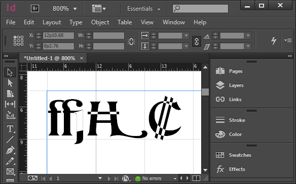
There is another practical issue with Garamond in particular. The version bundled by Microsoft (from Monotype Imaging) does not have a bold italic, which is an unfortunate lack if one wants to promote its use for all government documents. (Yes, you can turn on bold and italic in your word processor anyway. You will just get a faked font instead of the actual one, which is ugly and less legible.)
The question that should be asked is: what font and size combination could be used to maintain or increase legibility while saving money on printing, by reducing page count and/or ink/toner usage, with a font that is bundled with common apps (or free), and has all the required font styles?
But that is a far more complex question, and most folks covering the issue much prefer simple and appealing messages like “high school kids tell gov’t how to save $400 million!”
I like innovative ideas to save money. Really, I do. But I wish the media and public had consulted some experts on this area before going nuts promoting this idea, because it just doesn’t hold water—or save money—without losing legibility.
Thomas is currently CEO of ATypI, the international typography society, since 2004. In other relevant background, he was a teaching assistant for a senior level stats course in his second and third years of undergrad, has an MBA from UC Berkeley, and an MS in printing, specializing in typography, from the Rochester (NY) Institute of Technology.
Updates & notes
This post has seen some editing for grammar, clarity, adding a few more details, and to be less of a jerk. Also to update my background to be current. Again, I am impressed as heck that a high middle school student is attempting serious research. I would not be analyzing it critically ,like a serious adult study ,if not for the fact that the media initially largely embraced it uncritically as if it were.
* The student study does not specify which Garamond they used, but it was obvious (to me) in the samples that they were using the Monotype version that is bundled with Microsoft Windows. Because Garamond goes back to the 1500s, and there is no trademark on the name, there are literally dozens of typefaces by that name, with about four or five being fairly common.
Since I wrote this, there has been some interesting coverage. The Guardian UK was in with the initial pack, with some caveats, but then their Nadja Popovitch wrote about this blog post and interviewed Jackson Cavanaugh of Okay Type for his reaction and analysis.
Meanwhile, John Brownlee did a nice job of explaining the point-size part of my analysis in layman’s terms, for Fast Co Design.
I did more elaborate checking on the study’s original sources and found that their five government test documents each used different body text typefaces: New Century Schoolbook, Minion (with Myriad headlines), Melior with a little Helvetica, Times with Helvetica headlines, and Book Antiqua. The average of these was almost identical to my original estimate using two of them, but I updated my numbers appropriately.
Given that the five source documents all use different fonts, one could reasonably wonder if they are a representative sample. Generally, as a rough guideline, you need a sample of about 30 to get sufficient statistical reliability for something like this.
CNN quoted Suvir: “”Ink is two times more expensive than French perfume by volume,” Suvir says with a chuckle.” This may be true, but that stat is not original to him—it dates back ten years, and is specifically about inkjet printer ink. Such printers may still be common in schools (although even there I expect laser printers are taking over), but government agencies are definitely not using inkjet printers for much of their output. Most high-volume government printing is on laser printers, or even printing presses, whose ink is even cheaper still.