Phinney on Fonts About Thomas & the blog Phinney on Fonts main page

Picture of ThomasThomas “my other car is a sans serif” Phinney on fonts, typography & text. Geeky troubleshooting and info for font developers and users. Consulting & expert witness for fonts & typography.Read more...


Why Did Adobe Discontinue Font Chameleon in the 90s? »

Back in the mid to late 90s, Adobe acquired a company called Ares Software. Ares made font-​related software products, including doing the programming (but not owning or distributing) of Letraset FontStudio, which in its day was one of the best font editors. They are best known for a remarkable application and technology called Font Chameleon.

There is a popular myth that Adobe bought Font Chameleon to kill a threatening technology. Actually, no, removing it from the market was not a motivation for the acquisition. The team that made fonts and would have cared one way or another had nothing to do with those decisions, and were simply not interested in Font Chameleon.

Adobe’s purchase of Ares was done to acquire Font Chameleon technology, and was entirely driven by the PostScript group at Adobe, to use its technology for font compression purposes in PostScript 3 printers. All Ares retail products (not just Font Chameleon) were discontinued as Adobe put the two Ares principals to work on adapting the tech for Adobe’s use.

(Also, Font Chameleon was in some respects massively more powerful than MM, but also had huge limitations. It could only handle the axes it knew about, and could only handle the characters it knew about.)

I joined Adobe in mid-​1997, shortly after the acquisition, and thought it was an interesting tech. I ended up deeply involved in helping make the whole system work (chameleon fonts in ROM including CE fonts, printer drivers, and supposedly matching fonts on end user computers). All the systems were optimized to make an individual piece work in a static environment, according to known schema. Real end-​to-​end testing hadn’t been needed in years. But because there were numerous technical changes being made at the same time to all these pieces, suddenly end-​to-​end testing was critical. I got involved in pointing that out and pushing everyone to make sure their pieces played together instead of all pointing at specs that had been made before any of the pieces actually existed. 

Through some internal asking around at Adobe was able to get my hands on Ares’ Font Chameleon editor: the company’s internal tool used to make a Chameleon “font descriptor” that could be blended with others. These font descriptors as individual files were also super compact, which is why the PostScript team wanted the tech. They relied on a (large) mutatable “master” font , plus the descriptors; the master + descriptors for 136 PostScript 3 fonts were a LOT smaller than the set of fonts themselves, and allowed support for central European accented characters with hardly any size impact.

What was super interesting to me was how insanely fast it was to create such a font descriptor—which could also be exported as a stand-​alone font if one wished, not to mention instantly manipulated in weight, width, x-​height, etcetera. At the time I thought it could have been an incredible rapid prototyping tool. With it I could do in a day what would otherwise take me weeks. But the limitations of the tech, and tendency to encourage some degree of blandification meant… nobody in a position of power and influence within the type group was interested. They had looked at it, and decided it had inferior results and wasn’t worth pursuing.

It is also worth noting that the lead programmers from Ares were freakin’ brilliant, but the code was not entirely stable/​reliable. I certainly had quite a few crashes using the Chameleon editor—although to be fair, that was only intended as an internal app, not a retail/​external app.

So, Font Chameleon died because the Adobe team that bought it wanted it for underlying tech and didn’t do retail products, and the team that did retail fonts had no interest in it, and there was a general perception that maintaining/​developing any of the Ares products would have been painful.

Font Detective forensic typography assistant needed »

Hello, Watson!

UPDATE 25 DEC: Just thought I should say that yes I picked someone (out of many highly qualified—or even overqualified—applicants). They are choosing to stay anonymous for now, but have been doing a lovely job so far!

UPDATE 23 NOV: (1) Good lord, I have a lot of applicants. Application deadline will be Nov 24 at 8 am US Pacific time, and yes that is Thanksgiving for us. (2) By “very occasional, part-​time work” I mean maybe 3 hours, or 6, or 16, all in a week or two… and then maybe nothing for weeks or even months. This is just an occasional brief gig. Over time it might become more. Or perhaps not. The task of sample clipping is the main thing I have come up with, and will be an ongoing one. It is pretty darn tedious, sorry. (3) Added a couple more details in the body.

This is currently very occasional, part-​time work. Many of my cases from my detective work involve things like time consuming fiddly data collection, which I don’t have time to continue doing all by myself. A particular case at hand involves about a dozen documents. To demonstrate what the font is, part of my method involves taking samples of some specific letters (defined by me) from the documents. This amounts to clipping graphic images (from a PDF or image file, via Acrobat or Photoshop) and pasting them into a table (in Word or possibly InDesign). It is pretty rote work. In this case, like most of them, we already know what the typeface is when we go to do this clipping: the problem is to demonstrate that to the court. So, we take these laborious samples and make a pretty chart. And for a particular case at hand, instead of the usual one document and just maybe two, there are many. And a deadline in December.

I have more than a bit too much total work for the rest of this year, so I am looking for somebody to do this task, on this and future cases. Currently I define which characters are worth collecting samples of, but that is something I could potentially hand off in the future. Or perhaps we both pick some.

This could quite possibly lead to other work; it depends on your skills and what you bring to the table. There are times when I could use somebody to research some issue… I would give an example from a current case, but I definitely shouldn’t say it. Sigh.

The work pays well, and I am happy to share some of that. 

Email me if you have my email, or just use the comment function to give me your email address and a link to your resume or a description of your background. (I won’t publish these comments!) Obviously some design and typography background is a bonus, but then again, this is also pretty basic, for now. Brains are the most important resource. No promise of growth and advancement, but I certainly wouldn’t rule it out!

This will require signing a non-​disclosure agreement. I will let you know what you can say about any given case at hand, but it is often nothing, or pretty minimal. Even afterwards, most cases remain largely confidential. The ones we can talk about are a distinct minority.

Font Detective talk in Dublin, 16 Nov 2022 »

This Wednesday night at 6 pm, I will be doing a presentation about my font detective work in Dublin! Come on by—it’s free and no advance registration is needed. (Note however there is no on-​campus parking: transit or bicycle recommended, else park on the street nearby.) 

Location: TU Dublin, East Quad (I am told there will be a sign-​in desk at the entrance)
Time: 6 pm! will run maybe an hour to an hour and a half, with Q&A
Cost: Free!

I am in Dublin to do a Crafting Type workshop (Thurs–Sat) at TU Dublin, before a visit to London for one of my current cases! The good folks with Typography Ireland at the Uni asked me to do a wee talk about my forensic font work….

I shall discuss and show evidence from four forensic cases, including The Case of the Concealed Credits (featuring Justin Timberlake and will.i.am), the Respected Rabbi, the Canadian Caper, and the Secret of the Certificate. I am the world’s only ongoing “font detective”; as a global expert on fonts, typography and printing, I do font-​related document forensics in legal cases around the world. The stakes can be fortune, fame, careers, imprisonment, the family house, or the provenance of one of the world’s most valuable artworks.

Blackletter glyphs from The Secret of the Certificate
a different certificate, the s’micha from The Respected Rabbi

About me: I have been doing font forensics since I testified about a forged will back in 1999. My list of expert witness clients includes a “big three” auto maker and a major California city. I have been consulted on questioned documents by BBC News, The Washington Post, PBS television’s “History Detectives,” NPR, the US Treasury, and many others. I am also a type designer who has created fonts for Adobe and Google. I am the former CEO of FontLab, and previously had strategic/​technical font product management roles at Adobe and Extensis. I was on the board of ATypI, the international typography association, from 2004–20. I have four patents and a medal, as well as an MS in printing & typography from RIT, and an MBA from UC Berkeley.

Career Change! »

In early June, I will be leaving FontLab! My Font Detective work continues to grow beyond what works with a full-​time day job. I am also looking for other gigs that are compatible with said investigations!

I am pleased with many things FontLab has accomplished for its customers in my time there, and have written about what we have done over on the FontLab blog. It has been a fun ride, and I wish my colleagues nothing but the best! But the time has come to move on and do other things.

What was once just occasional expert witness and related work has kept growing, and become quite frequent since I launched my “Font Detective” expert witness web site, a year ago—and even more so in recent months due to publicity around a particularly high-​profile case in Canada (see the Toronto Star and National Post articles).

But I can’t keep up with this, while also being full-​time CEO of FontLab. Yet the pay relative to time is excellent for the detective gig, it is quite fun, and I can imagine doing it part-​time into retirement 20 years from now… so rather than restricting it to a sideline, I am now doubling down on it.

This is a bit tricky, seeing as the detective work is incompatible with being full-​time CEO, yet also not quite at the volume/​reliability to fully replace that full-​time work. Hence, I am looking for other part-​time or temp gigs that are compatible with my “consulting font detective” work:

Talking about font detective cases at Typo San Francisco, 2012.
© 2012 Amber Gregory, FontShop, CC-​BY.
Contact Ms Gregory.

Truth” is hard to come by »

Truth was a late 2015 film about the Bush National Guard memos (a.k.a. the Killian memos), and the downfall of Dan Rather and Mary Mapes at CBS News. It stars Cate Blanchett as Mapes and Robert Redford as Rather, with very good performances, a solid script and decent direction. But, like the Mapes memoir book the film is based on, it does not quite reach “the truth,” ignoring that the memos were proven to be forged.

Yes, there is evidence that former President Bush, like many young men of elite backgrounds, avoided service in Vietnam thanks to string-​pulling to get into the National Guard. There is no doubt that Bush didn’t fulfill his Air National Guard service obligations (which was verified by many other reports, both before and after the CBS coverage). There are records mysteriously missing from the National Guard that might have explained the details. But what was presented as the smoking gun of the tale was the set of purported National Guard memos acquired by CBS and aired on 60 Minutes II—and they are simply forgeries.

As Mapes complains in her memoirs (and via Blanchett in the movie), the focus ever since has been on “botched reporting” and said forgeries, and has ignored the story. Even without the memos, yes, there is a story there. (This is not the only case I have been involved in where a forgery distracted from something more important: see Bullet Bob Hayes & Pro Football Hall of Fame).

But sadly, Rather and Mapes, the subjects of the tale, are still in a flat-​earth reality-​denial mode about the authenticity of the memos and the possibility that the reaction to the memos was anything other than a political plot—matters which I have been deeply involved in. Although some news outlets do not question the assertion that the memos have not been proven to be bogus, others accept evidence-​free flat-earth—style denials as enough that they need to present both sides in the name of balance. From my point of view, this nonsense this makes it harder for me to set the issue aside and focus on the rest of the story.

Background

For those who do not recall, CBS on their investigative news show 60 Minutes II aired a story shortly before the 2004 election, alleging that the incumbent President Bush had failed to perform duties required of him in the Texas Air National Guard, during the Vietnam War. The newest pieces of evidence included an interview with the politician who claimed to have pulled strings to get Bush into the Guard… and the memos, purportedly written by Bush’s commanding officer. But immediately after the show aired, the blogosphere erupted with conservative bloggers and a few others claiming that the memos were self-​evidently fake, likely done on a modern word processor such as Microsoft Word using Times (New) Roman.

At first CBS ignored the nay-​sayers, then it dug in, but eventually it conceded that it might not have investigated the memos adequately, and launched a commission which came to the same conclusion. Oddly, the commission was not tasked with determining whether the memos were actually authentic, hence it did not come to a strong conclusion on that question, only interviewing one expert other than those originally consulted by the producers of the show. This strange decision is perhaps the strongest evidence supporting Mapes’ assertions of political interference. I suppose it makes sense 

Producer Mapes was fired. Rather was essentially demoted and eventually left. He sued CBS over it later, but his suit was dismissed.

The Memos

Reading Mapes’ book, and some excellent commentary in New York Magazine, I can totally understand why Mapes and her team got taken in by the fake memos. They thought they had plenty of verification from numerous sources. The quantity and nature of details in the memos suggested that only someone intimately familiar with the details of Bush’s service could have written the memos.

But Mapes’ post-​facto thinking is simply out of touch with reality. She suggests in her book that if only she had properly presented that additional evidence, the firestorm of controversy wouldn’t have happened. People would have believed. This is nonsense: the fact that the memos could not have been physically produced with office equipment in the early 1970s is unaltered by the other evidence. They don’t stop being forgeries (or recreations, if you prefer) just because there is supporting evidence that caused you to believe them.

Rather than believe in one or more well-​informed insiders making an imperfect forgery, Mapes chooses to believe in a larger and more active conspiracy behind the social media uproar against the memos, claiming it to be orchestrated by Republicans and apparently the White House itself. While not impossible, it is much less likely than the simpler story that somebody did an imperfect forgery trying to bash Bush. It could have been Bill Burkett, who gave her the memos, who even she acknowledges as a rabid anti-​Bush partisan, and whose story about the origins of the memos has changed and remains highly suspect. Or it could have an equally anti-​Bush friend of his. Burkett’s lawyer’s comment on the memos was to suggest that “someone” who was familiar with the case might have “recreated” documents they believe existed at the time.

So, there are really two questions worth asking here, in my mind. First and most important, does the CBS story stand up without the memos? Let us pretend that everyone concedes that the memos are forgeries. Fine, what about the rest of their evidence? Well, even without the memos, they have plenty of evidence of preferential treatment of Bush—as was common for many young men of elite families, by the way. He was one of many. However, the memos are the only conclusive evidence that he failed to complete his domestic National Guard service—without them there are just open questions about his service.

Of course, the other question is, were the memos forgeries? Here one should probably ask “to what standard of proof?” If you seek a “preponderance of the evidence” (needed in a civil suit), then there is no doubt the memos should be considered forgeries. If you want “beyond a reasonable doubt,” we have also achieved that over time, thanks to the inability of anyone to produce a device available at that time that could have created the memos, outside of a high-​end typesetting device only found at a printing office.

So, yes, the memos could have been made on a Linotype or Monotype machine, but those would not have been used to produce an office memo for filing. (Note relative size of office chair in front of the machine.)

Linotype-vorne-deutsches-museum-annotated

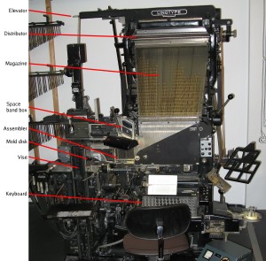
Linotype machine Model 6, built in 1965 (Deutsches Museum), with major components labeled . Original photo by Clemens PFEIFFER, Vienna. Annotations by Paul Koning. Licensed under Attribution via Commons.

Sadly, both Mapes and Rather have remained steadfast in their belief and public statements that the memos have not been proven to be forgeries. I wish they would concede the point so that we could move on to the rest of the discussion.

So… yes, the memos are forgeries. Every device seriously proposed to date, I have specifically disproved. Devices such as the IBM Selectric Composer or IBM Executive typewriter simply could not duplicate the memos. I have long offered a $1000 cash reward for anybody who could propose another device that could have produced the memos, including the relative line endings. I mention it in every presentation I make about my font investigations. Not only has nobody collected the reward, but nobody has even proposed another device I didn’t look into the first time.

One of the other key problems with the defense of the memos is that it relies on irrelevant rhetoric. First off, Mapes and Rather call out all their attacks as coming from right-​wing bloggers. That would explain these people’s  motives in investigating the memos, but it does not mean the attacks are wrong—that is the classic ad hominem logical fallacy.

It is particularly irksome because Mapes’ book literally dozens of times, over and over uses adjectives such as “extreme,” “rabid” and the like to describe her opponents. At the same time she is incensed that anyone would question whether her own reporting might be influenced by her politics.

Unfortunately for her unending rhetoric, not all of the memo critics are right-​wing extremists. I both donated money and voted against Bush in both of his elections, I dislike the overwhelming majority of his policies and positions, and would have been thrilled if the memos had been authentic. So saying that all the accusers were politically motivated was nonsense. My own political preferences would have pushed me hard in the other direction. I got pulled into looking at the case by a “yellow-​dog Democrat” friend who was hoping I could explain away the apparent issues with the typesetting of the memos. I made a valiant go of it, but found the evidence in the other direction overwhelming. I went where the evidence led me.

When I found early on that Mapes had given access to better (photocopied, but not faxed) copies of the memos to one of her defenders, I asked Mapes for the same, and she never replied. However, he published an analysis based on the better copies, and when that was published it was easy to figure out where he went wrong insofar as the typeface is actually Times Roman.

Second, defense of the actual typesetting of the memos relies on two key straw-​man arguments.

Most importantly, in claims about the proportional spacing, Mapes simply says there were plenty of proportional-​spacing typewriters at the time. But the claim made by experts is not that there were no proportional-​spacing typewriters (although there were only a few models), but rather that none of them could duplicate the spacing in the memos, because of its very fine degree of proportional spacing (an 18-​unit spacing system). No typewriter available at the time had that fine a spacing system, with the same variety of wide and narrow letters. The Selectric Composer used a 9-​unit system, and its widest letters were much narrower than the widest letters in the memo. The IBM Executive used an even cruder system, and its fonts were just generally wide, including the ones that look even vaguely Times-​like. Nothing like the memos.

As the typewriter expert Peter Tyrell explained, for the Boccardi/​Thornburgh Report, typewriters capable of doing this did not appear until the 1980s.

Yes, many other things appeared to match. The dead officer’s signature is one that Mapes cites in her book. It is even possible, as Professor Hailey argues, that the memos were typed. I can’t discount that, although I am not entirely persuaded. But if they were typed, they certainly weren’t typed on a 1972–73 era typewriter, but rather something more modern, and backdated.

Bloggers didn’t bother looking at the entire forest— the content, the context, the totality of the documents. They peered through soda straws at individual twigs,” wrote Mapes. To continue her analogy, discovering that the forest’s trees are made of metal is enough to prove that a forest is manufactured. If the document could not physically be created in the year on the document, it is a fake! That aspect of the case really is that simple. No arguments about consistency of the content and the context can change that; that additional information instead then only tells us more about who could have manufactured the forgeries.

The memos’ font was not Times New Roman, recent examination has confirmed.” True: it was Times Roman, an equally improbable result. Most likely, the forger was a Mac user.

The font also existed in 1972 and 1973.” Yes, but only on high-​end typesetting machines like the one pictured above. Not on a typewriter. Neither Times Roman nor Times New Roman, with their shared distinctive letter-​widths, was available on a typewriter until years later. Yes, there were typefaces that bore some general resemblance, but they did not even come close to matching the distinctive letter-​widths. Many people have tried, and all failed, to identify a specific typewriter-​class device that could have created the memos in 1972–73. I say again: there was no such device. It did not, and does not, exist.

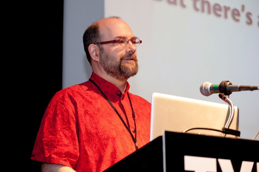
Personally, I’ve presented about the memos and my critique repeatedly over the years as part of my “Font Detective” talks, in front of over a thousand typographers, type designers, graphic designers and computer geeks. I ieven nvited Mr Rather to come so I could give him stage time to rebut me, when I did such presentations in his two home towns, NYC and Austin. Of course he did not reply, either.

Some of my previous writings and interviews about this:

Places I have presented about the memos and offered a reward to anyone who could identify a typewriter that could have produced them in 1972–73:

Will Calibri leave Pakistan sans Sharif? »

Calibri font samples

Luc[as] de Groot’s Calibri, which entered wide use in 2007.

Update 26 Feb 2018: The Calibri cases just keep coming, fast and furious. I have done many hours of research since I wrote this, and now understand far too much for anyone’s sanity regarding the details of Calibri’s availability during its development. Besides past cases, I am currently consulting on three court cases about this, including providing assistance to another expert.

I answered a question on Quora early last week about the availability of Microsoft system font Calibri before its official release in 2007, and quickly found myself caught in a maelstrom centered on the family of the Prime Minister of Pakistan. I have now been interviewed by both the BBC and NPR about the case, and quoted in various other places. Sensibly enough, one publication got feedback from Luc[as] de Groot, the designer of Calibri.

Pakistan has seen a high-​level corruption inquiry based on the Panama Papers leaks last year, that incriminated many public figures. Several of the Pakistani PM’s children appear to have investments in offshore companies. The question is, who owned the investments? The PM’s daughter Maryam Nawaz Sharif (who purportedly has political ambitions) produced a document that purported to prove that she was a “trustee” while her less-​politically-​interested brother was the owner.

The document had a date of early February 2006, and was set in Calibri, although that typeface wasn’t formally released until January 2007.

As my writeup on Quora explains, Calibri was available in “preview” versions of what would become Windows Vista as early as 2004. But normal people were not using this for office documents before it came out in 2007. One can debate whether it qualifies as a “smoking gun,” but it is at least highly suspicious, and I have no inclination to argue that the Pakistani Supreme Court is being unreasonable to say that the burden of proof is now on the defense to explain this improbable situation.

I have testified in court about a backdated document using Calibri before—although in a clearer case where the document was dated prior to even 2004. I am pretty sure that I will again—plenty of people will not remember or hear about this case, so being the default font in both Word and Excel it will come up again in future forgeries.

Save $400M printing cost from font change? Not so fast… »

I am really bummed that the idea trending hot online now, popularly represented as “the US government could save $400 million dollars a year by switching fonts,” is a bit off-​base. It is not the change of design that saves toner; it is that their chosen font is smaller at the same nominal point size than the comparison fonts. Not to mention that the $400 million figure being bandied about is not actually the main number suggested by the kids, which was $234 million. Unfortunately, those fonts that use less ink/​toner at the same actual size are generally less legible.

That said, it is great that middle school kids (the study has two authors, although one has gotten all the media attention) are doing creative problem solving and applying scientific thinking! No sarcasm intended. It is not their fault that non-​obvious aspects of the problem mess up the idea.  (Readers of my blog may remember that point size and font size have a rather nominal relationship.) Garamond* lowercase is about 15% smaller than the average of the fonts they compare it to, while its caps are only about 7.5% smaller. So it is no surprise that it uses less ink at the same point size.

This is why most scientific studies comparing typefaces first compensate by resizing the fonts to eliminate differences in the lowercase height (called “x-​height” by us font geeks). This study failed to do that. As a result, they actually get results that are the exact opposite of other studies. Century Gothic has a very large x-​height, so printed at the same nominal point size it uses more ink than Times. If it were instead printed at the same x-​height (as in other studies), due to its relatively thin strokes, it would use less ink.

Setting any font 15% smaller would save 28% of its ink usage. This is because the font letters are two-​diemensional, so the ink usage is based on the square of the size:.85 x .85 = .7225. Of course, there are some caps in the texts as well, which would make the savings a bit less. Interestingly, this is pretty exactly much what the study found. So, you could just as easily save ink by setting the same font at a smaller point size.

For a moment though, let us pretend that the study did in fact equalize the x-​height, and found that a typeface change saved noticeable amounts ink. With a “normal” typeface such as Garamond, this would mean that the strokes making up the font were just thinner at the same size (“stroke” is a virtual thing here; modern digital fonts essentially trace the outlines of the letter). If that were good and useful, why not go further? Why not make the strokes even thinner? Maybe there is no font bundled with common operating systems and software that would meet these needs, but one could just commission one. Even a master type designer could do a basic four-​member family for $100K or so, which is a lot less than the hundreds of millions at stake. Make it razor thin and save even more!

But any of those changes, swapping to a font that sets smaller at the same nominal point size, or actually reducing the point size, or picking a thinner typeface, will reduce the legibility of the text. That seems like a bad idea, as the % of Americans with poor eyesight is skyrocketing as our baby boomers (and even their children, like me) age.

Aside from that, the reduction in toner/​ink usage probably would save less money than claimed in the study. The claim is based on the proportion of total cost of ownership of a laser printer that goes to toner. There are sadly two big problems with the idea that using less ink (or toner) will save that amount of cash, based on that proportion.

First, large offices that use printers and copiers do so under a maintenance agreement that includes the cost of toner. They pay per page printed, and actual toner consumption is generally ignored. In such cases, a font change will only save based on the page count, not the toner. (Certainly, smaller fonts can also use less paper—I will get to that.)

Second, the study makes the interesting claim in a footnote: “Ink and toner are used synonymously in this study. Even though traditional ink is more expensive than toner, a focus on determining the percent savings in cost rather than the magnitude of the cost obviates this difference.” Urm… how? They are assuming that the percentage of printing cost ink or toner accounts for is the same for all classes of output.

This is untrue. Many of the documents that account for a substantial percentage of the government’s overall printing costs are printed on a printing press, using offset lithography. For offset printing, the percentage of the cost of  that is associated with ink is in fact much smaller than for laser or inkjet printing. But it isn’t a fixed percentage, either, due to the large proportion of the cost that is associated with setup. It will be a higher percentage for short runs, and lower for long runs. Additionally, because of the huge cost of owning printing presses, many or most offset litho jobs will be printed out of house, using third-​party printers.

So, for in-​house printing-​press printing, the savings will be a much smaller proportion than the quoted 26%. For outside printers, they will not charge based on minor variations in ink usage; they just check things like whether it’s a page of text vs graphics. Either way the savings will be less.

There is a different way an effectively smaller font will definitely save money: by allowing multi-​page documents, especially long ones, to take fewer pages! So maybe it all works out—if you don’t worry about legibility.

There is another practical issue with Garamond in particular. The version bundled by Microsoft (from Monotype Imaging) does not have a bold italic, which is an unfortunate lack if one wants to promote its use for all government documents. (Yes, you can turn on bold and italic in your word processor anyway. You will just get a faked font instead of the actual one, which is ugly and less legible.)

The question that should be asked is: what font and size combination could be used to maintain or increase legibility while saving money on printing, by reducing page count and/​or ink/​toner usage, with a font that is bundled with common apps (or free), and has all the required font styles?

But that is a far more complex question, and most folks covering the issue much prefer simple and appealing messages like “high school kids tell gov’t how to save $400 million!”

I like innovative ideas to save money. Really, I do. But I wish the media and public had consulted some experts on this area before going nuts promoting this idea, because it just doesn’t hold water—or save money—without losing legibility.

Thomas is currently CEO of ATypI, the international typography society, since 2004. In other relevant background, he was a teaching assistant for a senior level stats course in his second and third years of undergrad, has an MBA from UC Berkeley, and an MS in printing, specializing in typography, from the Rochester (NY) Institute of Technology.

Updates & notes

This post has seen some editing for grammar, clarity, adding a few more details, and to be less of a jerk. Also to update my background to be current. Again, I am impressed as heck that a high middle school student is attempting serious research. I would not be analyzing it critically ,like a serious adult study ,if not for the fact that the media initially largely embraced it uncritically as if it were.

* The student study does not specify which Garamond they used, but it was obvious (to me) in the samples that they were using the Monotype version that is bundled with Microsoft Windows. Because Garamond goes back to the 1500s, and there is no trademark on the name, there are literally dozens of typefaces by that name, with about four or five being fairly common.

Since I wrote this, there has been some interesting coverage. The Guardian UK was in with the initial pack, with some caveats, but then their Nadja Popovitch wrote about this blog post and interviewed Jackson Cavanaugh of Okay Type for his reaction and analysis.

Meanwhile, John Brownlee did a nice job of explaining the point-​size part of my analysis in layman’s terms, for Fast Co Design.

I did more elaborate checking on the study’s original sources and found that their five government test documents each used different body text typefaces: New Century Schoolbook, Minion (with Myriad headlines), Melior with a little Helvetica, Times with Helvetica headlines, and Book Antiqua. The average of these was almost identical to my original estimate using two of them, but I updated my numbers appropriately.

Given that the five source documents all use different fonts, one could reasonably wonder if they are a representative sample. Generally, as a rough guideline, you need a sample of about 30 to get sufficient statistical reliability for something like this.

CNN quoted Suvir: “”Ink is two times more expensive than French perfume by volume,” Suvir says with a chuckle.” This may be true, but that stat is not original to him—it dates back ten years, and is specifically about inkjet printer ink. Such printers may still be common in schools (although even there I expect laser printers are taking over), but government agencies are definitely not using inkjet printers for much of their output. Most high-​volume government printing is on laser printers, or even printing presses, whose ink is even cheaper still.

Debating Bush memos (with Rather?) on Reddit »

Yes, that really is me trying to debate the Bush National Guard Memos with Dan Rather on Reddit.

There are a zillion posts in that thread, so he may never see my comment, and has every excuse to ignore it if he does. I wish I could get him to come out to one of my “Font Detective” talks that covers that case, preferably the one in NYC that is more open-​ended. But if not, the talk at SXSW in Austin a week later.

In a funny coincidence, it turns out that Mr Rather currently has two main residences, one in NYC, and one in Austin. So you would think the odds would be good that he could come to one of the talks, if he wished.

Font ID Reward! (SOLVED) »

[EDIT: I believe this is solved, though I won’t have time to reach 100% certainty until much later today. The current leading candidate is Swiss 721 Medium, horizontally squished, as demonstrated by Florian Hardwig.]

Sometimes even a font detective can use help. Particularly when running out of time….

At the bottom of this post are some samples from a document, a legal notice printed as a classified ad.

Here are the rewards if you give me an ID by 6 pm Pacific time, Friday Feb 8, 2013. If you are the first to give me a definite read on what font is used in this document, I will pay you $200! If you are the first to give me the right lead without definitive proof (for example, you name a couple of typefaces, and I investigate and one of them is it) then I will give you $100. I can pay by PayPal or personal check.

Why a reward? Well, I’m getting paid for my time and effort in the case, so why not share that? Plus I hope to motivate some folks to assist. 🙂

Half the above reward is available for an ID after the above deadline, but before 6 pm Pacific time, Sunday Feb 10.

So what is the story here? Many of you have heard of my various “font detective” work; cases where I have been called on as a font expert to investigate the authenticity of a document or some typographic issue that drives a legal case. This is one of those cases.

Right now I am in the depths of two cases. The one I am writing about involves a document that is set in something like Helvetica Condensed (but not actually, of course). Although the actual issues in question are elsewhere, identifying the font would be an immensely helpful piece of the puzzle for me. 

Looking carefully at the font, I have noted that it is a highly condensed sans serif, in the same general style as Helvetica Condensed. Part or all of that horizontal compression may have been achieved by means of simply squishing the type horizontally to fit more in. The letterforms have some distortion that is typical of that kind of artificial condensation.

Typefaces I have tested that did not seem to match: Helvetica, Helvetica Condensed, Helvetica Neue, Helvetica Neue Condensed, Swiss 721, Swiss 721 Condensed, Pragmatica, Pragmatica Condensed, Nimbus Sans, Nimbus Sans Condensed.

I have an entire document at 2400 dpi, but the file is huge. Several chunks are available here for download, and if you’re somebody I know/​trust I will share the full document for you to download.

All files are in PNG format unless otherwise specified. The type is roughly 5.5 or 6 pt high, and the entire text block is about 6.5 inches wide (

mystery-ad-lowercase-clip (High-​res image clip of lowercase section, 4 MB)

mystery-ad-caps-clip (High-​res image clip of caps only section, 5 MB)

mystery ad text (RTF file of one paragraph of the ad, 3 KB)

mystery ad med-​res (PDF file of entire ad, 930 KB)

On the side, I hope to see some of you at one of my “font detective” talks:

New York: WebVisions + Font Detective (discount!) »

Friends of Speakers (like me) Save 15%!
WEBVISIONS NEW YORK + FONT DETECTIVE

Feb 27th – March 1st
Theater for the New City

WebVisions explores the future of web and mobile design, technology, user experience and business strategy with an all-​star lineup of visionary speakers, including author, filmmaker and futurist Douglas Rushkoff, Ethan Nicolle, creator of Axe Cop and Jason Kunesh from the Obama for America campaign! Oh, and also me. 🙂

The event kicks off with a full day of workshops followed by special evening events, including my “Font Detective: Extra Bold” talk about cases of forged documents (sponsored by AIGA). And of course, two days of sessions, keynotes and panels, including my talk “Typography is the New Black.”

The “Font Detective: Extra Bold” talk sold out in Chicago, and it will be a much shorter version at SXSW a week later, so this is your best opportunity to come hear some really fun stuff. The Chicago audience refused to even take a bathroom break when given the option to hear more cases instead, so I gather people find it pretty compelling. Or maybe Chicagoans just have unnaturally strong bladders.

To receive the conference discounts, click the link “Enter promotional code” by the Order Now button and enter the code “DOGOODERY

Register online at http://wvnyc-2013.eventbrite.com/#

« Previous posts