Category: Typography

  • Variable Font UI is Broken

    in Adobe CC, Affinity, CorelDraw… & most apps with “live” interactive interfaces

    Many major graphics/​publishing apps have made some poor user interface choices for variable fonts. Given the ongoing steady growth of variable font usage and availability, it seems worth fixing. The biggest problem, and the easiest to fix, is lacking ongoing access to axis settings while working with text. Other issues include maintaining common settings across fonts, and accessing the pre-​set meaningful axis values while using sliders.

    How common are variable fonts, anyway? Variable fonts make up 28% of all fonts available on Google Fonts, but only 7% of Adobe Fonts (as of mid-​2026). The percentage is smaller on MyFonts, but with over 3000 variable font families there is still a dignificant number for those who like the technology.

    Note: I will gladly give app-​specific advice and feedback to any developer who would like to discuss/​improve their application’s behaviors in this area.

    The Variable Font Settings panel

    Ongoing Settings Access

    Variation selection needs to be just as easy to access as selecting a font style, because it is essentially the same thing. But putting the detailed variation settings exclusively on a transient pop-​up/​fly-​out menu, which goes away as soon as you click anywhere else, including on other text is a bad idea. This creates an extra click… Every. Single. Time. …one wants to do this thing that needs to be done constantly.

    The temporary fly-​out in Adobe InDesign; many other apps are similar.

    Do you want to replicate settings from one place somewhere else, or base settings on other settings, without using character or paragraph styles? Too bad.

    A variable font instance is ~ equivalent to a font style. Apps generally let people click in any text to see exactly what font style is currently selected for that text… except when the selected text is in an instance of a variable font, which is set to something other than one of its predefined instances.

    Variable font axes offer continuous ranges to choose from, and often two, three or more of them. Because of this, one often looks at what one has already done, axis-settings–wise, to figure out what to do next.

    Users need to be able to play with and explore variations. When we click in some text or on a text box, we often want to instantly see what the variation settings are for that text. All of these things require an option or route to have the variation settings not be solely a pop-​up that is only active when you move your pointer over and click on it in the character settings.

    It mostly isn’t that the elements within the typical pop-​up settings interface are terribly wrong (modulo some refinments, see below), but the biggest thing is just their transience. Perhaps it could be a part of the same panel that has font selection/​formatting controls, that is available whenever a variable font is selected.

    Making Stop Points Visible

    The other oddball thing is, most apps just pop up sliders, with no indication as to what the values mean. Sure, you have a weight axis, but no indicator as when you are using a slider as to what particular weight is Semibold (for example). Fonts have two ways of indicating such standard values on axes.

    The one people are most used to is a list of static styles, equivalent to a style name or menu name for a single-​master font. Each such style is a specific combination of values.

    On the plus side, when you get all your slider settings lined up with a named instance, InDesign and Affinity Publisher do show you the current instance name. That is nice.

    Integration

    One argument some typographers have with current interfaces is, they still treats variable fonts as some sort of second-​class citizen. These can be the most powerful and versatile fonts your users have access to… if you treat them appropriately.

    One part is making features more visible, as discussed.

    Another is doing new things with existing features. Or even doing old things that have been forgotten. That can mean using the hz justification algorithm with width axis character stretching/​condensing (good) instead of just distorting text (highly questionable and not what Zapf designed). 

    Or another riff on the same idea: offer an auto-​fit-​to-​line-​length option for headings that makes use of the width axis if available—great for some kinds of display typography. (I did this manually last night for a t-​shirt design, and it seemed silly that it was not a built-​in app feature.)

    Menu (or named stop points) per Axis, using Axis Value Tables

    Variable fonts can have a set of specific named instances. That easily enables a single-​menu selection model. But when three, four or more axes are available, naming every reasonable instance combination is a bit unwieldy from the naming end, and even more so in terms of selecting dozens or even hundreds of styles from a single menu.

    Conveniently, variable fonts have a STAT (style attributes) table. This also allows for Axis Value Tables (within the STAT table), that define stops along each axis in and of itself.

    With a slider approach, such stops could be highlighted on the sliders of the variable font settings pane, perhaps with some slight “snap” to make them more easily selected (e.g. if the slider is being moved via drag, and that value is within 1% of the slider range, jump to it).

    For example, in a typical font with a weight axis, the 100-​unit increments tend to correspond to named weights (e.g. Thin = 100, ExtraLight = 200, Light = 300, Regular = 400, etc.), and it would be nice if there was some way to show this on the weight axis slider.

    Menus and Axes

    Further to the above, if there are more than two or at most three axes, the font is not going to even try to put each and every combination into a named instance for menu purposes. My most recent projects for example:

    Google/​Material Symbols: 7 weights x 4 sizes x 3 (or 4) grades x 3 roundness = 336 styles (or “only” 112 if you separate the roundness into separate families) 

    Science Gothic: 9 weights x 9 widths x 3 slants x 5 contrasts = 1215 styles

    An app could consider putting each axis into its own menu and have a style menu per axis. I am not certain this is good and needed, but I would sure love to be able to try it and find out if it is a Better Way.

    The general idea of storing each axis setting as a separate font style attribute, though—that is good and powerful, and a clear way forward for apps in general… see below for what else that might help enable.

    Apps & Axis Settings

    Switching Fonts

    When one switches from one font to another, versions of InDesign, Illustrator, Affinity Publisher and CorelDraw that I tested aren’t smart enough to preserve axis values, even if the other font has the same axes and supports the same values. This may seem like a corner case, but consider that in many variable font families, the upright and italics are separate fonts. (Yes, they are also sometimes in the same family, if it has an “italic” or “slant” axis. But both scenarios are common.)

    Mind you, many apps won’t even let you use their standard keyboard shortcut to swap from regular to italic (or the reverse) when a variable font is in play. Adobe Illustrator does—but all the other variable font settings reset to their default values when you do this. This rather spoils the point of the operation: switching between upright and italic while keeping the other variable font settings the same.

    When you are switching between two typefaces that have at least some of the same axes available, and the same settings available in the second one, the app should maintain those settings. I tried this with many fonts in multiple apps and had no joy from any of them.

    Sure, don’t worry about axes they don’t have in common, but for axes they do… preserve the settings when switching fonts if you can. At least, preserve any axis setting that is at a non-​default value. (OK, that shows that there are potential subtleties and questions here. But that is no excuse to just leave the situation at Maximum Awfulness.)

    Axis Granularity vs Standard Values

    Over in Affinity Publisher, the axis sliders are given a surprisingly coarse granularity. Each slider has a maximum of 21 stops, so an axis with a wide range “jumps” pretty coarsely. This has interesting side effects in terms of one being unable to stop sliders particularly close to desired or standard values. If a font has a weight axis that goes from 100–900, the weight slider is going in 40-​unit increments, one can’t quite get within “can’t tell the difference” range of Regular (400) with the slider, as it stops at either 380 or 420. Instead you have to manually enter the number. Not the end of the world, but a bit weird, and undesirable.

    Adobe does only somewhat better in this regard, with jumps fine enough that they seem almost continuous. But one still can’t land right on the named values, even though 401 or 398 is close to 400.

    Other Issues

    Optical Size

    Every app should offer an option to automatically use the correct optical size setting for the current point size, when using fonts that have an optical size axis. This should be on by default, both with text in new documents, and in the style settings when creating a new paragraph style (and perhaps character style?).

    The more advanced version would be to even let users select relationships 

    Copy/​paste

    I know it is too much to hope that copy/​paste between apps will always maintain variable font custom axis settings. But maybe at least between apps from the same vendor? And certainly within the same app.

    InDesign width axis and hyphenation

    When one has a narrow text block in InDesign, in a language that it knows, with hyphenation on, and adjusts the Width axis on the first couple of words, it can do some truly bizarre things with breaking words via hyphenation, when the whole thing could easily fit. I hit this when trying to put a small variable font showing in the family winter holiday card… it was sufficiently frustrating that I ended up starting this blog post last year, instead of continuing to work on the family holiday card.

  • How do you get an image into something like an emoji, so that when you paste it it is treated like normal text (without Unicode)?”

    Imaginary physical emoji being added to a document

    tl;dr: You can’t do it without actually making it an emoji, or using a custom font that has the character.

    Emoji are text. Unicode is the global standard for text, and especially for large character sets. This is the strength of emoji and what makes them work as well as they do. (Not perfectly, but as well as reasonably possible.)

    Unicode (including the emoji parts of the standard) is exactly what enables emoji to be copy/​pasted as text. It is a vital part of the tech behind emoji. Emoji have standard Unicode codepoints, and an understanding of those is shared by essentially all the world’s computers and digital devices… and that is why emoji work across nearly all different devices and technology platforms.

    Just like any other text, you need a font that supports the particular characters in question; in this case, the particular emoji characters. Luckily operating systems (and some apps) come with emoji fonts for this purpose, and those fonts get regularly updated, so when you update your OS (or app) you get a newer font with the latest emoji included.

    But let’s take all the bits of the question one at a time and break it down for you.

    (This post started as one of my Quora answers, years ago. Since revised and updated.)

    First, what do you consider “normal text”? You must be part of the minority 15% of the world’s population that has English as their first language, so even ASCII is more-​or-​less sufficient for you. But for the other 85%, there is no single obvious standard… other than Unicode. And in fact, Unicode is “normal text”: starting in ~ 2011, more than half of the world’s 10 million most-​used web pages were already encoded as Unicode. By 2023 it was about 98%. So, I think it is safe to say that the encoding used by 98% of all web pages (and a similar proportion of desktop applications and operating systems) is normal text, pretty much by definition.

    Let’s temporarily ignore that, and still talk about ways of communicating “something like an emoji” without Unicode.

    What counts as “something like an emoji”? You can have an image in HTML/​CSS that has “alt text” with a description. That text is normal text, and the full text includes the URL link to the image. That doesn’t require Unicode, something that supports even one language is sufficient (for just that one language!). That does not seem much like an emoji to me, but fine, the stuff you paste is indeed treated as text. However, the image part of that is not text, and will not come along when you copy/​paste text alone. So… maybe that part is a “fail”?

    Another obvious answer would be… you can invent your own competing standard to Unicode! It would have to work pretty much the same, including the idea that all operating systems and software vendors would need to support it. So you would have to convince everyone that it was worth doing so. That’s a process that took decades for Unicode, even though all the biggest players in operating systems and software were backing Unicode, and there wasn’t a viable alternative!

    So if you want to compete with Unicode… well, good luck with that. It was long and slow getting everything to support Unicode, even though the alternative was badly broken; even if a slightly better alternative existed, it would not be worth the immense effort to switch or support it, because the additional benefits (if any) would not be worth the effort. Unicode has its flaws (ahem, Han unification, ahem), but I don’t expect to see any real contender to Unicode in my lifetime.

    OK, there is a slightly more sane answer, but it is not terribly reasonable, for most people. You could design/​engineer a custom font that uses an arbitrary non-​standard code (could even be ASCII!) or a ligature (so you can spell out the word) and then create a web site that hosts that font, and then you can input your own text on that web page, including your custom emoji-​like character. And it will show up just fine. Until somebody tries to copy and paste it… anywhere else. At which point it will be broken. So it doesn’t really meet that important criterion.

  • Also, Quora Lies: WW2 Arial, Helvetica, Courier; also Times misinformation

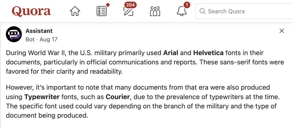
    About a month and a half ago, I explained a bunch of reasons I was migrating my own content off of Quora, the knowledge-​sharing site. I failed to mention one of the most egregious issues: Quora has its own AI assistant bot that provides “helpful” but often (usually?) false answers to questions, and often inserts them ahead of real answers created by humans. It lies.

    Here is a great example, answering “What font did the US military use in World War 2 era documents? (an example is in the details)”

    During World War Il, the U.S. military primarily used Arial and Helvetica fonts in their documents, particularly in official communications and reports. These sans-​serif fonts were favored for their clarity and readability.

    However, it’s important to note that many documents from that era were also produced using Typewriter fonts, such as Courier, due to the prevalence of typewriters at the time.

    The specific font used could vary depending on the branch of the military and the type of document being produced.

    Most egregiously, every specific font reference in that blurb is a lie. World War II ended in 1945. Courier was invented about 1956, Helvetica about 1957, and Arial in the 1980s (only popular after 1992 when bundled with Windows 3.1 and Word). So none of those three typefaces even existed yet, during the war.

    Oh, also the example in the question details? 

    That is Bernhard Gothic, which wasn’t even mentioned by the AI bot.

    Google’s Slightly Less Awful Answer 

    Of course, AI hallucination is hardly unique to Quora. Google today helpfully answered “what fonts did the us military use in ww2” with an AI summary, claiming that:

    The US military used a variety of fonts during World War II, including:
    LL Akkurat, Akzidenz-​Grotesk, Albertus, GT America, Avenir, Caslon No. 471 & 540, Cooper Black, Franklin Gothic, Futura, Futura Condensed, Futura Extra Bold Condensed, Georgia, Gotham, Harbour, Helvetica, TWK Lausanne, Microgramma, Montserrat, Optima, Suisse Int’l, and Windsor.

    About half of those did not exist yet, specifically: LL Akkurat, GT America, Avenir, Georgia, Gotham, Harbour, Helvetica, Microgramma, Montserrat, Optima, Suisse Int’l.

    I guess 50% is considerably better than Quora’s zero percent, but still, ouch.

    Interestingly, as my colleague and font ID expert Florian Hardwig points out:

    Google’s answer is swiped from @FontsInUse. The non-​standard phrasing with “Caslon No. 471 & 540” being grouped together and “Futura”, “Futura Condensed”, and “Futura Extra Bold Condensed” being listed separately suggests as much. All names appear in the site’s top menu – which is identical for all pages, including those related to WWII. Very intelligent.

    @[email protected] ’s recent contribution lists some of the fonts actually used by the U.S. Army: Army Talk Orientation Fact Sheet 64, “FASCISM!”

    Although a serious contribution, of course this last is only what the US Army happened to use in a single document, and is not an attempt to provide a general answer. But unlike the Google AI failure it at least does exactly what it claims to do.

    I should add that Florian is one of a very small handful of people who are the world’s true masters of font ID. He is incredible—I have gotten his help on a couple of especially troublesome font forensic cases; never regretted, always impressed!

    Another Quora Howler

    What are the differences between Times and Times New Roman? Which one is considered better?

    Right after I first posted this, I went to grab some more of my own content for a post about the history of Times Roman, to add to a draft-​in-​progress adapted from a couple of my Quora answers. This was literally the very next Quora bot post I read, after I created this blog post. Once again, it is howlingly, insanely wrong (and tops all but one of the human answers):

    Every single section of this is wrong. False. All of it.

    Name: Properly it is Times Roman rather than just “Times.” Personally I often use “Times” when I want to refer to both Times Roman and Times New Roman. (Or I will write Times (New) Roman, that also works.)

    Origin and Design: The two typefaces are the same design. To the extent that they differ, Times New Roman is the original designed by Morison (with one r not two) and Lardent at Monotype, and Times Roman is the adaptation by Linotype. But they both went into general use on the same day, at different locations printing The Times of London. So this section is wrong in about three different ways, plus it spells the name of the designer wrong.

    Character Design: All lies. Neither is more compact. Every normal character for each is exactly the same width, because they needed to be perfectly compatible!

    Legibility and Aesthetics; Which One is Better: All lies. Although the serifs of Times New Roman are indeed the tiniest hair finer in modern digital versions, the real answer is, normal people can’t tell them apart, and even most typographers need to look at one of just a few particular characters to be sure which one they are looking at.

  • About .notdef: the symbol (not emoji!) that is often an “X” inside a tall rectangle

    I have fielded many versions of this question: “What does the emoji with an X in a large rectangle mean?” or “When texting, what is the meaning of the symbol with an “X” inside a tall rectangle?”

    That it is an X-​in-​a-​tall-​rectangle is just the most common rendition, although not the only possible one, for the “.notdef”. A variety of font-​specific notdefs are shown above.

    It is not an emoji, but you can get it instead of an emoji or other unusual character. A notdef (undefined glyph) is what gets displayed when a character is specified in text, but your current font does not support that character. Most commonly it happens with a newer emoji, but it could be in an unusual language or a new currency symbol, or… well, something unusual.

    This problem is not unique to texting, but applies to all kinds of displays of text on all devices, whenever the needed character is not available in the available font(s).It is an indicator for a “missing character,” which stands in for an emoji or any other character that your device or current font doesn’t have a glyph to display it with. This makes it a very special symbol.

    (A particularly hefty notdef, that I designed for one of my typefaces. The font is quite bold, so I made the outer box of the notdef quite bold to match. How font-​specific should a notdef be? As I get older and hopefully wiser, I gravitate towards what seems to be a near-​concensus view that it should contrast with the font, so users realize something is wrong. That means matching weight is actually a bad idea. Oops.)

    This is more common when you are receiving rather than sending a text, since you are unlikely to enter a character that you don’t see correctly. But it can happen when you try to view a web page, or copy text from a source and paste it somewhere that it comes out in a different font.

    Often there is some kind of font fallback available; your phone (or computer) tries to display unusual characters and emoji in some other font, that supports those characters. That is why in some situations you can see a name and some unusual character in the name is displayed in a different font than the rest of the name. But phones have limited storage space, and whether it is a phone or computer, there are over 150,000 characters defined in Unicode, with more added every year.

    So when your phone (or web browser or computer) runs out of ideas on how to display a character? You get a notdef.

    If you copy and paste a notdef on your computer or into a text or email you are sending, you will probably be copying some specific emoji or obscure character. That means that some other person who receives that (or later views the same file on their computer) may well see something else entirely!

    Even if they do see a notdef, it may look different, depending on the font they see it in. Here are the most common/​standard approaches to the notdef, as defined in the OpenType specification.

    The thinner box creates a very different appearance compared to the X-​in-​a-​box approach, doesn’t it? Note that these are general approaches, not precise glyph outlines that a font maker would use directly.

    The plain rectangular box is the style of notdef that was common in PostScript Type 1 fonts, back in the 1980s–90s. But it has fallen out of favor. I believe the main reason for this is that as a shape it is not as distinctive, and hence more easily missed by someone looking over some text.

    That plain box is the origin of the slang term “tofu” for the notdef, over some notional idea that it resembled a piece of tofu. I originally thought Google staff invented this slang, as the first time I remembered seeing it was in publicity for Google’s “Noto” universal font set (“Noto” being short for “no tofu”!). But my font colleague Denis Moyogo Jacquerye pointed to this thread on the Unicode mailing list in spring 2009, and says it was one of a number of references around that time. John Hudson seconds encountering the “tofu” term in Unicode circles, so I may have been hasty in assuming it was a Google invention. 

    The question-​mark-​in-​a-​box is used in many of Microsoft’s fonts, such as Calibri. Note how the question mark inside the notdef is in the style of the font—it isn’t just a generic one. This style was invented by John Hudson during the development of Calibri and the other so-​called “ClearType fonts,” that shipped in January 2007.

    The ART [Advanced Reading Technologies] group had used a spiral .notdef in Palatino Linotype, but it had caused confusion because it wasn’t recognised by users as a missing glyph indicator. For the C* fonts, I suggested that a) a box of some kind was necessary, and b) a question mark would indicate uncertainty: there’s a character here, but we don’t know how to display it.”

    John Hudson on Mastodon, 17 Dec 2024

    A plain rectangular box was the style of notdef that was common in PostScript Type 1 fonts, back in the 1980s–90s. But it has fallen out of favor. I believe the main reason for this is that as a shape it is not as distinctive, and hence more easily missed by someone looking over some text and trying to spot errors and glitches. When I was at Adobe, we went from the empty box to the X-​in-​a-​box style as part of our transition from PostScript Type 1 to OpenType, from 1999–2003.

    HOW DO I GET THE RIGHT CHARACTER INSTEAD?

    Updating to the latest OS for your phone (or computer) usually also updates your Unicode and emoji support and system fonts. If the problem is in an app that has its own Unicode/​emoji/​fonts, then updating that app may help.

    Many apps and OSes will use “fallback fonts” when the current font does not support a needed character. In that case, the above advice is good: you need better support from some core system font.

    (This was originally written for Quora, but as Quora continues to turn to garbage, one of my answers on this, despite having the most upvotes, was made invisible by the system for unclear reasons. So I have merged my answers to two similar questions into one, and posted it here.)

  • What does a design brief for a new typeface (font) look like?”

    Many of the same questions could reasonably be in play, whether one is choosing an existing typeface, commissioning a typeface, customizing an existing typeface, or designing a new typeface oneself. There may not even be a “typical design brief” for a new typeface—but there are certainly elements one should include and things to consider.

    A design brief is sometimes neither written down, nor clearly developed. I encourage both aspiring type designers and clients of custom type design projects to go through the same process: write it all down. It will be helpful, often immensely, to articulate questions and goals clearly. It sets everyone’s expectations and creates reasonable limits.

    Even in a solo project, sometimes there is a temptation to allow “goal creep” and more gets added to the project in small pieces, with a final scope that is considerably more than originally intended. Writing out a design brief can help prevent this.

    Many clients don’t know what questions to ask, so the design brief is something that usually gets developed in collaboration between the type designer and the client. Or, when there is no specific client, it means asking the questions of yourself, to better focus the design process. Being specific is restrictive, but this is likely to result in a more successful design outcome—even if the final fonts are used in ways beyond what was originally intended (consider Bell Centennial, originally designed for telephone books).

    A design brief may be a living document, revised over time during the early stages of the project as it unfolds. There may be a first round brief written in the early exploratory stages, and a later “final” brief to guide the full execution.

    In any case, when taking on a new typeface design project, some good questions to ask might be:

    Who is the client, or target customer?

    Hypatia Sans: Myself/​graphic designers. But I also wanted something Robert Slimbach would say was good, original, and versatile enough to be an “Adobe Original.” In case you are wondering what it looks like… this entire blog is set in Hypatia Sans, both body text and headlines.

    Extensis logo redesign: Software company Extensis (my employer at the time)—makes font management & digital asset management apps.

    Is it replacing a current typeface? If so, what does the client like and dislike about the current typeface? What is motivating the change?

    Neither project was approached as a font replacement. For Extensis, I was specifically trying to ignore the previous logotype (which I disliked very much), just starting over. But along the way, I made a full basic-​character-​set font.

    If they considered off-​the-​shelf options, what did they consider and what did they like about each of them? What did they dislike about each of them? Why did they not go with any of them?

    Hypatia Sans: Although not replacing a single existing typeface, I was trying to differentiate it from other geometric sans. Futura was too cold, but the classic proportions of the caps were good. Instead of imitating them directly, I instead looked to the same source, classical roman caps (e.g. Trajan) for proportions. The Futura lowercase was too cold, but Avenir lowercase was too bland.

    Extensis: I found this part incredibly helpful in the process of creating a new logotype recently for a font software company, Extensis. We looked at a bunch of specific typefaces and rejected them for a variety of reasons. In the end I took an existing typeface, Adelle (by Veronika Burian & José Scaglione of TypeTogether), and modified it quite heavily—with their permission, of course! But I used the knowledge of what my internal client and I liked about other typefaces to guide what I did to the pre-​existing typeface. The logo is wider, a tiny bit lighter than the Thin weight of Adelle, and 5 of the 8 letters have significant design tweaks. But it did start with Adelle.

    What is the typeface a vehicle for? What is to be communicated with it? In what way should it flavor the message? Is it intended for a particular project or product?

    Extensis: We wanted it to feel modern and somewhat techno, yet warm and approachable. We had a very playful graphic for the logo—it was almost wacky. We needed the font to be playful enough to not clash with the graphic, but still be serious, to ground it all. It was a balancing act.

    Is there a specific target usage? 

    E.g. “advertising headlines” or “body text in all publications and online.” Even if not…. What sizes will it be used at? In what media? How will the type be reproduced (imaged, rasterized)? On screen? For web pages? In print?

    Extensis: The logo needed to function at pretty small sizes, as logos often do. Some of the typefaces we had considered were dropped because their weight got too spindly at small sizes on screen… they were not holding up well enough across all use cases.

    Hypatia Sans: Originally I intended it for display usage. I imagined it being used for product packaging, maybe some logos. Then I found it worked surprisingly well even at larger text sizes. So I revised my plan and spaced it so it was OK in larger text sizes (like 12-​14 pt in print). So, moderate amounts of body text, through to larger display sizes. Should look good on screen, but with details that will be interesting in print.

    What else is known about the desired design category?

    Extensis: We had decided we wanted something in the line of a slab serif typeface, something in a realm defined by typefaces such as Archer, Donnerstag, Vista Slab, and Adelle.

    How many styles (individual fonts) are desired? 

    Regular, italic, bold and bold italic are four fonts right there (and no, you can’t get reasonable quality results by just using algorithmic slanting and bolding.) More weights, more widths, or other variants (eg different optical sizes) can all add up. Families of 8–20 fonts are common. The largest family I know of is Kepler, comprising 168 fonts!

    Hypatia Sans: I wanted a wide dynamic range of weight, and ended up with six weights and their matching italics, from extra light to black.

    What kind of language coverage is required? 

    Any other particular character set needs (e.g. particular symbols, math capability, whatever). There are a variety of semi-​standard character sets and language groupings, but the whole matter is a bit fuzzy around the edges. A basic but complete western European character set might include over 200 glyphs. With central/​eastern European accented letters (“extended Latin”), you would end up over 300. 

    Each of these choices involves either choosing to adopt somebody else’s pre-​packaged language coverage definitions, or extensive research of your own. And some choices are more complex than they first appear: if you do Greek, do you also do polytonic Greek? If you do Cyrillic, which languages do you cover? (Cyrillic character sets are almost as complex as Latin.)

    For Hypatia Sans I was completely out of control. Latin, extended Latin, and even more obscure. Cyrillic, extended Cyrillic… I ended up further formalizing and extending Adobe’s character set standards for Latin and Cyrillic because of it! My manager stopped me when I was considering Norse runes (I am not making this up, I swear). Still, it was too much and I regretted it later, when what seemed fun for one style became a ton of work, for the full range of weights and italics too. Plus, the project became so big and slow that I advanced massively in skill before I was done, and found myself redesigning some things, or just seeing things at the end that I wished I had done differently. In retrospect, I could have advanced my skills more efficiently/​effectively by doing multiple smaller projects.

    What kind of typographic extras (characters/​glyphs) are required, or might be desirable? 

    Arbitrary fractions, both lining and oldstyle figures in both tabular and proportional widths and the five f-​ligatures – fi fl ffi ffl ff – are now “basic” for me. But others might think of them as extras. I think of small caps as extras, especially if there is a large language support requirement. Superscript and subscript numbers? A full set of letters for ordinals? So many possibilities!

    Create a glyph set definition 

    Now that you know what you want, consider documenting the glyph complement /​ character set fully, perhaps with a spreadsheet. If there are common characters not covered,  that too should be mentioned or highlighted some way, either by the spreadsheet or in accompanying text.

    Hypatia Sans ended up with something like 2700 glyphs per font ( 3000 after it was updated to match later character set standards). That is why it took for-​bloody-​ever to complete. I hope everyone learns from my errors! Not that you shouldn’t ever do a huge project, but just perhaps not as a first (or second or third) typeface.

    Many of these things essentially multiply together. For example, if you need ‘real’ small caps, you should probably have them for all the supported languages, and in all the fonts in the family. This kind of extension of features to the full font is often assumed, but it is best to be explicit about it, so it can be part of a delivery checklist. It is even more important to be explicit if there are inconsistencies either within a font (small caps only for un-​accented Latin?) or between fonts in the family (small caps only for the upright styles but not the italics?).

    For reference

    Adobe character sets: Latin (5 levels), Greek (2 levels), Cyrillic (3 levels). These do not include “typographic” extras such as small caps, oldstyle figures, or additional ligatures beyond the most basic (fi and fl). But they are fairly comprehensive for language and basic symbol coverage.
    Thomas’ page of type design resources!

    Note

    This is a much edited version of what was once a Quora anwer. Special thanks to Dave Crossland for edits and input when we used this in our Crafting Type classes! Any errors or omissions entirely my fault. Also see discussion about typeface design briefs on Typedrawers.

  • More of my fonts/​typography answers coming here!

    Because Quora turned to junk

    Back around 2013–2021, I really liked Quora. I could go through questions people asked, find interesting questions that I was especially qualified to answer (mostly about fonts and typography), and write up an informative answer that people would read and upvote. Comments and further questions in the discussion to each of my Quora answers would help me refine and improve them.

    I could similarly find and read interesting thoughts and analysis on darn near any topic of interest. I accumulated favorite writers and would often read Quora as a leisure activity, just for intellectual interest. It was a social network focused on ideas. 

    Quora has since mostly turned to junk. At this point, I don’t even have any confidence as to how long the site will even continue to be up. Or if it is still up, will the content be freely available? Findable? (EDIT: see below for a scary update about that.) So I have been revising and saving my best answers here, to trickle out over time.

    This is the process Cory Doctorow calls enshittification. Why does it happen? They were getting participation and views, but without making money. The site needed to figure out how it would make money. So they experimented in a bunch of different ways to try to increase “reader engagement” and reduce costs… and in the process lost everything I liked about it.

    In the case of Quora, some particular things included: 

    • Making it harder to find the answers to a question. The default when you click on a question is now to show “all related” answers instead of the answers to the current question… which means you have to read more and click more to get the info you actually want.
    • Rewarding people for asking questions (through the “Quora Partner Program”) instead of focusing on getting good answers. Worse, specifically rewarding questions that upset people as long as they got responses. Responses pointing out problems in the question itself are still responses, so… you can see where that path leads.
    • Allowing anonymous questions. Yes, there are totally legitimate reasons for question-​askers to want to be anonymous. But the proportion of junk and trolling skyrocketed after this change.
    • Doing all the above while reducing their staff of moderators.
    • Most of the above factors contributed to spam, misinformation, and low-​quality content
    • At first, it was just more bad content. BUT, the spam, low-​quality content and user-​hostile interface decisions drove away many of the best contributors (myself included, obviously). So now the fraction of “good content” is much worse, not only because the denominator grew out of control, but the numerator also shrank.
    • ADD: Speaking of low-​quality content, Quora adds egregious garbage “AI” bot answers to questions. They are often outright lies, so bizarre and hilarious that I made a separate post about how bad they are.
    • ADD: Also, you can no longer read Quora answers without being logged in to a Quora account.

    Quora’s “Top Writers” program lasted from 2013–18, coinciding with peak Quora. There weren’t any huge perks, just a little recognition, a badge on your Quora profile. But still, it was nice. It was not a big enough deal that it made it onto my c.v.—but I did link to my Quora answers. I recently deleted that link on my c.v., because being associated at all with Quora seems like a negative.

    But now Quora has been overrun with spam and fake questions plus hate speech and bullying. And AI garbage answers. I won’t yank my existing answers (already often revised and polished over time), but I am polishing and further revising the best ones, and posting them here. I have already copied a couple dozen of my best answers to draft posts here, edited and posted the first couple, and done some light editing on most of the others (with more to come). I may set them to auto-​post periodically.

    That all makes me sad, but at least I was able to slurp up a whole bunch of my existing content and start editing/​re-​posting!

  • Wired mag off-​base on Roboto typeface

    Wired magazine’s puff-​piece on Google’s Roboto typeface revisions is really bothering me. I thought if I held off, I could just do a few sarcastic tweets and be done with it, but no.

    I am not a huge Roboto-​hater like some folks in the type community. I just object to uncritically publishing quotes that make blatantly false statements.

    UIs [user interfaces] are crafted from images and type,” Matias Duarte, Android’s head of design tells WIRED. “But the idea of having a typeface that’s thought out as a UI typeface—that’s not been done before.”

    Well, that’s pretty much simply false. (UPDATE: Duarte says he thinks he was misquoted, basically he was trying to just say UI typefaces are hard, and Roboto had a particular challenge in needing to work in a wide range of contexts and types of devices.)

    [Perhaps not Duarte, but apparently the Wired author was] unfamiliar both with an obscure operating system called “Windows” and its typefaces Segoe UI (introduced in Windows 7) and Tahoma (introduced in Windows 95), both of which were specifically designed/​intended for UI usage. Not to mention Chicago, developed for the original Mac OS back in 1984. (UPDATE: Plus, there is Prelude, designed by David Berlow and Font Bureau as a UI typeface for the Palm Pre operating system—when Duarte himself was in charge of UI for the Pre. Not to mention Android’s own Droid Sans, also designed as a UI typeface.)

    A slightly weaker argument could be made for Lucida Grande (the Mac OS X UI font), which is only slightly tweaked from Lucida Sans. Of course, Lucida Sans itself was specifically designed for low-​res screens and the like. Designer Chuck Bigelow got a MacArthur “Genius” award for his work on the family.

    There are seven substantial paragraphs to the article, but both the people quoted are on the Android team. Thus it avoids mentioning the most famous thing anybody has said about Roboto, ever: Stephen “Stewf” Coles calling it a “four-​headed Frankenfont” in a strong attack on the design philosophy behind it.

    This is also why there is so much puffery throughout the article emphasizing how the typeface is designed for performance rather than aesthetics. Such choices do certainly explain most of the changes from v1 to v2 of Roboto, but “performance over aesthetics” is clearly false as a general proposition about the typeface. My big problem with Roboto is that the choice of closed counterforms for many letters and numbers (35CGSacs) is an inherently anti-​legibility choice. Yes, they had more of these before the revision, and some (5) have been slightly improved, but they need to finish the process of transforming it into a different typeface if they want it to be an outstanding UI typeface.

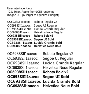
    Roboto compared to other UI fonts

    Indeed, I would argue that such closed shapes are stupid bordering on criminal in a user interface typeface. There is a reason that most other typefaces specifically designed for user interfaces have used open counters, and that is because there is massive evidence that tells us these shapes are more legible (see for example the research cited in Sofie Beier’s book on the subject). Legibility should be a the paramount concern for a user interface typeface.

    Roboto designer Christian Robertson explains the mix of open and closed shapes as saying that they create an appealing texture in body text. Which is lovely and all, but in a user inferface, that is not as important as legibility.

    That said, to be fair, Apple is doing a much worse thing in choosing Helvetica Neue as their UI typeface, first for iOS and soon for the next version of OS X. They too have gone to lengths to declare publicly how they are optimizing it for legibility, which is rather like trying to polish a turd. Helvetica is inherently anti-​legibility. The only way to make it otherwise would be to change it so much that it doesn’t look like Helvetica any more. Sadly, that is not what Apple is doing. (Update: Apple later changed to San Francisco, which has the same “modern” look as Helvetica, but with just slightly more open counters… rather like Roboto in that regard.)

    Aside from the business of being first with a dedicated custom UI font, if Google and Apple were to explain that they are making their UI font choices for design reasons, that’s fine. But when they (or Wired) start touting the awesome legibility and functionality of their choices, I have to call them out on it. Nonsense.

  • How to Tell If a Font Sucks

    Are you a user of fonts who needs to tell if a font is well made, or an aspiring novice type designer? The March–April 2014 issue of Communication Arts features my article on evaluating font quality, “How to Tell If a Font Sucks,” on p. 24—now online as well!

    It looks like it is hard to see the subtleties in some of the graphics in the down-​res web-​ified version of the article, though the print mag looks great. I will see about posting a version with high-​res images in PDF.

    I’m really pleased with this article. My new editor Robin Doyle at CA did a great job helping me clarify some points and figure out where more graphics were needed.

    That said, there are some corner cases and subtleties around this discussion that I didn’t have time or space to get into in the article, which was already long and involved. But that is what blogs are for. 🙂

    Although I stand by everything in that article, typefaces that are deliberately naïve/​unsophisticated are one place for legitimate exceptions to some of the guidance I give in the article. For example, I had a lovely discussion with some folks who made a typeface based on some classic road signs. The original signs did not use optical compensation at stroke joins (point 5 in the article), so they didn’t do it in the typeface either. Although I might rarely be interested in going that way myself, I have to agree that it was a perfectly legitimate design choice, given the origins of the typeface as a signage revival—even though in many another context I would be calling it crap!

    Optical compensation at stroke joins is also specific to certain typographic traditions. Certainly for Latin-​based fonts (English, French, German, Hungarian, etc.) it is nearly universal, as it is for Cyrillic (Russian, etc.) and Greek. But some writing systems do things differently, such as Devanagari (used for Hindi, Marathi, Sanskit).

    Non-​western writing systems can also change other assumptions. For example, the idea that straight-​to-​round transitions  (point 6 in my article) should be very smooth is very much not the case for Thai.

    Anyhow, check it out and let me know if I can clarify anything else!

  • Fonts and Typography for Writers and Non-Designers

    What are some good resources for non-​designers, who perhaps write, edit or publish professional documents? Somebody recently asked this in the comments to my blog. There are quite a lot of resources I could suggest, but given limited time, we should limit the complexity/​depth/​scope of the resources. So given that….

    Before getting into the depths of font selection, teach typography. I think Matthew Butterick’s Practical Typography is a great place to start. Short, straightforward, no-​nonsense, useful, and little I could disagree with.

    After that, for an intro to selecting and combining fonts, this article from Smashing Magazine is good.

    At the next level of complexity, there are plenty of good longer introductions, mostly aimed at designers. Ellen Lupton’s Thinking With Type is a good start here. Nothing wrong with reading Butterick first, before moving on to this, btw!

    For more advanced thought, the closest thing to a typography bible remains Robert Bringhurst’s The Elements of Typographic Style. It is better as a reference book or to read a chapter at a time, rather than try to take it all in at once.

    The original query from a business writing teacher at the University of Colorado, Colorado Springs:

    I teach business writing at a university and we have a document design unit. I try to get the students to understand fonts, but don’t have a good exercise, video, material, etc. about effectively using fonts. DO you have any tips, links, etc. that I might be able to use with the students to help them discover fonts beyond Times Roman and Arial and understand how to use them effectively? Thank!

  • Save $400M printing cost from font change? Not so fast…

    I am really bummed that the idea trending hot online now, popularly represented as “the US government could save $400 million dollars a year by switching fonts,” is a bit off-​base. It is not the change of design that saves toner; it is that their chosen font is smaller at the same nominal point size than the comparison fonts. Not to mention that the $400 million figure being bandied about is not actually the main number suggested by the kids, which was $234 million. Unfortunately, those fonts that use less ink/​toner at the same actual size are generally less legible.

    That said, it is great that middle school kids (the study has two authors, although one has gotten all the media attention) are doing creative problem solving and applying scientific thinking! No sarcasm intended. It is not their fault that non-​obvious aspects of the problem mess up the idea.  (Readers of my blog may remember that point size and font size have a rather nominal relationship.) Garamond* lowercase is about 15% smaller than the average of the fonts they compare it to, while its caps are only about 7.5% smaller. So it is no surprise that it uses less ink at the same point size.

    This is why most scientific studies comparing typefaces first compensate by resizing the fonts to eliminate differences in the lowercase height (called “x-​height” by us font geeks). This study failed to do that. As a result, they actually get results that are the exact opposite of other studies. Century Gothic has a very large x-​height, so printed at the same nominal point size it uses more ink than Times. If it were instead printed at the same x-​height (as in other studies), due to its relatively thin strokes, it would use less ink.

    Setting any font 15% smaller would save 28% of its ink usage. This is because the font letters are two-​diemensional, so the ink usage is based on the square of the size:.85 x .85 = .7225. Of course, there are some caps in the texts as well, which would make the savings a bit less. Interestingly, this is pretty exactly much what the study found. So, you could just as easily save ink by setting the same font at a smaller point size.

    For a moment though, let us pretend that the study did in fact equalize the x-​height, and found that a typeface change saved noticeable amounts ink. With a “normal” typeface such as Garamond, this would mean that the strokes making up the font were just thinner at the same size (“stroke” is a virtual thing here; modern digital fonts essentially trace the outlines of the letter). If that were good and useful, why not go further? Why not make the strokes even thinner? Maybe there is no font bundled with common operating systems and software that would meet these needs, but one could just commission one. Even a master type designer could do a basic four-​member family for $100K or so, which is a lot less than the hundreds of millions at stake. Make it razor thin and save even more!

    But any of those changes, swapping to a font that sets smaller at the same nominal point size, or actually reducing the point size, or picking a thinner typeface, will reduce the legibility of the text. That seems like a bad idea, as the % of Americans with poor eyesight is skyrocketing as our baby boomers (and even their children, like me) age.

    Aside from that, the reduction in toner/​ink usage probably would save less money than claimed in the study. The claim is based on the proportion of total cost of ownership of a laser printer that goes to toner. There are sadly two big problems with the idea that using less ink (or toner) will save that amount of cash, based on that proportion.

    First, large offices that use printers and copiers do so under a maintenance agreement that includes the cost of toner. They pay per page printed, and actual toner consumption is generally ignored. In such cases, a font change will only save based on the page count, not the toner. (Certainly, smaller fonts can also use less paper—I will get to that.)

    Second, the study makes the interesting claim in a footnote: “Ink and toner are used synonymously in this study. Even though traditional ink is more expensive than toner, a focus on determining the percent savings in cost rather than the magnitude of the cost obviates this difference.” Urm… how? They are assuming that the percentage of printing cost ink or toner accounts for is the same for all classes of output.

    This is untrue. Many of the documents that account for a substantial percentage of the government’s overall printing costs are printed on a printing press, using offset lithography. For offset printing, the percentage of the cost of  that is associated with ink is in fact much smaller than for laser or inkjet printing. But it isn’t a fixed percentage, either, due to the large proportion of the cost that is associated with setup. It will be a higher percentage for short runs, and lower for long runs. Additionally, because of the huge cost of owning printing presses, many or most offset litho jobs will be printed out of house, using third-​party printers.

    So, for in-​house printing-​press printing, the savings will be a much smaller proportion than the quoted 26%. For outside printers, they will not charge based on minor variations in ink usage; they just check things like whether it’s a page of text vs graphics. Either way the savings will be less.

    There is a different way an effectively smaller font will definitely save money: by allowing multi-​page documents, especially long ones, to take fewer pages! So maybe it all works out—if you don’t worry about legibility.

    There is another practical issue with Garamond in particular. The version bundled by Microsoft (from Monotype Imaging) does not have a bold italic, which is an unfortunate lack if one wants to promote its use for all government documents. (Yes, you can turn on bold and italic in your word processor anyway. You will just get a faked font instead of the actual one, which is ugly and less legible.)

    The question that should be asked is: what font and size combination could be used to maintain or increase legibility while saving money on printing, by reducing page count and/​or ink/​toner usage, with a font that is bundled with common apps (or free), and has all the required font styles?

    But that is a far more complex question, and most folks covering the issue much prefer simple and appealing messages like “high school kids tell gov’t how to save $400 million!”

    I like innovative ideas to save money. Really, I do. But I wish the media and public had consulted some experts on this area before going nuts promoting this idea, because it just doesn’t hold water—or save money—without losing legibility.

    Thomas is currently CEO of ATypI, the international typography society, since 2004. In other relevant background, he was a teaching assistant for a senior level stats course in his second and third years of undergrad, has an MBA from UC Berkeley, and an MS in printing, specializing in typography, from the Rochester (NY) Institute of Technology.

    Updates & notes

    This post has seen some editing for grammar, clarity, adding a few more details, and to be less of a jerk. Also to update my background to be current. Again, I am impressed as heck that a high middle school student is attempting serious research. I would not be analyzing it critically ,like a serious adult study ,if not for the fact that the media initially largely embraced it uncritically as if it were.

    * The student study does not specify which Garamond they used, but it was obvious (to me) in the samples that they were using the Monotype version that is bundled with Microsoft Windows. Because Garamond goes back to the 1500s, and there is no trademark on the name, there are literally dozens of typefaces by that name, with about four or five being fairly common.

    Since I wrote this, there has been some interesting coverage. The Guardian UK was in with the initial pack, with some caveats, but then their Nadja Popovitch wrote about this blog post and interviewed Jackson Cavanaugh of Okay Type for his reaction and analysis.

    Meanwhile, John Brownlee did a nice job of explaining the point-​size part of my analysis in layman’s terms, for Fast Co Design.

    I did more elaborate checking on the study’s original sources and found that their five government test documents each used different body text typefaces: New Century Schoolbook, Minion (with Myriad headlines), Melior with a little Helvetica, Times with Helvetica headlines, and Book Antiqua. The average of these was almost identical to my original estimate using two of them, but I updated my numbers appropriately.

    Given that the five source documents all use different fonts, one could reasonably wonder if they are a representative sample. Generally, as a rough guideline, you need a sample of about 30 to get sufficient statistical reliability for something like this.

    CNN quoted Suvir: “”Ink is two times more expensive than French perfume by volume,” Suvir says with a chuckle.” This may be true, but that stat is not original to him—it dates back ten years, and is specifically about inkjet printer ink. Such printers may still be common in schools (although even there I expect laser printers are taking over), but government agencies are definitely not using inkjet printers for much of their output. Most high-​volume government printing is on laser printers, or even printing presses, whose ink is even cheaper still.