Author: Thomas Phinney

  • Font Point Size and the Em Square: Not What People Think

    It’s easy enough to determine that a point is 1/​72 of an inch, and used to be about 1/72.27 in the days before digital type. But the challenging question is, when you look at printed type on a page, what part of a 12-​point font is 12 points high? The short answer is “none.” Seriously. For metal type it’s the “body” which is not something you see in print, and for digital type it’s the “em,” which is completely virtual.

    Font Size Measurement Confusion

    The background to this is long and complicated, so I hope you’ll forgive me if I first explain how this is the question that just refuses to die, and the confusion it can cause… in painful detail.

    • In current litigation, Microsoft is contesting Apple’s trademark of the term “App Store.” In the latest salvo, Microsoft says Apple’s most recent brief in the case is too many pages, and in too small a font size. Interestingly, they say how many pages it is over by, but they don’t actually mention the exact font size. I am not convinced this is because of the measurement issues described elsewhere in this blog post, as one can easily check the font size in Acrobat (except for docs that are scanned in to create a PDF). The font size is supposed to be at least 11 point, and at a cursory examination it appears to be… 10.98 pt (according to the Acrobat Touch-​Up text tool, anyway—I didn’t spelunk the PDF the way I would have if I were advising one side or the other). What happened? I can’t be sure, but I will note that there are some workflows that can cause this kind of minute shrinkage inadvertently. For example, when a PDF is printed, and Acrobat “helpfully” tries to make sure the document’s margins fit within the printable area on the currently targeted output device. Perhaps that (or something similar) happened here. It seems unlikely the person making the doc did it on purpose, since they did not fit within the page limit anyway, and many applications do not even allow people to adjust type size in increments that small.
    • The other day I looked at a bunch of lesson slides from a university-​level typography course. One of them claimed that the distance from the baseline (bottom of a letter such as H) to the cap height (top of a letter such as H) was the point size. I wish that were true, as it would be much simpler than the reality. On average, the cap height is about 70% of the point size.
    • When Apple first released the Zapfino script font, they sized it relative to the largest and swashiest capitals in the font. But this made the size of the lowercase letters look very small indeed, relative to most other fonts. Around 2002, they revised it for Mac OS 10.2, so that for any given point size, it was 2.5× as large. This was mostly a marketing/​usability decision; neither version is more “correct” from a technical point of view.
    • In a closely related issue, the “em” is a typographic measurement equal to the current point size (usually an “em square” or “em quad” in two dimensions), but since it relates to point size, it too has no precise measurement relationship to anything one sees in print or on screen. I have sometimes had difficulty convincing non-​typographers of this fact, notably for the relevant article on Wikipedia.
    • Some years ago, I was contacted by the San Diego District Attorney’s office. A snail-​mail spam-​scammer was mass mailing a document that included a legal disclaimer, which the scammer was trying to make as unobtrusive as possible. The legal disclaimer was required by law to be in 12 point type. The font turned out to be a free version of Empire, with its ultra-​narrow and super-​thin caps and small caps. I downloaded it and as best as I could determine from a physical print-​out comparison, it had indeed been printed at 12 points. Of course (for reasons described more below), one could easily have modified in the reverse of the change Apple did with Zapfino, so that 12 point type would be half as big when printed. But the real problem was that Empire is an ultracondensed sans serif, rather like what one often sees in movie poster credits, and is pretty well unreadable at 12 points. If the objective was to get people to not notice the legally-​required disclaimer, the company that wrote the letters did a great job, and seemed to have done so within the law as far as point size was considered. I told the DA’s office I was sorry, but I didn’t think I had anything that could help them.
    • A couple of months ago, I was contacted by New York City lawyer Brad Richter about pretty much the same issue. Recently passed legislation around Power of Attorney in New York state requires that forms granting power of attorney be printed in 12 point type. Brad had done enough reading to strongly suspect the truth: point size doesn’t relate to anything specific in size of printed letters! Yes, given a specific font, the size of 12 point text in print is related to the font data. But 12 point in one font can be bigger or smaller than 12 point in another. If the objective was to provide useful guidance to people using typical fonts, then I’d say the law is just fine. But if we take that the objective is, as Brad described it to me, to legislate the “literal size of text – a minimum physical printed size so that the elderly can easily read the form,” then the law is useless. (Below I propose some wording that might come closer to achieving the desired effect.)

    Historical Background

    Back in the days of metal type, the answer was simple, even if it didn’t relate to anything one saw in the printed output. The point size of the type was simply the height of the metal body the type was cast on. Additional line spacing was added by means of thin strips of lead between the lines, hence the term “leading” (pronounced “ledding”) for line spacing.

    Metal type, showing point size

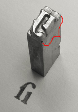
    Above is shown a piece of traditional metal type (photo courtesy Daniel Ullrich, licensed under Creative Commons Attribution Share-​Alike 3.0). The added red bracket shows the body height, which one would measure to determine the type size.

    In metal type, without leading, the distance from the baseline of one line to the next would be the same as the point size. However as you can see in the example, once the metal type was printed, there was no direct means of knowing what the original point size had been, unless one also knows either the original typeface or the amount of leading used with some certainty.

    Today’s Answer & Implications

    In digital type, the font’s letters are drawn on a grid, where an arbitrary number of units (often 1000 or 2048) are set to equal the “em” which is then scaled to the current point size for output. So to get 12 point type in print, with a 2048-​unit em, that digital space is scaled so that the 2048 units in the design space are equal to 12 points. As Karsten Luëcke put it in a recent discussion on Typophile:

    In digital type, the EM does not refer to a “real” box. You better consider the EM as a yardstick – an abstract letter-​height yardstick which establishes a link between micro and macro level, between font-​internal unit system and font-​external unit system: The font-​internal unit system is defined via UPM, i.e. as the number of units per EM. It is the letter-​design grid or resolution. The font-​external unit system may be typographic point, millimeter, pixel, etc. And this abstract EM serves to project the font-​internal unit system onto the font-​external unit system.

    An example. You have a font with 2048 units per EM, internally, which is to be projected on 12 pt type size, externally. So 12 pts = 2048 M-​units or 1 M-​unit = 12/​2048 pt.

    So to image the font at 12 point, one scales the abstract EM to equal 12 points.

    The catch for purposes of measurement and standardization is that while there are some restrictions on how large one can draw letters in the design space, there is no necessary and required relationship between the size of the letters and the em. On average, with Latin-​based languages such as English, the “cap height” of capital letters is about 70% of the point size, and the “x-​height” of lower-​case letters is about 70% of the cap height, or about half the point size. But (and I cannot stress this enough), those are only averages, and there is no technical requirement whatsoever that one be close to those averages. Indeed, x-​height relative to cap height is one of the ways typographers describe typefaces (“high x-​height” vs “low x-height”).

    [UPDATE : I did some research for a client, and verified that as expected, cap size varies substantially between different fonts. In my sample, cap size was most usually 62%-78% of the em square, averaging right around 67-​70%. Or to put it another way, if you take an “average” font printed at a given point size, other fonts at the same point size will commonly have capitals as much as 10% smaller or 10% larger than the capitals from the average font. At the extreme you can find fonts “in the wild” with caps barely over half the average size! (I expect you could also find fonts with caps close to half again the average size, but I wasn’t looking so hard in that direction.)]

    Moreover, the Zapfino example given earlier shows how a given font could be at a radically different size relative to the point size and still be a legitimate font. Indeed, anyone knowledgeable in modifying fonts could in a matter of minutes, take almost any font and create a modified version, with the only visible difference being that text at a given point size is only a fraction of the size.

    What About the Web?

    The web can use points, but just defines them in terms of pixels. It has inherited the Windows definition of that ratio, so on the web by default 1 pt = 4/​3 pixels, so 12 pt = 16 pixels (but see below).

    It used to be that Mac browsers used the Mac relationship of points to pixels, which was one-​to-​one, but that has been abandoned just a few years ago. so at least points vs screen pixels are now consistent across platforms, though how big a point is on screen (or a nominal browser pixel for that matter) depends on your screen resolution, what zoom level your browser happens to be set to at the moment, and (on Windows) whether you have set something other than the default screen resolution of 96dpi.

    But the relationship between pixels and points is broken in some browsers on Windows (such as Internet Explorer 7 and earlier) when the user has a non-​standard resolution set. For example, if you actively tell Windows your screen resolution is 120 dpi instead of 96 dpi, that means that point sizes get multiplied by 5/​4, but sizes in pixels do not. So at 120 dpi, a font set to 9 pt will instead show up at 15 px, but a font set to 12 px will still be 12 px, and now smaller. Arguably this is a reason never to do font sizes in px. (Bitmapped grapics generally are not scaled by the 5/​4 ratio in browsers, but they are in other apps such as Word or the usual graphics previewing programs.)

    This may get even less standard in the future, as CSS 3 is threatening to make pixels a truly imaginary thing, always equal to 4/​3 the point size. This would cause pixels to scale into virtual pixels when non-​standard resolutions are set.

    Of course, some users (like me) are constantly changing the zoom level in their browsers, which also plays hob with any notion of fixed sizes for points, though at least relative sizes are maintained by browser zoom.

    Things get kinda weird on the web, in another regard. CSS can use “ems” as a measurement unit. Okay, that makes sense, right? I mean, why not set an indent or margin in ems? No problem. Where it gets weird is that you can set the type size in ems. Now, logically based on the “normal” definition of the em, this makes no sense, because the size of an em is always the same as the type size, so the size of the type is always one em. But CSS allows you to break that assumption by setting an em to some specific number of points or pixels, and then setting the type size to some multiple of that. It gets even weirder, actually, because you don’t need to define the em in the first place. If you don’t define it, the standard browser assumption is that one em = 16 pixels (Firefox and possibly Chrome), or 12 points (Internet Explorer). The difference between IE and the rest doesn’t matter with default Windows resolutions, but it gets interesting at non-​standard Windows resolutions because IE then scales the default em, while Firefox does not…. Ouch.

    [Note: edited and expanded this section several times on 21 March 2011 to better reflect system scaling setting issues. Thanks to Beat Stamm for pointing out the omission and helping me with details I hadn’t yet encountered.]

    How to Legislate Type Size Today?

    First, a disclaimer: One can implement reasonable precautions, but it’s not possible to stop determined people with sufficient knowledge of fonts and typography from creating customized fonts, which can in turn be used to create either illegible documents, or disclaimers that most people would never read. To even attempt to cover all possibiities would probably yield many pages of added law, which frankly somebody like me could probably still find a loophole in with a moderate investment of time and thought. What reasonably can be done, however, is to make the laws tight enough that it would take significantly more expertise, creativity and effort to work around them than is currently the case.

    So what variables does the law need to control when it wants to legislate a minimum size and legibility?

    • Instead of (or even in addition to) declaring a minimum point size, one could declare both a minimum cap height (defining that as the height of the smallest of the capital letters A-​Z), and a minimum x-​height (defining that as the height of the smallest of the lowercase letters a-​z), both in physical units. For example, one could require a cap height of at least 7 points and an x-​height of at least 5 points, which would be met by 12 point type in most everyday text typefaces.
    • As evidenced by the case described above from San Diego, adequate width also needs to be legislated. You don’t have to be a font geek to go out and license an ultracondensed font. One way of avoiding this would be to say that the total advance width of the letters a-​z and A-​Z, at the chosen font and size, meet some minimum. Times set at 12 pts clocks in at roughly 208 pts for A-​Z and 143 pts for a-​z. After checking many other fonts, I believe one could go with minimums of perhaps 162 pts (2.25”) wide for A-​Z and 120 pts (1 2/​3”) for a-​z as minimums.
    • I probably ought to add something on stroke thickness as well. However, given that stroke thickness varies within a font, and differs between horizontal and vertical strokes as well, the best way to cover this is not obvious. The desire would be to avoid extra light (or ultra bold) fonts. I wouldn’t feel too sad if it also outlawed typefaces such as Bodoni for legal documents, due to their very thin horizontals. Hmmm.

    Most common system fonts a reasonable person would think of using would mee these requirements, including Times/​Times New Roman, Arial, Helvetica, Courier/​Courier New, Verdana, Trebuchet, Georgia, Calibri, Consolas, Constantia, and Corbel.

    Of course, I’ve only addressed the font size part of the equation. There are many other components to legibility of text in print, such as line spacing, letter and word spacing, line length, and the color of the text and the paper.

    [EDITED various times to clarify minor points and improve wording. Most recently to correct that Zapfino was rescaled by 2.5x, not 4x, and replace a dead link.]

    ADDENDUM 16 August 2012:

    This stuff just doesn’t go away! A recent decision of the Michigan Supreme Court hinged on exactly this issue. The underlying subject matter was the hottest state political issue of recent years, an attempt to put in place a ballot measure that would in effect stop the ongoing removals of collective bargaining rights for folks doing business with cities. Here’s the Detroit Free Press about the case, and the actual court decision (including concurring and dissenting opinions).

  • Build graphs with a font: Chartwell!

    Fellow Portland type designer and all around good guy Travis Kochel has released the most amazing new font which acts as a graph/​chart builder: Chartwell. This really pushes the bounds of what you can do in OpenType in some amazing new ways! You have to check this out or you will certainly not imagine what has been accomplished here.

  • Type Tuesday in Portland, Oregon

    Effective immediately (that is, starting tomorrow!), on the first Tuesday of each month at 7:00 pm, I invite Portland typophiles to congregate. This is in the spirit of the monthly first Tuesday get-​togethers held in Seattle. This is a chance to socialize, meet fellow type fans, and have a beer, a meal or a snack.

    The first monthly Type Tuesday will be at Horse Brass Pub, which is an English style neighborhood pub in SE Portland. We may rotate through other locations, depending on the general will.

    4534 SE Belmont St
    Portland, OR 97215
    (503) 232-2202

    Next month we might postpone to the second Tuesday. Watch this space. Or contact me to be on a mailing list for future Portland Type Tuesday announcements. You can reach me by email as tphinney at the cal.berkeley.edu domain (they do free email for alumni).

    I look somewhat like this:
    Thomas in Green Hat

  • Winners, losers and fonts in the eBook revolution

    A couple of weeks ago I bought a Kindle, Amazon’s dedicated eBook reader device. This enabled me to carry a whole bunch of reading around with me in a compact form and way less than a pound of weight. This has been a great convenience, because I have been taking the bus to and from work since moving to a new house recently (though I miss the convertible), and I’ve been traveling a lot and like to read on the plane, such as on a recent press tour I did in my day job at Extensis (Portland > Minneapolis > Denver > SF Bay Area > Portland).

    I love many things about books as artifacts: the variety in their appearances/​layout/​typography, the smell of paper and ink, and the refined look of printed type. Yet I am quite certain that within a decade, the majority of what was once print publishing will be electronic (some estimates are as high as 75% by then). The advantages and economics are just too compelling… although of course physical books have their advantages as well.

    My interest was initially sparked because, like web fonts, eBooks are a growth area for fonts and typography, while the traditional print usage continues its inexorable slow decline. It’s clear now that after years of false starts, eBooks are finally taking off. Amazon says they’ve sold 40% more eBooks than hardcovers over the last three months, and in the past month it’s been 80% more eBooks than hardcovers.

    Now of course, that’s hardcovers and not paperbacks, and that’s units and not dollars. (Some books in the Kindle top 10 non-​free list cost as little as $1.16.) If one looks at the data from the Association of American Publishers, which includes all retailers and not just Amazon, it seems in the month of May, eBooks were more like 4.4% of all book sales in the USA. or for “trade books” 8.5% year-​to-​date, up from 2.9% fir the same period last year. (The AAP figures are based on dollars, not units, by the way.) That may not sound like much, but factoring in the growth rate, we’re looking at the beginning of the explosion. eBook market share of all books three years ago, rounded to the nearest whole percent, was zero.

    In that same time the price of eBook devices has plummeted. The original Kindle was $399 when it came out in November 2008. Now the third-​gen Kindle, announced July 28, is to come out in late August for $139 (wi-​fi only) or $189 (3G and wi-​fi). Many of these prices are set in response to similar pricing/​drops on the price of Barnes & Nobles’ “Nook” eBook reader. Then there’s the Borders/​Chapters Kobo, Sony’s Reader, and perhaps most importantly the iPad…. Even if prices don’t drop for Christmas, you could see a lot of these things under the tree for Christmas. Next year? I’m thinking in 2011 you could easily see, in terms of US sales in dollars, 20% of trade books and 10% of all books in general being eBooks. Maybe more.

    Given the usual topics of this blog, I would be remiss not to comment on eBook fonts and typography. Generally, I’m impressed with the current crop of eBook devices in their display and font choices. All the dedicated eBook devices (but not the iPad) use eInk tech for screen display, which is currently limited to B&W (plus greyscale), but has the advantage of using a lot less power than LCD or even LED, and not requiring any power to maintain an image on the screen. It’s also reflective rather than transmissive, making it more “paper-​like” and meaning the screen doesn’t wash out in bright sunlight, though you’ll need a night light to read in bed

    On the font side, slab serifs are in, with the occasional sans or Dutch-​English oldstyle. Apparently the new Kindle has the same PMN Caecilia typeface (slab) as the previous editions, and adds a condensed version of Caecilia, and an unspecified sans serif option. The Nook uses Amasis (a slab), Helvetica Neue (sans, and a horrid choice for on screen legibility), and “Light Classic” (serif). Sony’s Reader uses Dutch 801 (a Times knock-​off) as the default, with Courier and Swiss 701 (a Helvetica knockoff, again an awful choice) as options. Apple’s iBooks on the iPad offer a bunch of serif faces (Baskerville, Cochin, Georgia, Palatino and Times New Roman) and one sans (Verdana). Kobo offers Baskerville Georgia, Verdana and Trebuchet. With all these devices there are a bunch of complications around whether font embedding is respected (mostly not, unless it’s a PDF) and such, but that’s probably for another post. See also here for font support details.

    Many of the eBook reader devices have limited language support, often just for western European languages. The newly-​announced Kindle’s bundled fonts are a dramatic improvement in this area. Now they have Latin, Greek, Cyrillic, Chinese (simplified and traditional), Japanese and Korean. Given the rest, I’ll bet the Latin is extended Latin that covers central/​eastern Europe, Baltic languages, the Balkans, Turkey, etc. One can reasonably expect competitors to take similar steps, of course.

    One thing that fascinates me about the eBook revolution besides fonts is the economics of it. One thing most people focus on is “which device will win?” What’s interesting is that the e-​stores and devices are not always tightly tethered to each other. The eBooks I buy via Amazon for the Kindle, I can access via Kindle software on either my iPhone, the just-​acquired iPad from work, my home Windows laptop, or my work Mac laptop—and other devices I don’t even have around. Same thing goes for the Nook, by the way (B&N is currently rebranding its eReader apps to share the same name as their hardware device, like Amazon has been doing for a while.)

    Side note: I have surprised myself on several fronts with my own preferences in reading eBooks. I thought I’d like the Kindle DX (the oversize model) better than the base model, but the opposite is true: I didn’t find any real advantage of bigger pages in reading mostly fiction, and the lighter weight of the base model (240 to 290 g, 8 to 10 oz.) was quite important to me. The iPad is heavier (a pound and a half, or 680 to 730 g) even than the Kindle DX (540 g, 19 oz) though of course far more versatile… so it’s further from my ideal reading device. I was particularly shocked to discover that, if I was already half-​way through a Kindle book and into it, I didn’t find it problematic to read it on the iPhone, either! I would have thought the tiny iPhone screen would have made that unpleasant. Clearly the big screens will be helpful for more highly structured content, such as textbooks and some kinds of reference works, but I think the dedicated eReader device folks got the size/​weight tradeoffs about right in their standard models.

    Anyway, with all these different delivery vehicles for a single eBook store, it’s possible that either Kindle or Nook eBooks could be dominant without the same being true of their corresponding hardware. I wonder if Apple’s iBooks will do the same, allow other devices to run the software? I expect they’ll do it like iTunes, and restrict it to Apple devices, plus full-​blown computers (Macs and PCs).

    The companies who I expect to lose out in all this are publishers and authors’ agents. Not for all kinds of books, and not at all levels of the industry, and not eliminated completely. But for your basic fiction novel, these entities may sometimes be “disintermediated,” cut out of the middle.

    In fonts, we see this with MyFonts.com, where the server is a giant aggregator. The folks who make fonts can directly put their fonts on MyFonts, and take a big slice of the revenue, while 95% of the process of getting the fonts up there is automated. There are some advantages to folks banding together as a foundry, because of collaborative work, specialization of font production tasks (including testing), and marketing. But they no longer have to, or they can do so without handling distribution and marketing.

    There are similar advantages to having an agent and/​or getting your book in with a print publisher—most notably the potential for physical publication, which will still be where most of the money is for a few more years. Some authors also benefit immensely from having a relationship with an editor to help refine their books.

    But eBooks reduce the friction in the system and grease the way from author to reader. So last week we saw mega-​agent Andrew Wylie eliminate the publisher entirely for a bunch of classic novels, cutting an exclusive eBook deal with Amazon under his new agent-​owned imprint, “Odyssey Editions.” Publishers such as Random House are freaking out, and understandably so.

    Yet there’s nothing stopping the authors from bypassing the agents as well. It’s just a matter of time until folks like Amazon set up a route for authors to self-​publish eBooks… nope, wait, I just checked and to my lack of surprise, they already have, and they offer royalties of 35% or 75%. I am not sure whether publishers or agents will go away entirely, because they can in fact add value. But I am sure that some authors will bypass them in favor of a more direct route to the reader, with a better percentage of the revenue pie.

    [Small update on writers cutting out publishers, from the authors of Draculas.]


    That’s the future for books and fonts both. Aggregators like Apple and Amazon for books, MyFonts for desktop fonts, or (my own employer’s) WebINK for web fonts are the only thing really needed besides the creators. Yet just as we see many surviving vendors for fonts even in today’s all-​digital era (as in, few people buy fonts on disk today, unless it’s a huge collection), I expect we will continue to see several major vendors for eBooks as well. Somebody with an iPad might have iBooks, Kindle and Nook apps all running on one device, allowing them to access even the content that is exclusive to one or another e-​store. Similarly, even if the market settles out at some point, there’s room for multiple major vendors of eBook reading devices.

    And… what about the consumers of books in all this? Sure, we can be sad about the loss of book-​as-​artifact. But for mass-​market paperbacks, the artifacts were not that exciting, and relatively undifferentiated in appearance, beyond the cover. There are some advantages to print, but not enough to stop the rise of eBooks: consumers will find the advantages compelling and will vote with their money. Freedom from the costs of printing (whether economies of scale or the higher unit costs of one-​off print-​on-​demand) will cause a huge explosion in the number of different works available. I know some folks writing hyper-​specialized academic works with huge page counts and short print runs, which cost hundreds of dollars for a single copy today. That can now change. Similarly, books out of print for decades or centuries have come back in print as eBooks.

    It is a great time to be somebody who enjoys reading.

  • Hypatia Sans typeface finally shipping

    As many folks in the font biz already know, a while back I designed a typeface called Hypatia Sans. The upright faces were made available as a registration incentive for Adobe Creative Suite 3, but the typeface wasn’t available at retail, awaiting the completion of italics to go with it. Three years (!) later, the italics are finally available, and Adobe has released the typeface as a regular retail item. The italics in particular are available at a heavy discount, for those who already have the upright faces as part of CS3 (something I had arranged when I was at Adobe, as I wanted there to be an inexpensive upgrade for existing users). The new version of Hypatia Sans also adds a few more characters, and corrects some minor bugs.

    Hypatia Sans poster style sample

    Hypatia Sans poster on Adobe’s site, click for high-​res PDF.

    All told, it took me five years part time to do the upright faces, and then a total of three years for first me and then Paul Hunt to finish the italics. Both Paul and I had considerable input from master type designer Robert Slimbach, and he and Miguel Sousa did the kerning of the upright faces when I ran out of time before the CS3 ship.

    You can read about the design process of the italics and get some idea of why it took so long from Adobe’s type blog, or go to the Adobe store to buy the typeface (links to the US store, international stores should have it soon):

    With the upright faces having been available for so long, it has already seen a fair bit of use, despite the lack of italics. Although I occasionally spot it myself, colleagues often send me examples of it in use. I’ve now seen it in plenty of documents, not only for headings, but even for body text in places ranging from a Sharper Image gadget catalog to $pread, a magazine by and for sex workers. I’ve seen it on business cards from graphic designers and in a visual identity for an architect. Besides those, here are a few of the other uses I’ve collected over the years (click on any one to get a bigger picture or go to a web site):

    Starbucks uses Hypatia Sans for the titling on the label of its House Blend coffee.
    photo of Starbucks House Blend package

    This Seattle garage door company uses Hypatia Sans… it’s not great typography, but their pickup truck was the first time I saw Hypatia Sans on a vehicle. (I drove by it several times over the course of a couple weeks before I stopped and took a picture. It was parked in between home and the hospital, and I was driving to the hospital every day for two months.)
    photo of truck with lettering on the side

    Here’s a more impressive vehicular use: a banner for the USS Pampanito, a WW2 submarine docked in San Francisco.
    photo of submarine at dock

    In the same city, the SF Asian Art Museum used Hypatia Sans to promote their exhibition of the art of Bhutan.
    photo of front of museum, displaying banner

    Finally, here are a couple of web sites that use Hypatia Sans. I was reminded of Mint.com in particular earlier this week when I saw their site used as an example in a talk at “An Event Apart” in Boston.

    Mint.com uses Hypatia Sans throughout. Their logo uses it as well, but customized with modified serifs.
    image of Mint.com web site

    This dental site is a more basic use:
    image of Valley Dentistry web site

  • Font Remix Tools (RMX) and Multiple Master Fonts in type design

    A little while back, Tim Ahrens asked me if I’d write a testimonial for his Font Remix Tools (“RMX Tools”), a set of plug-​ins for FontLab Studio 5. I was more than happy to share my thoughts:

    The Font Remix Tools are an essential toolkit for anyone who wants to develop sophisticated typefaces with much greater efficiency. I can’t imagine willingly working without them. Type designers owe it to themselves and their sanity to check out RMX Tools.” — Thomas Phinney, Senior Fonts Product Manager at Extensis, designer of Hypatia Sans Pro for Adobe

    (FontLab Studio is the primary type design application used by the overwhelming majority of professional type designers. FontForge and DTL FontTools (including FontMaster) are its fellow high-​end alternatives, while TypeTool and Fontographer are the primary low to mid-​range options.)

    Tim has a interesting/​useful demo version for free download, while the full version starts at €179 for one computer.

    I think of the Remix Tools as having two sets of functions. First are several very useful things that work with just about any typeface:

    • harmonize” curves: this takes the “lumpiness” out of malformed curves. Very cool, even for moderately experienced type designers, though the experts may not need it.
    • intelligent slant: slants glyphs while keeping vertical tangents straight. A useful step towards making italics, at least for sans serifs.
    • tabular figures from proportional with only a couple of clicks

    But the real power of RMX comes when you start with a font file that has a Multiple Master weight axis. Yeah, I know MM fonts are pretty nearly dead as a deliverable format for end users. Apple’s support for MMs is flaky enough that Extensis tech support has suggested Suitcase should warn people they won’t work reliably, and Windows has no reasonable native support (an ATM install can be hacked on Vista and probably Windows 7 to make them work well, or you can do manual registry entries for every single font).

    Yet Multiple Master fonts are still very useful as a font development tool, even if what gets delivered is a bunch of separate fonts. Although Adobe hasn’t shipped a new MM font since the 90s, virtually all their internally developed type families use MM technology, and many other typeface designers use it as well. If you start with a font that has master outlines for two different weights, RMX can incredibly easily:

    • create true condensed and extended versions (again, generally without distortion!)—or add a full “width” axis for infinite variation
    • tune the width, height and weight of single letters interactively
    • automatically generate small caps with the “right” weight and width (as determined by you, the designer, but with some very clever defaults)
    • generate superiors, inferiors, numerators and denominators similarly
    • make even better automatic tabular figures

    Most of these functions still seem like magic when I see them working. Most of it works insanely well almost all the time. Of course it still needs to be checked by humans, and there can be problems on occasion, but dang….

    What about Superpolator?

    Aside from the Font Remix Tools, another insanely powerful option for working with font development using the power of MM space is Superpolator from Just van Rossum and Erik van Blokland, a.k.a. LettError. It has always looked great, but back when I was doing a lot of type design, my main box for doing so was Windows based, and Superpolator is a Mac-​only tool, so I never really gave it a fair try. It’s available from €250.

    More on MM fonts:

  • Browser Choice vs Font Rendering

    This post by Jeffrey Zeldman on font rendering in web browsers is a good introduction to the subject in a number of respects, but unfortunately repeats a pernicious myth: that web browsers on Windows all render text differently, and that this interacts with the OS rendering. There are a couple of caveats (see below), but for the most part, this a this is a system level setting. On any given Windows computer running XP or Vista or Windows 7, you will generally get >pixel-​for-​pixel identical glyph rendering in Internet Explorer, Firefox, Chrome, or Safari. (As also shown in Si Daniels’ presentation at ATypI 2009 in Mexico City).

    Why is this? All of today’s major web browsers on Windows (IE, Firefox, Chrome, Safari) simply use the OS’s user-​adjustable GDI text rendering settings, whatever those may be. Similarly, all today’s major web browsers on Mac OS simply use the system text rendering.

    (Yes, there are a couple of caveats. Internet Explorer 7 actually ignores the OS setting in favor of its own prefs setting, which is to use the OSes ClearType rendering regardless. Safari for Windows has an optional setting to use Apple’s “Quartz” text rendering, even on Windows—this was the one-​and-​only rendering option in Safari 3 for Windows, but Windows users “freaked,” so Apple changed it for Safari 4 for Windows. Also, Firefox can use the kerning built into fonts, which affects spacing, though it doesn’t actually impact rendering of individual glyphs. Every major browser uses the same rendering as some version of OS rendering, however; none does something unrelated to Mac or Windows text rendering.)

    So why does rendering vary so much? Windows XP, Vista and Windows 7 can be set to one of three settings for “font smoothing” (a.k.a. anti-​aliasing). These settings affect all applications using the old-​school GDI APIs for text rendering, which as of late 2009 means all the major web browsers. The font smoothing settings are:

    • off (uncheck the box that says “use the following method to smooth the edges of screen fonts)
    • Standard (grayscale)
    • ClearType (optimization for color LCD screens)


    Note that the standard vs ClearType distinction only affects fonts with TrueType outlines. Fonts in PostScript Type 1 or OpenType CFF formats get a less sophisticated type rendering/​smoothing which, well, seems less than stellar these days.

    Standard” (grayscale anti-​aliasing) is the default on Windows XP, although installing Internet Explorer 8 will change that setting to “ClearType” (even if one then proceeds to use a different web browser). Windows Vista and Windows 7 default to ClearType. So, most folks on Windows are seeing ClearType rendering, one way or another. However, 

    Besides GDI (all of today’s browsers), there is a completely different rendering mode used by applications which are programmed to use the “DirectWrite” text APIs (similar rendering also available to the largely-​ignored WPF APIs). This uses ClearType, but a ClearType which is improved over the GDI version. For TrueType outlines, It offers moderate but noticeable improvements, such as options for improved spacing, and anti-​aliasing in the Y direction. OpenType CFF fonts see a truly dramatic improvement, going from really mediocre rendering under GDI to rendering roughly equally well with TrueType under DirectWrite (or under its predecessor, WPF)! Minion Pro and Myriad Pro in OpenType CFF render pretty well down to 9 pixels per em (ppem), and just fabulously at 12 or more.

    This is worth knowing and noting because it has already been announced that Internet Explorer 9 will use DirectWrite, and apparently FireFox is working on it as well.

    [Post updated 8 Jan 2010 to correct IE 7 having a built in pref for which OS rendering it uses. Thanks to commenters! – T]

  • Boing Boing Redesign Uncovers Web Font Ignorance

    People keep on sending me links to this article  “Boing Boing’s Redesign Uncovers Dark Side of Web Fonts,” about problems Boing Boing had with their new web font implementation. Only thing is, the article has a substantial dose of nonsense mixed in with the perfectly good analysis. I don’t blame the writer, though. This web font stuff is actually really complicated, and information has been hard to come by. Heck, I even briefly forgot a basic point in a first pass at this article. But nonetheless, I am fairly sure that Boing Boing could have fixed their problems easily, if they knew how. Here’s the story:

    WHAT HAPPENED

    The background here is that there are new ways of using fonts with web sites, and Boing Boing tried the simplest approach of just hosting a free font on their own web server and pointing at it, but the on-​screen results were not as good as expected.

    …the font it settled on — specifically BPreplay — ended up looking terrible for most users.”

    The result was hordes of angry Boing Boing fans complaining that the new headline font was “ugly,” “an abomination” and “plain nasty.” Of course, the culprit wasn’t really the font, but rather how different it looked depending on which browser and operating system the viewer was using.”


    FINDING THE CULPRIT?

    This is where things get tricky. I will update this post as I learn more. But, as best as I can tell, if that link to the font is right, and the font wasn’t modified by Boing Boing, the culprit really was in large part the font. But first let’s follow the trail of the previous article and make some corrections….

    The problem is that while modern browsers, like the latest versions of Safari, Firefox, Opera and Google Chrome, all support @font-face, the Windows XP operating system often doesn’t have anti-​aliasing turned on by default.”


    Not true. Anti-​aliasing is on by default in XP. What isn’t usually on by default in XP is ClearType, Microsoft’s enhanced anti-​aliasing for LCD screens. Sometimes a computer vendor will turn ClearType on for the computers they sell (particularly if they are laptops or come with an LCD monitor).

    But what makes this even less meaningful is that (again assuming the linked font is the right one), the font in question is in OpenType CFF format. Such fonts are always anti-​aliased in XP, even if you turn off anti-aliasing—the setting change only affects TrueType fonts. Even ClearType doesn’t affect how these fonts are rendered (rasterized) in web browsers, either. Same thing in Vista, and as far as I know in Windows 7 as well.

    The rule, which is still part of CSS3’s draft specification, is also not supported by any version of Internet Explorer. So, as cool as your font might look when properly anti-​aliased, on Windows XP it looks, as Rob Beschizza, head of Boing Boing’s redesign puts it, ‘like ass.’”


    I’m not sure how those two sentences are related. That’s a mystery to me. XP can get good anti-​aliasing as well as Vista, and Internet Explorer is bundled with Vista and Windows 7 as much as with XP. But even taking those points separately….

    The @font-face rule was actually in CSS 2 way back when, and removed in CSS 2.1. Internet Explorer has supported @font-face in every version from IE 4 to the current IE 8, but the catch is they support it only with Microsoft’s “.eot” font format (a wrapper around a TrueType font), not with regular desktop fonts. But there’s a good reason for not supporting regular desktop fonts directly: font vendors mostly won’t license their fonts to be stuck “naked” on web servers without any additional protections. Sure, there are free fonts, but, well, we’ll talk about those in a few minutes.

    If Boing Boing simply put up the naked .otf font file, and didn’t do anything for Internet Explorer users (and people running older versions of other browsers), then what font actually got displayed to those users would depend on what Boing Boing specified as the fallback fonts and whether the people actually had those fonts (and thanks to Ben Kiel for reminding me of this in passing). Now, if the fallback stack relied on fonts that most XP users would not have, but Vista users would, then there might be a difference that was at least partly based on operating system. But of course it would simply be up to the folks constructing the CSS for the web site to pick reasonable fallback fonts, and not really the fault of the operating system. Perhaps as a first-​level fallback from their desired font they specified one of the so-​called “ClearType fonts” such as Calibri or Corbel, which are bundled with Windows Vista and Office 2007. Not quite right to blame XP for not having the font, but that would explain how somebody could mislabel it as an XP-​specific problem.

    Other than that, whether you are using Windows XP or not has little to do with whether or not the font looks “like ass.” Turning on ClearType can further improve rendering for fonts with TrueType outlines, but would have no effect on this particular font. Being on Vista instead of XP would make no difference at all for any web browser rendering OpenType CFF fonts such as this one.

    Side note: The font wouldn’t even be seen in Internet Explorer, because Boing Boing didn’t use its .eot format as far as I know. Any further problems in IE would then be due to a poorly-​specified font fallback stack in the CSS. However, if they had used .eot and TrueType outlines…. Although XP has ClearType off by default, newer versions of Internet Explorer turn it on just for the browser, so there isn’t much difference between IE rendering of TrueType fonts between XP and Vista.

    In researching what went wrong, it doesn’t help that Boing Boing backed off from the font change part of their redesign, so we can’t look at it and test it. Looking at this screenshot, however, shows pretty clearly what was going on. This screen capture was definitely taken on Windows, and the font in question is still anti-​aliased. However, it has some pretty crappy artifacts in how it’s rendered on screen, at least some of which are related to it being unhinted. When I see things like a single pixel sticking out of the bottom of a round shaped letter, that’s a dead give-​away that the problem is likely hinting (or more accurately, lack thereof).

    Hinting” is essentially extra code in the font that improves its rendering at screen resolution. Apple’s rendering approach largely ignores hinting, but Microsoft’s rendering still uses it a fair bit. Passable hinting can be done automatically by font editing tools, so there’s no real excuse for leaving it out of a font (as with this one). In fact, pretty much every commercial font on the planet is hinted, as are most free fonts. But this isn’t even an average free font. Yes, the terrible spacing is pretty typical for free fonts, but being unhinted is uncommon. Maybe it was converted by somebody else.

    Bottom line: the font sucks. This should not be a surprise. Most free fonts do. Don’t get me wrong. There are a few great free fonts out there. But 98% of free fonts suck badly, and maybe about 20% of typically-​priced retail fonts suck badly, so set your expectations appropriately.

    THEDIRTY LITTLE SECRET

    But there’s another problem that might have led to complaints and concerns even if the font was made decently, but still in the same format. The “dirty little secret” of the font world is this: Windows GDI rendering of OpenType CFF and “PostScript” Type 1 fonts on screen just sucks, compared to its rendering of TrueType fonts.

    Typophiles have long ignored this fact, because in the environments they’ve cared about, Type 1 and OpenType CFF fonts render perfectly well on screen:

    • Just about any application on the Mac OS.
    • Adobe Acrobat, InDesign and Illustrator, on any platform.


    Unfortunately, Windows GDI rendering is what 90% of people see in web browsers and office applications today. (Yes, Safari for Windows also has the option to use its own rendering system, but that’s a tiny minority.) Internet Explorer sidesteps the problem simply by not supporting OpenType CFF fonts in .eot format, only TrueType (though one can convert). But it’s not like .eot ever caught on with web designers, anyway.

    The future could improve. There is much better OpenType CFF rendering, even applying ClearType, available for applications using Windows Presentation Foundation and  DirectWrite, but very few applications use these modes today, so it is sadly not very relevant… yet. My recollection is that the technical preview of Office 2010 for Windows has dramatically better rendering of OpenType CFF, so perhaps it is coming. Maybe Internet Explorer 9 will get there too, supporting both outline formats in .eot or some new web font format. Perhaps in five years decent support for OpenType CFF rasterization on screen will have reached the strong majority of web browsers….

    CONCLUSION

    So for me it’s a toss-​up as to whether I blame Windows GDI rendering, or the fact that Boing Boing used a crappy free font (BPreplay) because they couldn’t legally use the retail font they wanted to (VAG Rounded). My first take is that I think Windows GDI just made worse something that would have been a problem anyway. Somebody who knows what they’re doing could spend ten minutes and either fix the font’s hinting in BPreplay or convert it to the TrueType flavor of OpenType—if the license permits it, I’d be happy to try either for them. But then again, maybe the complaint is more about the fallback font, a factor easily controlled by the web site author.

    So yes there are some pitfalls. Obviously things would be better if one format worked across all browsers. But there’s also the question of whether one can use the fonts one wants, which tripped up the Boing Boing folks. What happens with that depends on what font vendors decide to do with the fonts they control the licensing for; many foundries are still trying to figure out how to approach the web fonts conundrum. Will they license fonts for use on web servers directly? Will they do so but specify security requirements that can’t be met by sticking regular desktop fonts on web servers, meaning that we’ll have to wait for new web font formats to be widely adopted, such as WOFF? Will they instead rely on a font serving process that involves something centralized, either run by themselves, or by a third party (such as TypeKit or Kernest)?

    How exactly this will play out is still TBD today. What I do know for certain is that within a few years, web fonts will be a reality for the average viewer and the average web site. Many or even most web sites will pick specific fonts that aren’t necessarily already on the viewing computer, and those fonts will get used to display the desired text. Font selection will become part of branding for the web the way it has been in print. We’ll also get an explosion of awful font choices on web sites, particularly small personal ones, much like when the masses first got access to a wide variety of fonts they could print on their home computers. But overall, it will be a Good Thing, and I relish the thought of a more typographically rich web world in a year or three.

    [Updated for minor clarifications 2009-​10-​12, reformatted 2009-​10-​13, added a bit on font fallback 2009-10-13]

  • Lifting the veil

    The press releases aren’t out yet, but at work we just came out with a Windows version of the Suitcase Fusion 2 font manager. The web site is live tonight and you can buy it or download it and try it for free for 30 days. All-​new Windows version jumps two versions to finally get feature parity with its Mac counterpart. This is one of the big projects I’ve focused on in the last few months at work. Sorry I’ve been so quiet lately… more soon.