Cristoforo Italics update »
Some screen shots and info on the font production process posted as an update on my Kickstarter page, including some thoughts on why ATF called it “American Italic” instead of “Columbus Italic,” the transition to standard type alignment around 1900, and illustrating good vs bad curves.
Conferences & Cristoforo »
Wow, it has just been a crazy time lately. I wrote most of this yesterday at 36,000 feet, on my way home from a quick tour of Europe for work: Barcelona, Paris, Hamburg and Munich. This included numerous customer meetings and three speaking engagements:

- Typo Week in Barcelona: I talked about some of my Font Detective work
- WebVisions Barcelona: CSS 3 OpenType support, the new web typography frontier
- Typographische Gesellschaft München (Munich): Fonts for eBooks
Now I have a break for a couple of weeks before my next conference, TypeCon in Milwaukee (Aug 1–5), where I’ll host a panel to talk about Kickstarter as a means of funding new type design. I’ll also be doing a talk on the same subject at ATypI in Hong Kong (October 11-15).
In the meantime, I have been hard at work in my off-hours on my Kickstarter-backed typeface, Cristoforo, with help from my fabulous intern, Andrea Harrison. The full details are available to my backers in an update on Kickstarter, but for public consumption, I’ll just say that work continues on the upright face, and has started on the italic, and I am predictably enough wishing that I hadn’t promised to add so much language coverage (central European, Greek, Cyrillic). But it’s coming along, and the extended language support offers some greater design challenges than just digitizing an old typeface.
My day job has kept me pretty busy, and has presented me with some one-sided decisions. Gee, I have exactly one day free in Paris: work on Cristoforo, or visit the Louvre? Okay, so I’m probably not going to collect a lot of sympathy votes here. But after spending less than 48 hours in each of Paris, Hamburg and Munich, then flying back to Portland, I am pretty beat.
Finally, I need to thank my backers for Cristoforo! Without them I would not have tackled the typeface, or would have done something much less ambitious and done it more slowly. Here is the backer listing (and yes, some of these are pseudonyms, it’s whatever they use on Kickstarter).
Cristoforo Backers »
As I’ve been posting about lately, Cristoforo is a family of three fonts I am developing, reviving Columbus & Columbus Initials (Ihlenberg, 1892) and American Italic and American Italic Initials (Ihlenberg, 1902) as well as adding a symbol font. I am the lead designer, with the assistance of my new intern, Andrea Harrison.
I funded the development of Cristoforo through a Kickstarter campaign, which raised over $10,000 from backers. Woot!
Current ETA on finished fonts? February 2013. However, limited pre-release versions will be available to appropriate levels of backers starting in mid-July.
Here are my awesome backers, in tiers by their level of support.
Elder Gods
Gerry Leonidas
“Hanover Fiste”
Laura Worthington
Lanny Maude
Michael Grzesina
Great Old Ones
Daphne Pfister
Andrew Leman
Adam Crossingham
Andy Watson
Harbs
Dorian Henao
Christian Mayland
Philip M. Payes
Sean Stewart
Mark Simonson
Eric Menninga
Greater Servitors
Steve Burnett
Owlglass
Shaun Huston
Robin Layfield
Alan Shutko
M Sean Molley
John Butler
Juris L. Purins
Ned Holbrook
John Bragg
Jens Kutilek
Ed Hurtley
Dean EngelHardt
Shaun Huston
Jens Kutilek
Unspeakable Horrors
H James Lucas
Rachael Stevens
Katherine Schroeder
anarch
Sarah E Canzoneri
Tom Orzechowski
Atarun
Alexander Y. Hawson, M.D.
jshallri
Adam Jury
Matt Goczalk
Eric Schild
Michael Mellinger
Genghis Kern
Tom Carlson
Josh Rensch
Justin Hernandez
Joerg Sterner
Kimlin
Emrys Hopkins
Jonathan Biddle
Bobn Gorski
trit
Bret Kramer
David Marshall
Melissa Bube
Christopher
Trampas Johnson
John Velonis
Alan Ackerman
Bruce
Jonathan Harnum
Brendan Sheehan
Val Lucas
Shelby Cinca
Solarom
Damon Loren Baker
Gene Breshears
Shabier Raffee
Battlefield Press, Inc.
James Hannum
Adrian Rector
Stephen Kick
Eric Havir
Trevor Stamper
Open Design
Marc Teppo
Ben Levy
Jim Ramsay
Luke Ovitz
Rick Ernst
Seth Godin
Reed Savory
Frédéric Gaudet
Skye
Steven Scherbinski
Ed Possing
Simon Rogers
Rob Kaughan
Filipe
Steve Huntsberry
Bugmaster
Christine Doyle
Gerald Saul
Raymond Michaud
Peter Miller
Fred Hicks / Evil Hat Productions
Brett Bozeman
Bryant Durrell
Mike
Mark Ho-Kane
Derek M. Koch
James Todd
Bill Walsh
chris
Mark L Pappin
Chris Huning
Michael Jacob
Dan Reynolds
Rod McDonald
Gerolf Nikolay
David Wolske
John Hawkinson
Galahad de Corbenic
Justin Unsworth
Rob Pinkerton
Tom Conder
Eric Nielsen
Terry McKelvey
David Occhino Design
Jean-Claude Tremblay
Randy
Chris Jarocha-Ernst
Jason Williams
Kate Eakman
Richard Kegler
Yukihiro Terada
Robert “Rev. Bob” Hood
Lesser Servitors
Zachstar2014
Jonathan Krell
Alex Kim
Torrain
Scott Dorward
Brien Croteau
Brian Schoner
Hans de Wolf
Jon Michaels
Andreas Welch
Jessica Kozaki
Benjamin Bangsberg
Gerald Kowarski
Blaine Horrocks
Rob
Knighthawk 2112
Angela Patel
Candace White
Thomas Taimre
Jeff
Darin DuMez
Antoine Bertier
Jed McClure
Stacey Van Keuren
Maika
Threemoons
Jon N
Rork
Haakon Sjursen
Tobias Svalås
Andrew Lee
James Allenspach
Akma
Rt Andrez Mora
“Rambo”
Curt Miyashiro
Elliott C. Bäck
Adam Hunter Peck
Munchezuma
Scott Morrison
THomas W. Holt Jr.
Dave Borne
David Barton
Nathan Clarenburg
Mike Hurd
Kathleen TInkel
arfunk
Candace Carpenter
Brian Moe
Micah Wright
rampantbicycle
Lila Symons
Gem Newman
Nikola Skopec
Brandon Holfeltz
Marcos Nogas
Phil Vance
Don Hosek
Eric Eslinger
Victor Hammersley
Dennis Wilkinson
Edward Iglesias
Jeremy Tavan
Adrian Rector
_Zed_
Christopher Harris
Jorg Rødsjø
Jeanette
AH
Mike Nutt
Mitchell Olson
Patrick Heagany
Sean Molley
Juan M. Escribano
Wayne A Arthurton
Brian Platt
Steph McW
Glenn Fleishmann
Laura
Ann Voelkel
Jesse Garrison
Michael Bowman
H. James Lucas
Raphael Solomon
Marty Barnett
Stephanie Schorr
Pablo Impallari
Dennis Kelley
Tieg Zaharia
Ernst Tedeschi
Dougal Campbell
Lorenz Thor
Halstead York
Ian Lovecraft
Richard Simon
Rebecca Evans
Byakhee
Ezra Claverie
Samuel Velasco
Daniel Steinbock
Lori
Ghouls
Missa
Justin Marsten
Michael Gerber
Steven Zeck
Alisha
Josh M
Caleb Stokes
Nicholas
Karen Babyak
Alex
Jenny Franck
Julian F
James Turnbull
Cristoforo $10K Promo: Free Dark Symbols Font »
With about 48 hours to go (midnight Sunday PDT), my Cristoforo font project on Kickstarter is at about $9,300 in pledges from backers who want to get cool fonts and other swag. As $10,000 is my final “stretch” goal (the point at which I add Cyrillic support to the fonts), I was trying to decide how to both celebrate and encourage the last few pledges I need. I settled on releasing a free font that might be of interest to some H.P. Lovecraft / Cthulhu fans: Dark Symbols icons designed by Brennen Reece and Graham Walmsley, fontified by me, released at no charge under the Open Font License 1.1.
Download Dark Symbols font (Zip archive of .otf).
What are the Dark Symbols? Graham explains them on his blog, but basically these are rough-edged hand-drawn symbols, intended for folks to mark up Cthulhu-related role-playing adventures.
I may also incorporate the Dark Symbols in my Cristoforo Symbols font; that’s TBD. But in any case, enjoy this free font, and consider supporting Cristoforo in its waning hours on Kickstarter!
Columbus typeface sightings, intern, Kickstarter »
My Kickstarter campaign for the Cristoforo typeface has passed half its $6400 target in the first week, with 16 days to go! That’s fabulous.
I will be making my intern decision no later than Sunday! I’ve been holding interviews, and I’ve only had a handful of serious applicants, but they have including some really awesome people. I’m still open to hearing from more people before I make my final decision, but I have at least a couple of great candidates. The absolute drop-dead deadline is tomorrow (Sat June 2) at 2 pm PST. Anybody else who applies at this point needs to be local or able to come out here, open to part-time internship, and ready to send me stuff right away to support their application, and to interview with me on Sunday (preferably in person).
I keep on seeing versions of Columbus (the source for Cristoforo) in interesting places. I was sitting having a coffee with one of my intern applicants in downtown Portland just this past Tuesday, next door to Portland landmark Voodoo Doughnuts, and realized that they use a hand-lettered version of Columbus for their slogan, “Good things come in pink boxes,” seen here on one of said boxes:
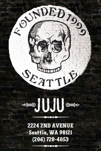
I’ve also in recent months seen it on the logo for Juju, a bar in downtown Seattle:
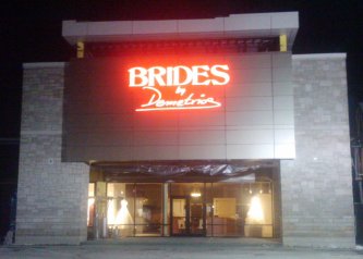
… and for the signage and logo of Brides by Demetrios, a wedding dress and bridal chain. I saw it in the upscale Buckhead suburb of Atlanta, but they have stores all over.
I believe the picture above is their Indianapolis location, but the Atlanta/Buckhead one had the same neon sign. I just couldn’t get a good picture of it with my cell phone at night.
Cristoforo: looking for American Italic »
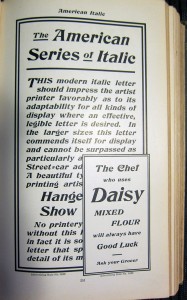
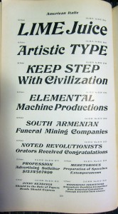
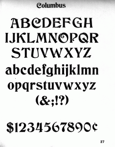
As mentioned previously, I’m working on a revival of the Hermann Ihlenburg typeface Columbus (1892, MacKellar, Smiths & Jordan / American Type Founders), under the name Cristoforo. But now I’m looking for samples of its differently-named italic companion, American Italic (Hermann Ihlenburg, American Type Founders, 1902). I have two from the ATF 1906 specimen book, shown at right. But neither shows a complete character set at a reasonable size. If anyone has the actual metal typeface, especially in a medium to large size, I would love to get a full specimen. Or, if you have a printed sample showing all or most characters at a largish size, that would also be great!
[Update April 21/22: Just got some great pics from Jackson Cavanaugh (Okay Type), showing the relevant pages from the ATF 1899, 1900, and 1903 specimen books! Amelia Hugill-Fontanel at the Cary Library is also digging into it. I am still thinking about scans, but the pics are a fab start. I am already in good shape for Columbus Initials, the swash caps font. I’d love to hear from anybody who has metal type for any of these faces!]
I’m already in decent shape for a sample of the upright version of Columbus, unless it turns out the full typeface has more characters?
Click on any image for a larger version.
Watch this space for news on the related Kickstarter campaign coming in a few days! Get in touch if you would like a sneak preview. [UPDATE 23 April 2012: I am now funding development of this typeface on Kickstarter! Deadline is May 19.]
Cristoforo: Reviving Columbus and font quality »
Many years ago, the very first digital font I ever worked on was a version of Hermann Ihlenburg‘s 1892 typeface Columbus, for American Type Founders. I had an interest in it because it was used in the logotype for the Call of Cthulhu roleplaying game, which I had long enjoyed. I never did anything serious with it, both because I did my revival by eye without benefit of scans or good quality originals, and because I didn’t know what I was doing back then. [UPDATE: I funded this typeface on Kickstarter in mid-2012! As of Feb 2013 backers have received pre-release versions of the regular and italic, but they are not “done.”]
Ihlenburg is pretty darn obscure, btw. He had the misfortune to be prolific back in the late 19th century, when type designers got very little recognition, and typefaces were just starting to be given unique names. The main available info about him is in a 1993 article David Pankow wrote about Ihlenburg for the American Printing History Association’s journal, on the occasion of an archive of Ihlenberg material being assimilated by the Cary library at RIT (Pankow was then curator of the Cary, and editor of the APHA journal).
Fast forward almost 20 years to 2010-11. While unpacking some boxes, I ran into some photocopies I had made of some good quality type specimens of Columbus, from early ATF specimen books. This was handy, because the earliest ATF book I have is about 1906, and the design had already been dropped by then. A quick search online verified that nobody had done a decent digital version yet. There’s a free version called by its original name, Columbus, by a fellow named Sam Wang, and an $18 commercial font called Beaumarchais from Scriptorium that is particularly awful, worse then the free font. Each has about 100 glyphs.
So I’ve been working on and off on doing a better version from digitized scans. It’s not “done” exactly, but it is already a whole lot better than either of the other versions currently available. I’m still tuning spacing and additional glyphs. I plan about 260 total glyphs, of which about 106 are in good shape right now, including alternate swash caps, which were not done in the previous digital revivals. I am using my old typeface as a placeholder and replacing glyphs as I fix them up.
I did a little bit of work on this font during the type busking at TypeCon New Orleans, and got some good feedback on the eszett and the spacing while I was there (thanks to Gary Munch et al).
I can’t call it Columbus, however: ATF’s trademark lapsed, and Monotype trademarked the same name for a 1992 Patricia Saunders typeface (celebrating the 500th anniversary of Columbus’ famous arrival, while Ihlenburg’s typeface was so named for the 400th anniversary). My previous attempt had for a while been called “Columbine” but that has taken some unfortunate connotations, so for now I’m calling it “Cristoforo,” after the sailor’s first name.
I’m still not sure what I’ll do with it. For now I am licensing it on special one-off terms to a very small handful of companies doing material related to the Call of Cthulhu roleplaying game. Maybe I’ll do a commercial release at some point, who knows?
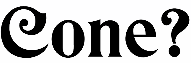
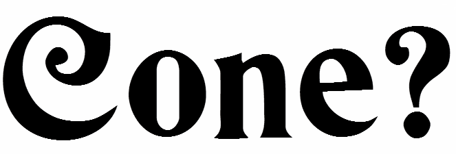
Here are samples of my work-in-progress and its nominal competitors. I’ll leave telling which is which as an exercise for the viewer—make your guess before you hover your cursor over the images, or read the comments.

 Thomas “my other car is a sans serif” Phinney on fonts, typography & text. Geeky troubleshooting and info for font developers and users. Consulting & expert witness for fonts & typography.
 0
-
0
- 

