Phinney on Fonts About Thomas & the blog Phinney on Fonts main page

Picture of ThomasThomas “my other car is a sans serif” Phinney on fonts, typography & text. Geeky troubleshooting and info for font developers and users. Consulting & expert witness for fonts & typography.Read more...


« Wired mag off-​base on Roboto typeface

Wired magazine’s puff-​piece on Google’s Roboto typeface revisions is really bothering me. I thought if I held off, I could just do a few sarcastic tweets and be done with it, but no.

I am not a huge Roboto-​hater like some folks in the type community. I just object to uncritically publishing quotes that make blatantly false statements.

UIs [user interfaces] are crafted from images and type,” Matias Duarte, Android’s head of design tells WIRED. “But the idea of having a typeface that’s thought out as a UI typeface—that’s not been done before.”

Well, that’s pretty much simply false. (UPDATE: Duarte says he thinks he was misquoted, basically he was trying to just say UI typefaces are hard, and Roboto had a particular challenge in needing to work in a wide range of contexts and types of devices.)

[Perhaps not Duarte, but apparently the Wired author was] unfamiliar both with an obscure operating system called “Windows” and its typefaces Segoe UI (introduced in Windows 7) and Tahoma (introduced in Windows 95), both of which were specifically designed/​intended for UI usage. Not to mention Chicago, developed for the original Mac OS back in 1984. (UPDATE: Plus, there is Prelude, designed by David Berlow and Font Bureau as a UI typeface for the Palm Pre operating system—when Duarte himself was in charge of UI for the Pre. Not to mention Android’s own Droid Sans, also designed as a UI typeface.)

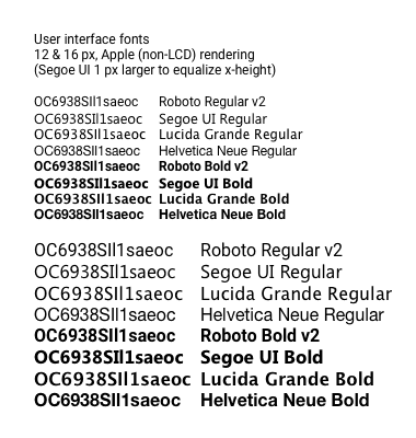
A slightly weaker argument could be made for Lucida Grande (the Mac OS X UI font), which is only slightly tweaked from Lucida Sans. Of course, Lucida Sans itself was specifically designed for low-​res screens and the like. Designer Chuck Bigelow got a MacArthur “Genius” award for his work on the family.

There are seven substantial paragraphs to the article, but both the people quoted are on the Android team. Thus it avoids mentioning the most famous thing anybody has said about Roboto, ever: Stephen “Stewf” Coles calling it a “four-​headed Frankenfont” in a strong attack on the design philosophy behind it.

This is also why there is so much puffery throughout the article emphasizing how the typeface is designed for performance rather than aesthetics. Such choices do certainly explain most of the changes from v1 to v2 of Roboto, but “performance over aesthetics” is clearly false as a general proposition about the typeface. My big problem with Roboto is that the choice of closed counterforms for many letters and numbers (35CGSacs) is an inherently anti-​legibility choice. Yes, they had more of these before the revision, and some (5) have been slightly improved, but they need to finish the process of transforming it into a different typeface if they want it to be an outstanding UI typeface.

Roboto compared to other UI fonts

Indeed, I would argue that such closed shapes are stupid bordering on criminal in a user interface typeface. There is a reason that most other typefaces specifically designed for user interfaces have used open counters, and that is because there is massive evidence that tells us these shapes are more legible (see for example the research cited in Sofie Beier’s book on the subject). Legibility should be a the paramount concern for a user interface typeface.

Roboto designer Christian Robertson explains the mix of open and closed shapes as saying that they create an appealing texture in body text. Which is lovely and all, but in a user inferface, that is not as important as legibility.

That said, to be fair, Apple is doing a much worse thing in choosing Helvetica Neue as their UI typeface, first for iOS and soon for the next version of OS X. They too have gone to lengths to declare publicly how they are optimizing it for legibility, which is rather like trying to polish a turd. Helvetica is inherently anti-​legibility. The only way to make it otherwise would be to change it so much that it doesn’t look like Helvetica any more. Sadly, that is not what Apple is doing. (Update: Apple later changed to San Francisco, which has the same “modern” look as Helvetica, but with just slightly more open counters… rather like Roboto in that regard.)

Aside from the business of being first with a dedicated custom UI font, if Google and Apple were to explain that they are making their UI font choices for design reasons, that’s fine. But when they (or Wired) start touting the awesome legibility and functionality of their choices, I have to call them out on it. Nonsense.

19 commentsto “Wired mag off-​base on Roboto typeface”

  • July 26, 2014
    Gerry K wrote

    Well said, Thomas. To my eyes, Android’s first UI font, Droid Sans, has the open shapes you are calling for. I don’t know why Google didn’t stick with Droid Sans or one of its descendants, Noto Sans or the aptly named Open Sans.

  • July 26, 2014
    Steve Brown wrote

    Superbly argued Thomas!

  • July 26, 2014
    Leo wrote

    Agreed – it’s refreshing to read some relevant and honest comment on this UI typeface after all the naive hype

  • July 27, 2014
    Espiekermann wrote

    One could also mention our Fira which was designed for small screens first.

  • July 27, 2014
    Chris Warrick wrote

    Why not use the new Segoe UI (from Windows 8) for the comparison?

  • July 27, 2014
    Max Dunn wrote

    Very well put, it is highly ironic these companies would pass themselves off as innovators when they can barely seem to maintain parity with what what was done before. I agree Apple is the one that went off the deep end: their latest UIs make their devices significantly less usable.

  • July 29, 2014
    Goran wrote

    I think Apple is going Helvetica because pretty soon all of their displays (inclusion iMac and Thunderbolt) will be retina. And Helve on retina looks as if it is printed on paper, so it is really legible. But, yes, Helve on low resolution displays is not readable all that we’ll.

  • July 29, 2014
    Thomas Phinney wrote

    Helvetica’s poor legibility is about the shapes and sizes (and viewing conditions) those shapes are seen at. Low resolution makes it worse, but high resolution does not fix the problem. Not even printed on paper.

  • July 29, 2014
    Wallace Harshaw wrote

    While I’ve softened my stance regarding Helvetica since the 80’s, (“I wish Helvetica would die”) when my only real experience with it was at sub-​laser resolutions, I’m terribly concerned with developments at Apple in this regard.

  • August 3, 2014
    Roger Black wrote

    The point about Roboto is that it is no more distinct from Helvetica than Ariel . . . or Helios. 

    And all this thin Helvetica we’re seeing is hard to read, whatever you call it

  • August 4, 2014
    Lun Esex wrote

    Also designed as a UI typeface is Espy Sans, for the Apple Newton, and later re-​used on the iPod Mini.

  • August 4, 2014
    Cognito wrote

    Going by this Twitter thread Duarte was misquoted/​editorialized: https://twitter.com/MatiasDuarte/status/491526407785545728

  • August 4, 2014
    Cliff Kuang wrote

    Thanks for the thoughtful response to that piece, Thomas. I’m not saying I necessarily agree with them–and I’m not saying I agree with Google, either. But I respect your perspective.

  • August 4, 2014
    Cliff Kuang wrote

    I will say also that I’m going to ask Matias if he misspoke on the quote you mention.

  • August 5, 2014
    Thomas Phinney wrote

    Yes, I saw the twitter thread last night on my way back to Portland from TypeCon. I have now updated my blog post based on what I read last night. I can tweak it further as needed.

  • August 5, 2014
    Aristotle Pagaltzis wrote

    They too have gone to lengths to declare publicly how they are optimizing it for legibility, which is rather like”

    Like… what now? Don’t be a tease. 🙂

  • August 5, 2014
    Thomas Phinney wrote

    Yeah, editing glitch. I needed a phrase but the one that came to mind was arguably sexist, and then I got distracted by other work. Sorry about that. Fixed now.

  • August 6, 2014
    Christopher Fahey wrote

    First, font “legibility” is often used as a way for font designers to contend that some fonts are empirically better than others without actually doing any testing or providing any actual evidence. Stating that a font has closed letterforms does not *at all* prove that the font is less legible than a font that has more open letterforms. Lithos has wide open apertures, does that prove it’s easier to read than Helvetica Neue?

    Second, font “legibility” is a reasonable thing to consider when deciding if your body copy should be in, say, Frutiger versus Papyrus. It is a broad spectrum, ranging from elaborate baroque fonts that take a few seconds to be able to read a single character, all the way to fonts whose legibility is so good that it practically cannot be improved on. 

    All of the fonts you are comparing Roboto to basically fall into that second category. They’re all very legible fonts (as long as the character spacing isn’t miscalibrated to make the letters actually touch each other, as it is in your Helvetica Neue examples!) 

    I’m just speculating, but I would guess (and I’ll admit I am guessing here) that if you did a reading speed and comprehension test, or if you did a usability test in an OS, comparing all of your example fonts, you would find that the best of them performed *infinitesimally* better than the worst of them. 

    In short, you’re right to call bullshit, but to call the choice of Roboto (Or Helvetica Neue) criminal for illegibility reasons seems pretty specious, too. All of these fonts are pretty legible. 

    Even the Beier book emphasizes that legibility is different in particular situations, and that you can’t make sweeping generalizations about them based on heuristic rules. Here’s some more research on the validity of citing “legibility” in font selection:
    http://alexpoole.info/blog/which-are-more-legible-serif-or-sans-serif-typefaces/

  • August 6, 2014
    Thomas Phinney wrote

    Thanks for the response, Christopher.

    as long as the character spacing isn’t miscalibrated to make the letters actually touch each other, as it is in your Helvetica Neue examples!”

    That was set in Photoshop using the default spacing built into the font. Yes, Helvetica is excessively tightly spaced. That said, Apple is likely playing with the spacing in their text engine to try to make it less awful at small sizes. The fact that it is so very necessary is just another reason they might have better just used a superior typeface in the first place.

    Stating that a font has closed letterforms does not *at all* prove that the font is less legible than a font that has more open letterforms. Lithos has wide open apertures, does that prove it’s easier to read than Helvetica Neue?”

    That is a reasonable point as far as it goes. I could make a more complex statement and say that between relatively normal and reasonably comparable sans serifs, or between relatively normal and reasonably comparable serif fonts, the open or closed aperture status of the letterforms is a major component of legibility. Or, “all other things being equal, more open counters are a major factor in legibility, and nearly closed counters are a major contributor to illegibility.”

    > I’m just speculating, but I would guess (and I’ll admit I am guessing here) that if you did a reading speed and comprehension test, or if you did a usability test in an OS, comparing all of your example fonts

    Yes, you’re guessing. Guess what, people are in fact doing these tests, and while not all the results are being shown in public, fonts like Helvetica don’t do as well on tiny screens at tiny sizes for this purpose. They are a lot worse.

    Part of the problem is that when you are talking mobile UI, you are talking about variable and sometimes just abominable reading conditions. The text is usually very small, 1/​2 or 2/​3 the visual-​arc-​size of body text on a big desktop screen. The text is often being read on an LCD under bright light outdoors. Sometimes in a moving or jittery vehicle. Sometimes at arms length because the device is mounted on the dash of your car (either built-​in or temporarily), or because you are glancing down at the thing in your lap while seated at dinner.

    I personally currently hit the issue of the confusability of numbers in Helvetica under iOS pretty nearly every week—daily when traveling and using my iPhone for navigation. During the period when I jailbroke my iPhone and substituted Myriad (for several months), the issue went away completely.

    So sure, if we were talking solely desktop UI and the two giant monitors in front of me right now, Helvetica would not be completely abysmal. But it would still be worse than the status quo, and I still see no great argument for why an OS vendor should deliberately make things worse.

Leave a comment