
 Thomas “my other car is a sans serif” Phinney on fonts, typography & text. Geeky troubleshooting and info for font developers and users. Consulting & expert witness for fonts & typography.
« Overlapping Paths in Type Design
 3
-
3
- One problem with releasing lots of pre-release builds to my Kickstarter backers is that I don’t test every single one as much as I otherwise would. Generally any errors are minor, but earlier today I managed a moderately important one: I didn’t remove overlapping paths in my outlines during the build process. Well, actually, I did remove overlap, but as I did not first decompose my composite glyphs, it didn’t fix most of the problem cases.
Why would you want to have overlapping paths in your glyph outlines, and why/when would it be a problem?
Here are several glyphs (as shown by H. James Lucas) that had overlapping paths in this last build:
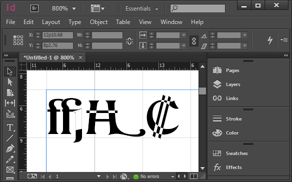
Overlapping paths rendering badly in Adobe InDesign
So, clearly it’s a problem if they render badly in some apps. Interestingly, this is dependent on not only what is doing the font rendering, but also what size the glyphs are rendered at. Adobe’s core rendering engine has three or four different rendering modes, and what it picks is size-dependent.
Overlapping paths are sort of okay in TrueType fonts—the rendering engines will deal with them better. But they will still produce bad results if a user does something like apply an outline or stroke to the text.
So why do I leave these things in while developing the font? Well, during development, it is useful to keep the basic elements separate, and only remove overlap later on. So for example, if I change the underlying swash H glyph, I want the Swash-H-with-bar to automatically pick that up. Similarly, the C shape seen in the colon currency symbol (used in Costa Rica and El Salvador) is shared between the Ghanaian cedi, the euro symbol, and a stylistic variant of the cap C. I used the same primitive elements in the ffj ligature in numerous other ligatures (including ffi). And so on.
Of course, as leaving overlaps in the final font causes problems, normally I take care of this as part of each build. My usual build sequence for creating OpenType OTF fonts from my FontLab file:
- Create a “next version” and make sure version string has been correctly incremented (in several places), including in the file name itself.
- With the current version of the file
- Remove all hinting (shift-F7 in FontLab Studio 5 for Mac)
- Select all glyphs in font (Cmd-A in FLS)
- Autohint all glyphs (F7 in FLS)
- Save file
- Then the following actions, done without saving the file again, to preserve original data in the FontLab file:
- Decompose all composite glyphs
- Remove overlap (Cmd-F10 in FLS)
- Export OTF font (Cmd-Opt-G in FLS) with correct version number in the file name
- Change license URL string to point at the personal license
- Export OTF font again with “-NC” (non-commercial) in the file name, in addition to the version number
- Close font without saving file
Anyhow, in this particular build I missed the “decompose” step, so all overlaps involving composite glyphs (most of them) still overlapping. Of course I have fixed this, and am sending revised fonts to my backers.


3 commentsto “Overlapping Paths in Type Design”
Interesting stuff. I didn’t know that the rendering mode changes with the font size.
Seems like this would be a good candidate for a Python script… 😉
Yes, I probably ought to use a script. Ben Kiel has one that is already close to what I need. I have been slow to do so just because I do builds infrequently; the time spent tweaking a script will actually be more than the time saved.
But, as this incident demonstrates, one of the advantages of a script is the reliability and repeatability of the process. So probably worth doing.
I’ve been working on the scripting solution. Of course, I have already put in more time than it will ever pay out, but nothing wrong with polishing my FontLab Python scripting skills, they will come in useful in the future. Plus, reliability is nice, as is the ability to generate a fresh build at the press of a button. (Not that I am quite there yet, scripting is ~ done, but I am having some minor issues with configuring RoboFab with FontLab and Python….)