[EDIT: I believe this is solved, though I won’t have time to reach 100% certainty until much later today. The current leading candidate is Swiss 721 Medium, horizontally squished, as demonstrated by Florian Hardwig.]
Sometimes even a font detective can use help. Particularly when running out of time….
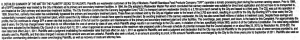
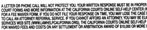
At the bottom of this post are some samples from a document, a legal notice printed as a classified ad.
Here are the rewards if you give me an ID by 6 pm Pacific time, Friday Feb 8, 2013. If you are the first to give me a definite read on what font is used in this document, I will pay you $200! If you are the first to give me the right lead without definitive proof (for example, you name a couple of typefaces, and I investigate and one of them is it) then I will give you $100. I can pay by PayPal or personal check.
Why a reward? Well, I’m getting paid for my time and effort in the case, so why not share that? Plus I hope to motivate some folks to assist. 🙂
Half the above reward is available for an ID after the above deadline, but before 6 pm Pacific time, Sunday Feb 10.
So what is the story here? Many of you have heard of my various “font detective” work; cases where I have been called on as a font expert to investigate the authenticity of a document or some typographic issue that drives a legal case. This is one of those cases.
Right now I am in the depths of two cases. The one I am writing about involves a document that is set in something like Helvetica Condensed (but not actually, of course). Although the actual issues in question are elsewhere, identifying the font would be an immensely helpful piece of the puzzle for me.
Looking carefully at the font, I have noted that it is a highly condensed sans serif, in the same general style as Helvetica Condensed. Part or all of that horizontal compression may have been achieved by means of simply squishing the type horizontally to fit more in. The letterforms have some distortion that is typical of that kind of artificial condensation.
Typefaces I have tested that did not seem to match: Helvetica, Helvetica Condensed, Helvetica Neue, Helvetica Neue Condensed, Swiss 721, Swiss 721 Condensed, Pragmatica, Pragmatica Condensed, Nimbus Sans, Nimbus Sans Condensed.
I have an entire document at 2400 dpi, but the file is huge. Several chunks are available here for download, and if you’re somebody I know/trust I will share the full document for you to download.
All files are in PNG format unless otherwise specified. The type is roughly 5.5 or 6 pt high, and the entire text block is about 6.5 inches wide (
 (High-res image clip of lowercase section, 4 MB)
 (High-res image clip of caps only section, 5 MB)
mystery ad text (RTF file of one paragraph of the ad, 3 KB)
mystery ad med-res (PDF file of entire ad, 930 KB)
On the side, I hope to see some of you at one of my “font detective” talks:
