I am joining Dave Crossland and other type designers (depending on registration levels) to teach a 3-day intro type design workshop here in Portland at the Pacific Northwest College of Art (PNCA). I am really looking forward to this, even if I don’t know that I can live up to the hype from the initial teaser post about it. But I love type, and I have spent a lot of time thinking about how to teach the basics of type design. I am looking forward to helping do that in a workshop environment, and doing so with other instructors so we can divide up the material, and even dynamically discuss things in front of the class. Dave comes from a very different perspective than I do in some respects, but we share our love of type and type design.
Thanks to Paul Platosh at PNCA for helping make this happen!
Here is some of my own work:
Hypatia Sans poster on Adobe’s site, click for high-res PDF.
Friends of Speakers (like me) Save 15%! WEBVISIONSNEWYORK + FONTDETECTIVE
Feb 27th – March 1st
Theater for the New City
WebVisions explores the future of web and mobile design, technology, user experience and business strategy with an all-star lineup of visionary speakers, including author, filmmaker and futurist Douglas Rushkoff, Ethan Nicolle, creator of Axe Cop and Jason Kunesh from the Obama for America campaign! Oh, and also me. 🙂
The event kicks off with a full day of workshops followed by special evening events, including my “Font Detective: Extra Bold” talk about cases of forged documents (sponsored by AIGA). And of course, two days of sessions, keynotes and panels, including my talk “Typography is the New Black.”
The “Font Detective: Extra Bold” talk sold out in Chicago, and it will be a much shorter version at SXSW a week later, so this is your best opportunity to come hear some really fun stuff. The Chicago audience refused to even take a bathroom break when given the option to hear more cases instead, so I gather people find it pretty compelling. Or maybe Chicagoans just have unnaturally strong bladders.
To receive the conference discounts, click the link “Enter promotional code” by the Order Now button and enter the code “DOGOODERY”
Register online at http://wvnyc-2013.eventbrite.com/#
For a long time I thought of the PANOSE numbers in fonts as only used for things like font matching, without any practical impact in most day-to-day use of fonts. I am reminded this week of how dangerously wrong that belief is.
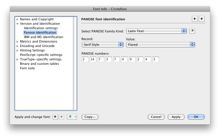
For those who are unfamiliar with it, the PANOSE number of a font is a chunk of metadata that describes the font with a sequence of digits, an encapsulated description. Here’s the PANOSE section in FontLab Studio’s Font Info pane.
PANOSE settings in FontLab Studio 5 (click for full size)
This week, for the second time in the past 15 years, I discovered a WIndows font bug caused by improper PANOSE numbers in fonts, which I had never heard of before.
The first bug was simple: if you set the appropriate PANOSE digit to say the font is monospaced, Windows will ignore the actual advance widths in the font and treat every glyph as having the same advance width. This means that you had better not set the PANOSE to monospaced unless the font is utterly and completely monospaced. This may seem simple, but consider that some supposedly-monospaced fonts still have ligatures. If, say, the fi ligature is to have a different width than the i by itself, then the font is not truly monospaced and setting the PANOSE to monospaced will mess up that glyph’s advance width (at least, in many Windows applications, though not most Adobe apps).
If my understanding is correct, the new bug is also simple: if you have a style-linked family such as a regular and an italic, the general PANOSE class had better be the same for every family member, or else Windows will get very confused. In my case, the regular was of the “Latin Decorative” class and the very early build of the italic was “Latin Text” (because I hadn’t bothered developing the PANOSE number yet for the italic). Some very odd symptoms occurred for a user with an existing document in Word 2010 on Windows 7.
This is also a lesson in font testing. Even something as simple as coordinating family members for Windows, a mostly well-understood area, and one in which I have considerable expertise, can fail for unknown reasons. There is no substitute for actual testing in apps: this issue was not identified by Adobe’s fabulous CompareFamily test tool, probably because they had never encountered it. I had used the italic by itself in Word on Windows, and both the fonts together in Creative Suite apps, and all was well. That was simply insufficient.
Definitely a major error on my part. Certainly, this was not a final release, but even a pre-alpha build released to my Kickstarter backers, as the new italic was, should behave more reliably than this one did.