Adding kerning is one of the very most tedious tasks in developing a font, if it is done well. It is also the final major production task in type design.
As I am finishing this stage on the Regular style of my Kickstarter typeface Cristoforo, and about to send updated fonts to my backers, I find myself needing to explain what this kerning business is, anyway. So I thought I would post something here for general public consumption, and point to it from my latest Kickstarter update.
In fonts, each glyph is placed in a slot with a certain amount of space allocated to it, which generally includes white space on either side. The total horizontal space allocated to a glyph is its “advance width.” The distances between the furthest extent of each side of the glyph and the ends of the allocated space are the “sidebearings”—which can even be negative numbers, if part of a glyph sticks into a neighboring space.
In high-end type design, spacing is an especially complex art and craft. But many junk fonts don’t even get the basics right, and that is easily detected. Decent spacing is consistent, and follows certain general principles about shapes. Consistency means the “same” elements should get the same space across different glyphs, and similar elements spaced similarly. So the left sidebearings of OCGQ and the right sidebearing of D are all usually either the same or very close.
Designing even spacing is about keeping a relatively consistent amount of white space between letters. In a typical sans serif font, a letter like O only needs 50–60% as much in the way of sidebearings as an H. Something like a T or a V might have sidebearings at or close to zero. Lowercase letters are generally spaced slightly closer than their cap brethren.
ADDED: Here is a video tutorial I did on spacing.
Kerning
The word “kerning” can refer to any of three things:
- noun: data in a font that adjusts spacing for particular letter combinations.
- verb: the act of creating such data
- verb: when setting text, the act of adjusting space between particular letters in text. This is an operation done by a typesetter in text setting software, and is not a font editing operation. Also, not to be confused with tracking, which is adjusting the overall spacing of a block or range of text all at once.
For purposes of this article, I’m concerned with the first two definitions: kerning data built into fonts, and how to create that data. We’ll get to the “how” later, first let’s talk about the “what.”
It’s critical that the basic spacing be done well in any font, but for particularly difficult combinations, the font should also contain built-in kerning (which can help avoid the need for the end user to do manual kerning). Kerning is a set of adjustments to the default spacing for specific troublesome letter combinations, so as to deal with fact that, without intervention, “AV” will be set too far apart, or that in some fonts “f)” will make the top terminal of the f collide with the parenthesis. Vast amounts of kerning are not always a necessity for a well-made font, but if there is no kerning, or if it does not deal with common situations like “LT” and “To”. . . then there is something wrong.
Making Kerning
In the “old days” prior to about 10–15 years ago, kerning was done by defining pairs and adjusting the spacing. So combinations such as To and Te would be separate pairs, as would VA and WA. This was a pain, but still manageable as long as fonts still only have <256 glyphs per font, although some would end up with thousands of kerning pairs, and some apps would break (in different and interesting ways) when working with very large amounts of kerning data.
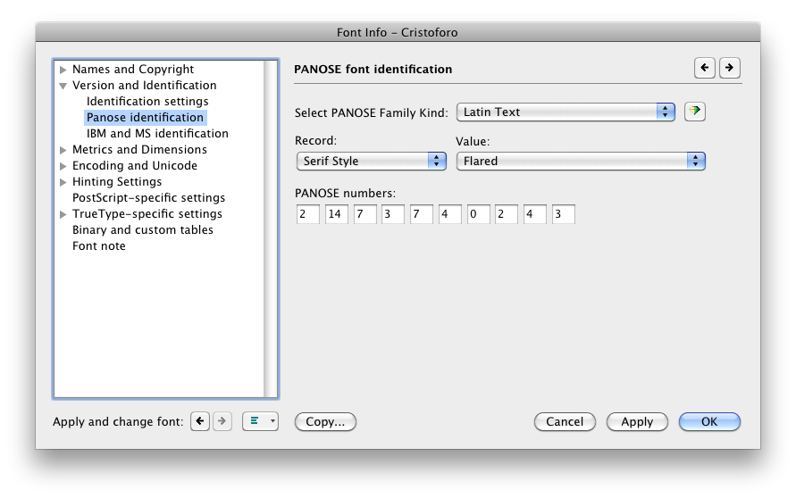
But it is not unusual for an OpenType font to have a thousand glyphs or more. Cristoforo Regular has 1324 glyphs now. Luckily, OpenType allows for “class kerning,” in which glyphs can be grouped into classes, and then the classes are kerned instead of individual glyphs.
So the first thing to do is to define those kerning classes! I spent days on and off just doing that for Cristoforo Regular. Some of them only apply when the class is on the left, some when the class is on the right, and a few apply to either side. I had 96 kerning classes before I started kerning. I made a few additions and deletions during the process, and am sitting with 101 right now, with 632 distinct adjustments between classes (the class equivalent of “kern pairs”). Probably a week or more of work, if it was full time.
Here’s the display of classes in FontLab Studio 5.1.4. Most of my classes for Cristoforo have anywhere from 4–30 glyphs, but some have just one or two, and the largest has 84.

Getting the class definitions right is critical. If a glyph is missed out, it doesn’t get kerned. If a glyph appears in two left-side or two right-side classes, it causes an error that means that a bunch of the kerning will never be applied when the font is used. (FontLab Studio warns appropriately, but debugging can take a while.)
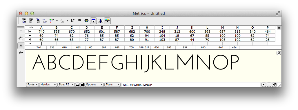
Here is how the spacing can be viewed with arbitrary strings of text in the metrics window. At the moment the effect of kerning is not being shown.

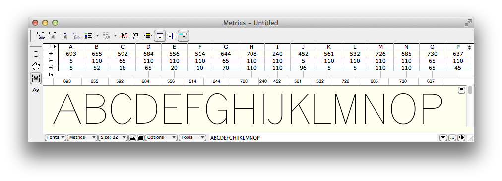
Below you can see the same text only with kerning applied.

The next version, below, highlights the points where kerning is happening. Mostly kerning makes the combinations closer together, except the “e.” combination, where the period has to be moved a smidge further away.

Application Support
Most graphics and publishing apps simply use the kerning data in the font by default. You have to do something special to avoid it or get different results. This is true of Photoshop, InDesign, Illustrator, and QuarkXPress.
The Adobe apps refer to the kerning built into the font as “Metrics” kerning, as opposed to no kerning or Adobe’s automatic “Optical” kerning. In a well-made font Metrics kerning produces the best results, but even then Optical kerning can be handy for combinations the type designer missed, or situations that can’t be handled by kerning built into the font (such as kerning between different font sizes or two entirely distinct fonts).
Even WordPerfect, back around 1990, had kerning on by default, if I remember correctly. But not Microsoft Office.
Microsoft Word has allowed you to turn on kerning pretty much forever, it just defaults to being off. To turn it on, in recent versions, go to Format > Font or hit Ctrl-D (Cmd-D on Mac). You’ll get a big dialog. Select the “Advanced” tab.
Then in the top “Character Spacing” section, check the box that says “Kerning for Fonts.” The default is to set kerning on for 12 point and above, but you can reduce it—I generally set it to 1 point because I want kerning on all the time. Unless I am writing an article about kerning I never want it off.
")
PowerPoint has more recently started supporting kerning. In more recent versions, go to Format > Font or hit Ctrl-T (Cmd-T on Mac). In the resulting dialog select the “Character Spacing” tab. Then check the “Kerning for fonts” option.
")
So that’s all you need to know to use and appreciate kerning!
NOTE: About 1/4 of the text of this post is borrowed from my article “Know If a font Sucks,” currently in press for the March–April issue of Communication Arts.