
 Thomas “my other car is a sans serif” Phinney on fonts, typography & text. Geeky troubleshooting and info for font developers and users. Consulting & expert witness for fonts & typography.
Spring/summer 2009 speaking »
 0
-
0
- I have a few talks coming up in the next little while. Currently planned:
WorldWare Conference, 17-19 March 2009, Santa Clara, CA
Font Handling in Multilingual Software
Um, well, yes, this talk is today. Fonts are a critical part of making software world-ready, and applications must test with the right fonts. Various font formats take different paths to dealing (or not dealing) with the needs of the world’s languages. Operating systems offer varying levels of support for the different formats. Learn how to navigate and escape this maze!
45 min
Justified West Conference, 25 April 2009, Vancouver, BC, Canada
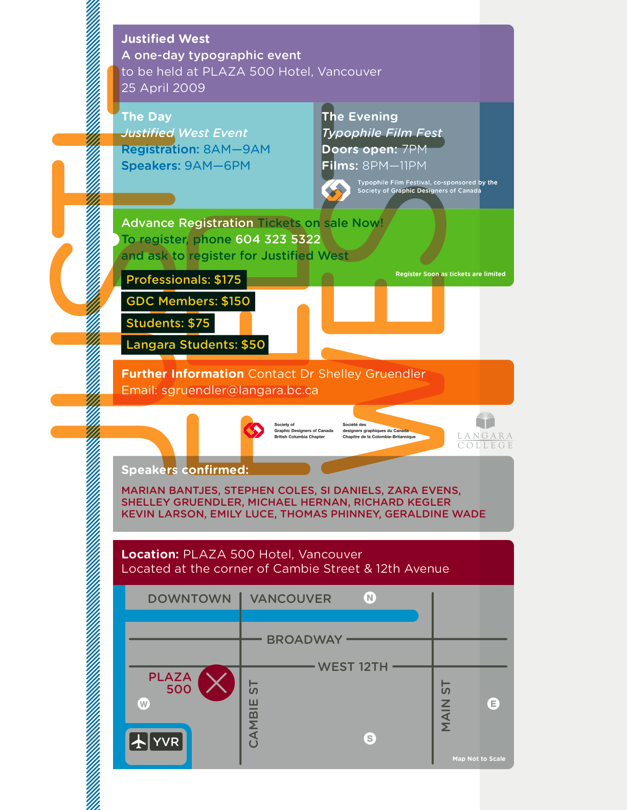
Justified West 2009 Conference poster image—click for higher-res version
To register, phone 604-323-5322. Email Dr Shelley Gruendler for more info
Forensic Typography
Thomas Phinney discusses and shows cases of forged documents and other typographic investigations he’s been asked to investigate, from a
father’s will to the NFL’s Pro Football Hall of Fame, to the US
presidency. Learn how choices of fonts, typography and output devices
have ruined perfectly good forgeries.
30 min
HOW Design Conference, 24-27 June 2009, Austin, Texas
10 Things You Didn’t Know Fonts Could Do
Join type guru Thomas Phinney on a whirlwind tour of advanced typography using OpenType, from the incredibly useful to the bizarre. You’ll learn how advanced typographic effects formerly only available to experts can now be automated, and see how cutting-edge fonts can do everything from emulate realistic handwriting to translate languages. You’ll get plenty of tips and tricks (including tips for more legible type in print and onscreen), and there will be time set aside for Q&A—so be sure to bring your burning type questions.
75 min
Bob Hayes NFL Hall of Fame forgery »
This is a sad case, really. Bob Hayes was a fabulous athlete back in the 1960s, first as an Olympic sprinter, and then as wide receiver for the Dallas Cowboys NFL football team. He set and tied various world records as a sprinter. He forced the Cowboys’ opponents to invent the new concept of a “zone defense,” because he was simply too darn fast for them to keep up using the man-to-man defense (previously used universally in the NFL). Even today, Hayes remains the only person to have won both an Olympic gold medal and a Superbowl.
Hayes’ career ended with drug use and other problems, which may have had something to do with why he never made it into the Pro Football Hall of Fame during his lifetime (he died in 2002). Or perhaps it was racism? I’m no football historian, so I can’t say.
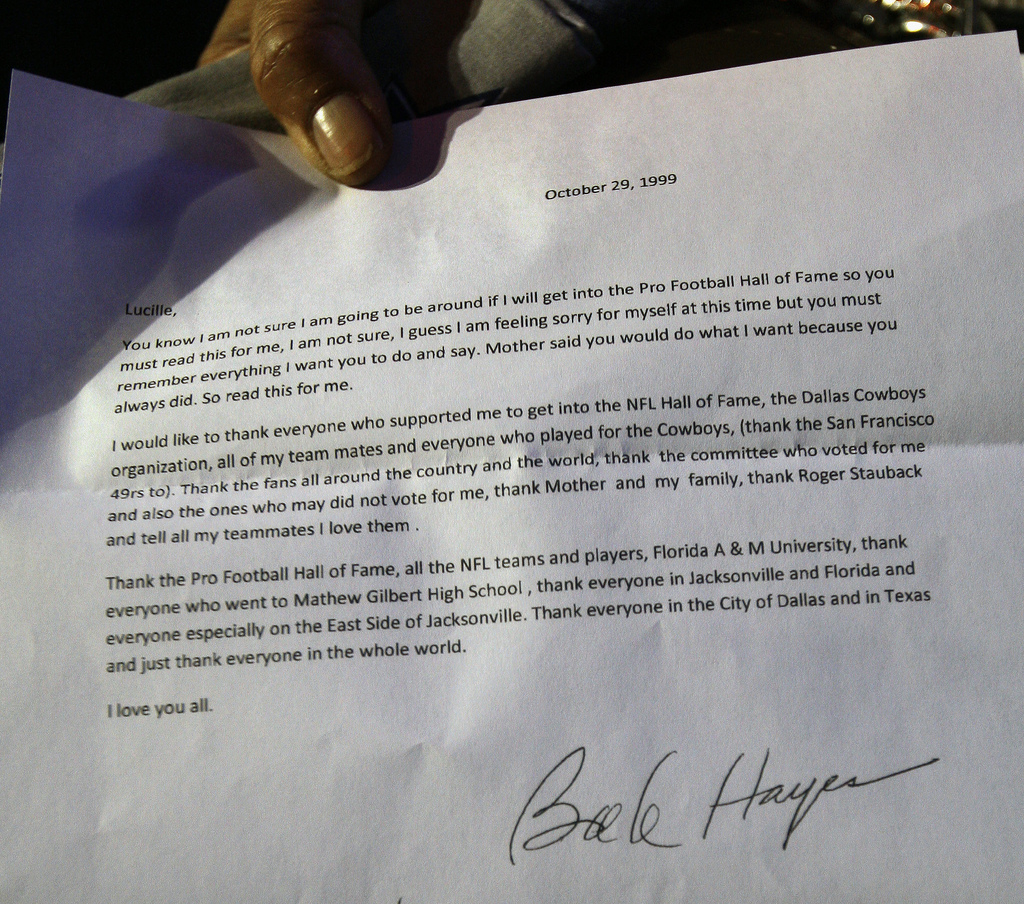
What I can say is that the letter from Hayes, which his purported half-sister read on national television last weekend, when he was at long last elected to the Hall of Fame, is a forgery. Or at least, it was printed and supposedly signed by him after he was dead, so I don’t know what else to call it.
Supposedly he wrote the letter well before his death in the fall of 2002, and gave it to his half-sister when he last saw her in 1999. The idea is that he knew his health was poor, and wanted to write up a statement to be read if he were to be inducted into the Hall of Fame post-humously.
So in some ways the fact that it’s a forgery is kind of trivial. The only reason anybody cares is that there were touching words and it was a teary-eyed moment for this statement to be read from this fellow long after he was gone. This letter being a forgery doesn’t—or at least shouldn’t—detract from celebrating this person’s athletic accomplishments.
In that sense, this is akin to the furore over the Bush National Guard memos, where the near-certain forgery of those particular memos distracted from the broader legitimate questions about the president’s military service.
That being said, for those of us into typographic trivia, here are some more details. 🙂
I was in an email exchange yesterday from a reporter from the Dallas Morning News, which resulted in a brief quote from me in the article in today’s paper (“Letter purportedly from former Dallas Cowboy Hayes under more scrutiny,” access may require registration.)
The paper also kindly also gave me permission to repost the photo they sent me, which is ignificantly better resolution than the one seen in the online version of the paper. Click on the low-res one below to see the high-res version.
Here’s my reproduction as described in my letter to the reporter below (click for the PDF).
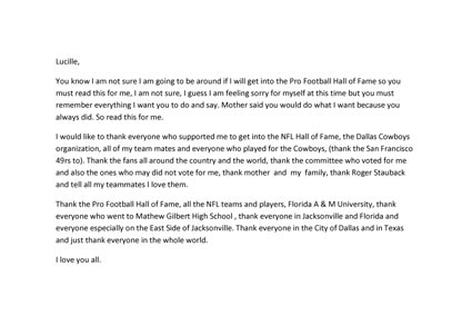
Below is the full analysis I sent to the Dallas Morning News, with just a couple of minor edits.
I am taking as given that Bob Hayes died in September 2002, and the question is whether this document could have been produced for him to sign it, whether in 1999 as claimed, or in fact any point prior to his death.
I conclude that (1) the typeface is Calibri, (2) the document shown in the photo could not have been printed when Hayes was still alive to sign it (for instance, in 1999), (3) it is highly probable that the document was set in Microsoft Word 2007 (Windows) or 2008 (Mac), which were not available while Hayes was alive.
I recreated the entire document in Word 2007 (here’s a PDF of my version) using that application’s default settings, which include 1″ margins and 11 point Calibri type. Besides the massive visual similarity to Calibri, the pattern of line endings precisely matches the purported Hayes document. By that I mean not only do the lines break on the same words, but how the letters line up from one line to the next at the end of the lines is identical.
It’s worth noting that in older versions of Microsoft Word, the default font was Times New Roman (12 point in 2003/2004, and 10 point in earlier versions), and default margins were 1.25″. Given that the document matches perfectly with the Microsoft Word 2007/2008 defaults compared to previous versions, and that these settings are unlike those of any major application available prior to that time, it seems highly probable that the document was created using a version of Microsoft Word that did not exist while Hayes was still alive. However, it would be possible to use other programs to set the document and get the same results, though one would have to change the default settings to more closely mimic MS Word.
Some people have commented that they have an older version of Word, yet they also have the Calibri typeface. Calibri can be installed by any of a number of Microsoft applications and updates, including the compatibility update that makes Word 2003 more compatible with Word 2007. Calibri really wasn’t available while Hayes was still alive to sign the letter.
There are other issues besides the typography. Perhaps Hayes would not misspell names such as “Stauback,” “49rs” and “Mathew” (for “Staubach,” “49ers” and “Matthew,” respectively). The family says the signature doesn’t match, either. But as far as I’m concerned, the typeface alone is sufficient to invalidate the letter.
[Updates: 07 Feb 2009, minor rearranging to improve clarity/flow; 09 Feb 2009, more of the same]