Columbus typeface sightings, intern, Kickstarter »
My Kickstarter campaign for the Cristoforo typeface has passed half its $6400 target in the first week, with 16 days to go! That’s fabulous.
I will be making my intern decision no later than Sunday! I’ve been holding interviews, and I’ve only had a handful of serious applicants, but they have including some really awesome people. I’m still open to hearing from more people before I make my final decision, but I have at least a couple of great candidates. The absolute drop-dead deadline is tomorrow (Sat June 2) at 2 pm PST. Anybody else who applies at this point needs to be local or able to come out here, open to part-time internship, and ready to send me stuff right away to support their application, and to interview with me on Sunday (preferably in person).
I keep on seeing versions of Columbus (the source for Cristoforo) in interesting places. I was sitting having a coffee with one of my intern applicants in downtown Portland just this past Tuesday, next door to Portland landmark Voodoo Doughnuts, and realized that they use a hand-lettered version of Columbus for their slogan, “Good things come in pink boxes,” seen here on one of said boxes:
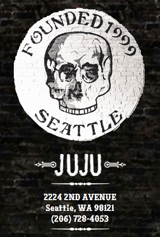
I’ve also in recent months seen it on the logo for Juju, a bar in downtown Seattle:
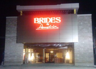
… and for the signage and logo of Brides by Demetrios, a wedding dress and bridal chain. I saw it in the upscale Buckhead suburb of Atlanta, but they have stores all over.
I believe the picture above is their Indianapolis location, but the Atlanta/Buckhead one had the same neon sign. I just couldn’t get a good picture of it with my cell phone at night.
Cristoforo: Reviving Columbus and font quality »
Many years ago, the very first digital font I ever worked on was a version of Hermann Ihlenburg‘s 1892 typeface Columbus, for American Type Founders. I had an interest in it because it was used in the logotype for the Call of Cthulhu roleplaying game, which I had long enjoyed. I never did anything serious with it, both because I did my revival by eye without benefit of scans or good quality originals, and because I didn’t know what I was doing back then. [UPDATE: I funded this typeface on Kickstarter in mid-2012! As of Feb 2013 backers have received pre-release versions of the regular and italic, but they are not “done.”]
Ihlenburg is pretty darn obscure, btw. He had the misfortune to be prolific back in the late 19th century, when type designers got very little recognition, and typefaces were just starting to be given unique names. The main available info about him is in a 1993 article David Pankow wrote about Ihlenburg for the American Printing History Association’s journal, on the occasion of an archive of Ihlenberg material being assimilated by the Cary library at RIT (Pankow was then curator of the Cary, and editor of the APHA journal).
Fast forward almost 20 years to 2010-11. While unpacking some boxes, I ran into some photocopies I had made of some good quality type specimens of Columbus, from early ATF specimen books. This was handy, because the earliest ATF book I have is about 1906, and the design had already been dropped by then. A quick search online verified that nobody had done a decent digital version yet. There’s a free version called by its original name, Columbus, by a fellow named Sam Wang, and an $18 commercial font called Beaumarchais from Scriptorium that is particularly awful, worse then the free font. Each has about 100 glyphs.
So I’ve been working on and off on doing a better version from digitized scans. It’s not “done” exactly, but it is already a whole lot better than either of the other versions currently available. I’m still tuning spacing and additional glyphs. I plan about 260 total glyphs, of which about 106 are in good shape right now, including alternate swash caps, which were not done in the previous digital revivals. I am using my old typeface as a placeholder and replacing glyphs as I fix them up.
I did a little bit of work on this font during the type busking at TypeCon New Orleans, and got some good feedback on the eszett and the spacing while I was there (thanks to Gary Munch et al).
I can’t call it Columbus, however: ATF’s trademark lapsed, and Monotype trademarked the same name for a 1992 Patricia Saunders typeface (celebrating the 500th anniversary of Columbus’ famous arrival, while Ihlenburg’s typeface was so named for the 400th anniversary). My previous attempt had for a while been called “Columbine” but that has taken some unfortunate connotations, so for now I’m calling it “Cristoforo,” after the sailor’s first name.
I’m still not sure what I’ll do with it. For now I am licensing it on special one-off terms to a very small handful of companies doing material related to the Call of Cthulhu roleplaying game. Maybe I’ll do a commercial release at some point, who knows?
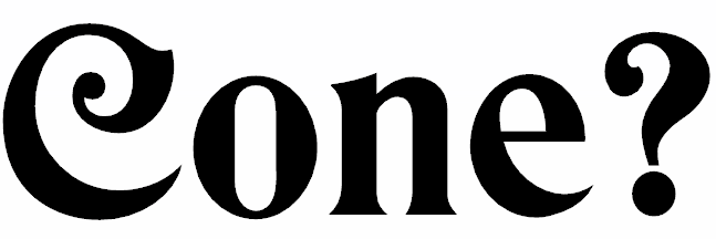
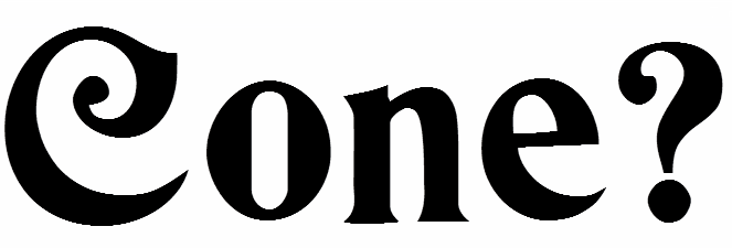
Here are samples of my work-in-progress and its nominal competitors. I’ll leave telling which is which as an exercise for the viewer—make your guess before you hover your cursor over the images, or read the comments.

 Thomas “my other car is a sans serif” Phinney on fonts, typography & text. Geeky troubleshooting and info for font developers and users. Consulting & expert witness for fonts & typography.
 2
-
2
- 


