
 Thomas “my other car is a sans serif” Phinney on fonts, typography & text. Geeky troubleshooting and info for font developers and users. Consulting & expert witness for fonts & typography.
Cristoforo promo draft t-shirts »
 0
-
0
- I’ve been having higher-level backers of my Kickstarter for the Cristoforo typeface vote on t-shirt designs the show off and promote the fonts, my revival of Hermann Ihlenburg’s Columbus (1892) and American Italic (1902). I will be printing several of the most popular designs for my backers.
Most of the votes are in, so I have finalized designs for the four most popular options so far. I am just waiting a couple of days to tally any straggling votes and maybe tweak the designs a tiny bit.
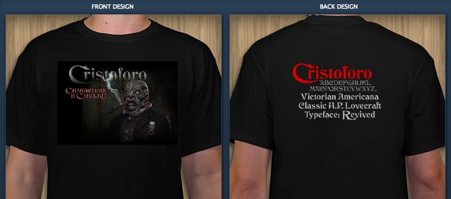
A) Front based on a design by Andrea Leksen, featuring art by Steve Kick.
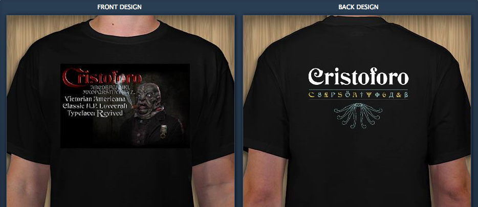
B) Front design by me, with art by Steve Kick. Back design by Andrea Leksen.
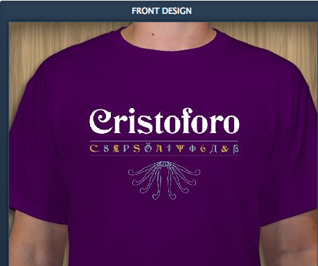
C) Design by Andrea Leksen.
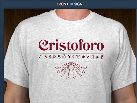
D) From the design by Andrea Leksen (colors changed for light shirt).
Thomas Joins FontLab »
As reported yesterday, I have joined the good people at FontLab, as Vice President.
I am very happy for the opportunity to work more directly in the field of type design software. FontLab is a great company with a long history. I still have my original FontLab manual (from before it was FontLab Studio) from 20 years ago!
It has its challenges, what with getting new app versions on a new codebase out the door, and new competition in recent years, but these are all part of a healthy evolution. I am enjoying getting up in the morning to tackle new things each day!
How to Tell If a Font Sucks »
Are you a user of fonts who needs to tell if a font is well made, or an aspiring novice type designer? The March–April 2014 issue of Communication Arts features my article on evaluating font quality, “How to Tell If a Font Sucks,” on p. 24—now online as well!
It looks like it is hard to see the subtleties in some of the graphics in the down-res web-ified version of the article, though the print mag looks great. I will see about posting a version with high-res images in PDF.
I’m really pleased with this article. My new editor Robin Doyle at CA did a great job helping me clarify some points and figure out where more graphics were needed.
That said, there are some corner cases and subtleties around this discussion that I didn’t have time or space to get into in the article, which was already long and involved. But that is what blogs are for. 🙂
Although I stand by everything in that article, typefaces that are deliberately naïve/unsophisticated are one place for legitimate exceptions to some of the guidance I give in the article. For example, I had a lovely discussion with some folks who made a typeface based on some classic road signs. The original signs did not use optical compensation at stroke joins (point 5 in the article), so they didn’t do it in the typeface either. Although I might rarely be interested in going that way myself, I have to agree that it was a perfectly legitimate design choice, given the origins of the typeface as a signage revival—even though in many another context I would be calling it crap!
Optical compensation at stroke joins is also specific to certain typographic traditions. Certainly for Latin-based fonts (English, French, German, Hungarian, etc.) it is nearly universal, as it is for Cyrillic (Russian, etc.) and Greek. But some writing systems do things differently, such as Devanagari (used for Hindi, Marathi, Sanskit).
Non-western writing systems can also change other assumptions. For example, the idea that straight-to-round transitions (point 6 in my article) should be very smooth is very much not the case for Thai.
Anyhow, check it out and let me know if I can clarify anything else!
Fonts and Typography for Writers and Non-Designers »
What are some good resources for non-designers, who perhaps write, edit or publish professional documents? Somebody recently asked this in the comments to my blog. There are quite a lot of resources I could suggest, but given limited time, we should limit the complexity/depth/scope of the resources. So given that….
Before getting into the depths of font selection, teach typography. I think Matthew Butterick’s Practical Typography is a great place to start. Short, straightforward, no-nonsense, useful, and little I could disagree with.
After that, for an intro to selecting and combining fonts, this article from Smashing Magazine is good.
At the next level of complexity, there are plenty of good longer introductions, mostly aimed at designers. Ellen Lupton’s Thinking With Type is a good start here. Nothing wrong with reading Butterick first, before moving on to this, btw!
For more advanced thought, the closest thing to a typography bible remains Robert Bringhurst’s The Elements of Typographic Style. It is better as a reference book or to read a chapter at a time, rather than try to take it all in at once.
The original query from a business writing teacher at the University of Colorado, Colorado Springs:
I teach business writing at a university and we have a document design unit. I try to get the students to understand fonts, but don’t have a good exercise, video, material, etc. about effectively using fonts. DO you have any tips, links, etc. that I might be able to use with the students to help them discover fonts beyond Times Roman and Arial and understand how to use them effectively? Thank!
More free FontLab encoding files for type designers »
Last week I wrote about posting five FontLab encoding files for Adobe Latin character sets.
Today I posted in the same Github repository three FontLab encoding files for Adobe Cyrillic character sets, and updated the five Latin files with a few added currency symbols and glyph name changes (as I expected I might).
The character set definitions underlying these files were built on a bunch of research I did at Adobe back in 2006–08, with additional work by Miguel Sousa. The headers include much detail on the differences between each set, and the languages covered. Both of these character sets reflect the latest data from Adobe on how they name glyphs and what they are including in current fonts (not including OpenType alternates and features, mind you). The headers of the files have some interesting details and history, especially on the Cyrillic side.
Thanks as always to my old friends at Adobe, including Miguel and David Lemon, for their willingness to share production information with the type design community.
I dedicate this post and my work on the Cyrillic encoding files to the memory of Emil Yakupov, CEO of the ParaType type foundry in Moscow, who passed away just a month ago at the age of 56. His advice and feedback on Cyrillic character sets—among many things—was invaluable to me. I remember one of our first meetings, when Emil gave me a pair of ParaType catalogs as I was first becoming involved with Cyrillic type design. I still consult them to this day when trying to internalize what forms different Cyrillic characters can take in different font styles.
Also, Emil remembered by Adam Twardoch.
Прощай, Эмиль.
Save $400M printing cost from font change? Not so fast… »
I am really bummed that the idea trending hot online now, popularly represented as “the US government could save $400 million dollars a year by switching fonts,” is a bit off-base. It is not the change of design that saves toner; it is that their chosen font is smaller at the same nominal point size than the comparison fonts. Not to mention that the $400 million figure being bandied about is not actually the main number suggested by the kids, which was $234 million. Unfortunately, those fonts that use less ink/toner at the same actual size are generally less legible.
That said, it is great that middle school kids (the study has two authors, although one has gotten all the media attention) are doing creative problem solving and applying scientific thinking! No sarcasm intended. It is not their fault that non-obvious aspects of the problem mess up the idea. (Readers of my blog may remember that point size and font size have a rather nominal relationship.) Garamond* lowercase is about 15% smaller than the average of the fonts they compare it to, while its caps are only about 7.5% smaller. So it is no surprise that it uses less ink at the same point size.
This is why most scientific studies comparing typefaces first compensate by resizing the fonts to eliminate differences in the lowercase height (called “x-height” by us font geeks). This study failed to do that. As a result, they actually get results that are the exact opposite of other studies. Century Gothic has a very large x-height, so printed at the same nominal point size it uses more ink than Times. If it were instead printed at the same x-height (as in other studies), due to its relatively thin strokes, it would use less ink.
Setting any font 15% smaller would save 28% of its ink usage. This is because the font letters are two-diemensional, so the ink usage is based on the square of the size:.85 x .85 = .7225. Of course, there are some caps in the texts as well, which would make the savings a bit less. Interestingly, this is pretty exactly much what the study found. So, you could just as easily save ink by setting the same font at a smaller point size.
For a moment though, let us pretend that the study did in fact equalize the x-height, and found that a typeface change saved noticeable amounts ink. With a “normal” typeface such as Garamond, this would mean that the strokes making up the font were just thinner at the same size (“stroke” is a virtual thing here; modern digital fonts essentially trace the outlines of the letter). If that were good and useful, why not go further? Why not make the strokes even thinner? Maybe there is no font bundled with common operating systems and software that would meet these needs, but one could just commission one. Even a master type designer could do a basic four-member family for $100K or so, which is a lot less than the hundreds of millions at stake. Make it razor thin and save even more!
But any of those changes, swapping to a font that sets smaller at the same nominal point size, or actually reducing the point size, or picking a thinner typeface, will reduce the legibility of the text. That seems like a bad idea, as the % of Americans with poor eyesight is skyrocketing as our baby boomers (and even their children, like me) age.
Aside from that, the reduction in toner/ink usage probably would save less money than claimed in the study. The claim is based on the proportion of total cost of ownership of a laser printer that goes to toner. There are sadly two big problems with the idea that using less ink (or toner) will save that amount of cash, based on that proportion.
First, large offices that use printers and copiers do so under a maintenance agreement that includes the cost of toner. They pay per page printed, and actual toner consumption is generally ignored. In such cases, a font change will only save based on the page count, not the toner. (Certainly, smaller fonts can also use less paper—I will get to that.)
Second, the study makes the interesting claim in a footnote: “Ink and toner are used synonymously in this study. Even though traditional ink is more expensive than toner, a focus on determining the percent savings in cost rather than the magnitude of the cost obviates this difference.” Urm… how? They are assuming that the percentage of printing cost ink or toner accounts for is the same for all classes of output.
This is untrue. Many of the documents that account for a substantial percentage of the government’s overall printing costs are printed on a printing press, using offset lithography. For offset printing, the percentage of the cost of that is associated with ink is in fact much smaller than for laser or inkjet printing. But it isn’t a fixed percentage, either, due to the large proportion of the cost that is associated with setup. It will be a higher percentage for short runs, and lower for long runs. Additionally, because of the huge cost of owning printing presses, many or most offset litho jobs will be printed out of house, using third-party printers.
So, for in-house printing-press printing, the savings will be a much smaller proportion than the quoted 26%. For outside printers, they will not charge based on minor variations in ink usage; they just check things like whether it’s a page of text vs graphics. Either way the savings will be less.
There is a different way an effectively smaller font will definitely save money: by allowing multi-page documents, especially long ones, to take fewer pages! So maybe it all works out—if you don’t worry about legibility.
There is another practical issue with Garamond in particular. The version bundled by Microsoft (from Monotype Imaging) does not have a bold italic, which is an unfortunate lack if one wants to promote its use for all government documents. (Yes, you can turn on bold and italic in your word processor anyway. You will just get a faked font instead of the actual one, which is ugly and less legible.)
The question that should be asked is: what font and size combination could be used to maintain or increase legibility while saving money on printing, by reducing page count and/or ink/toner usage, with a font that is bundled with common apps (or free), and has all the required font styles?
But that is a far more complex question, and most folks covering the issue much prefer simple and appealing messages like “high school kids tell gov’t how to save $400 million!”
I like innovative ideas to save money. Really, I do. But I wish the media and public had consulted some experts on this area before going nuts promoting this idea, because it just doesn’t hold water—or save money—without losing legibility.
Thomas is currently CEO of ATypI, the international typography society, since 2004. In other relevant background, he was a teaching assistant for a senior level stats course in his second and third years of undergrad, has an MBA from UC Berkeley, and an MS in printing, specializing in typography, from the Rochester (NY) Institute of Technology.
Updates & notes
This post has seen some editing for grammar, clarity, adding a few more details, and to be less of a jerk. Also to update my background to be current. Again, I am impressed as heck that a high middle school student is attempting serious research. I would not be analyzing it critically ,like a serious adult study ,if not for the fact that the media initially largely embraced it uncritically as if it were.
* The student study does not specify which Garamond they used, but it was obvious (to me) in the samples that they were using the Monotype version that is bundled with Microsoft Windows. Because Garamond goes back to the 1500s, and there is no trademark on the name, there are literally dozens of typefaces by that name, with about four or five being fairly common.
Since I wrote this, there has been some interesting coverage. The Guardian UK was in with the initial pack, with some caveats, but then their Nadja Popovitch wrote about this blog post and interviewed Jackson Cavanaugh of Okay Type for his reaction and analysis.
Meanwhile, John Brownlee did a nice job of explaining the point-size part of my analysis in layman’s terms, for Fast Co Design.
I did more elaborate checking on the study’s original sources and found that their five government test documents each used different body text typefaces: New Century Schoolbook, Minion (with Myriad headlines), Melior with a little Helvetica, Times with Helvetica headlines, and Book Antiqua. The average of these was almost identical to my original estimate using two of them, but I updated my numbers appropriately.
Given that the five source documents all use different fonts, one could reasonably wonder if they are a representative sample. Generally, as a rough guideline, you need a sample of about 30 to get sufficient statistical reliability for something like this.
CNN quoted Suvir: “”Ink is two times more expensive than French perfume by volume,” Suvir says with a chuckle.” This may be true, but that stat is not original to him—it dates back ten years, and is specifically about inkjet printer ink. Such printers may still be common in schools (although even there I expect laser printers are taking over), but government agencies are definitely not using inkjet printers for much of their output. Most high-volume government printing is on laser printers, or even printing presses, whose ink is even cheaper still.
Free FontLab Latin encoding files for type designers »
I just posted some free FontLab “.enc” encoding/character set files for the five Adobe Latin character sets, in my Github repository.
To install, quit FontLab, find the “Encoding” folder in the shared “FontLab” folder, and drop the files in there. Restart FontLab and these will be available as encodings.
NOTE: These were later updated to reflect minor tweaks Adobe has made since I described the character sets and posted the data, almost six years ago. I added currency symbols such as the Indian rupee, Turkish lira, Russian ruble and Ukrainian hryvni, and changed a few glyph names to match current Adobe practice. Thanks as always to my old friends at Adobe, including Miguel and David Lemon, for their willingness to share production information with the type design community.
This follows a couple of possibly-useful FontLab scripts I posted a couple of weeks ago, in the same place.
Some free FontLab scripts for type designers »
I have started posting a few scripts in my own repository on GitHub. They are libre (free, open source) under an Apache 2.0 license.
- Generate-substitutions.py: Select some glyphs in the font window. Run the script. It will automatically generate useful OpenType feature code (in .fea/AFDKO syntax) in the Output window, which you can copy/paste right into the appropriate feature. The script works with both simple substitutions and ligatures as long as you follow standard Adobe glyph naming standards (appropriate use of period and underscore). It does not work with complex cases involving multiple-feature interaction, sorry.
- Make-numbers-from-dnom.py: First you need to create some numbers sized and positioned for use as denominators. The script will take all the glyphs in your font ending in “.dnom” and create numerator, superscript and subscript versions using the dnom glyphs as components. If the font is an italic font, it will use the italic angle of the font to calculate how much to shift the components horizontally while moving them vertically. NOTE: the vertical shifts are hardcoded in the script now, but easily edited. Future improvement ideas: pop up a dialog to enter the vertical shift numbers, and/or try to auto-calculate them.
Unfortunately, my “best” (or at least most complicated) script is very specific to my workflow on developing my Cristoforo family (it does the steps detailed at the bottom of this blog post). It is a heavily modified version of Ben Kiel’s “Better Generate Font” script. I chose not to post it as the workflow is just so very peculiar to my needs and does things like put my license URLs in the font, but if you want it for some reason, perhaps as a starting point, ping me.
FontLab type design workshop in India, March 3–5 »
I am very excited to be getting my visa for India today! I’m one of the instructors for a 3-day advanced type design workshop with FontLab. Registration is now open on the FontLab blog, and there is a detailed schedule of planned talks.
Overlapping Paths in Type Design »
One problem with releasing lots of pre-release builds to my Kickstarter backers is that I don’t test every single one as much as I otherwise would. Generally any errors are minor, but earlier today I managed a moderately important one: I didn’t remove overlapping paths in my outlines during the build process. Well, actually, I did remove overlap, but as I did not first decompose my composite glyphs, it didn’t fix most of the problem cases.
Why would you want to have overlapping paths in your glyph outlines, and why/when would it be a problem?
Here are several glyphs (as shown by H. James Lucas) that had overlapping paths in this last build:
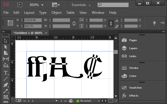
Overlapping paths rendering badly in Adobe InDesign
So, clearly it’s a problem if they render badly in some apps. Interestingly, this is dependent on not only what is doing the font rendering, but also what size the glyphs are rendered at. Adobe’s core rendering engine has three or four different rendering modes, and what it picks is size-dependent.
Overlapping paths are sort of okay in TrueType fonts—the rendering engines will deal with them better. But they will still produce bad results if a user does something like apply an outline or stroke to the text.
So why do I leave these things in while developing the font? Well, during development, it is useful to keep the basic elements separate, and only remove overlap later on. So for example, if I change the underlying swash H glyph, I want the Swash-H-with-bar to automatically pick that up. Similarly, the C shape seen in the colon currency symbol (used in Costa Rica and El Salvador) is shared between the Ghanaian cedi, the euro symbol, and a stylistic variant of the cap C. I used the same primitive elements in the ffj ligature in numerous other ligatures (including ffi). And so on.
Of course, as leaving overlaps in the final font causes problems, normally I take care of this as part of each build. My usual build sequence for creating OpenType OTF fonts from my FontLab file:
- Create a “next version” and make sure version string has been correctly incremented (in several places), including in the file name itself.
- With the current version of the file
- Remove all hinting (shift-F7 in FontLab Studio 5 for Mac)
- Select all glyphs in font (Cmd-A in FLS)
- Autohint all glyphs (F7 in FLS)
- Save file
- Then the following actions, done without saving the file again, to preserve original data in the FontLab file:
- Decompose all composite glyphs
- Remove overlap (Cmd-F10 in FLS)
- Export OTF font (Cmd-Opt-G in FLS) with correct version number in the file name
- Change license URL string to point at the personal license
- Export OTF font again with “-NC” (non-commercial) in the file name, in addition to the version number
- Close font without saving file
Anyhow, in this particular build I missed the “decompose” step, so all overlaps involving composite glyphs (most of them) still overlapping. Of course I have fixed this, and am sending revised fonts to my backers.