
 Thomas “my other car is a sans serif” Phinney on fonts, typography & text. Geeky troubleshooting and info for font developers and users. Consulting & expert witness for fonts & typography.
Hypatia Sans typeface finally shipping »
 4
-
4
- As many folks in the font biz already know, a while back I designed a typeface called Hypatia Sans. The upright faces were made available as a registration incentive for Adobe Creative Suite 3, but the typeface wasn’t available at retail, awaiting the completion of italics to go with it. Three years (!) later, the italics are finally available, and Adobe has released the typeface as a regular retail item. The italics in particular are available at a heavy discount, for those who already have the upright faces as part of CS3 (something I had arranged when I was at Adobe, as I wanted there to be an inexpensive upgrade for existing users). The new version of Hypatia Sans also adds a few more characters, and corrects some minor bugs.

Hypatia Sans poster on Adobe’s site, click for high-res PDF.
All told, it took me five years part time to do the upright faces, and then a total of three years for first me and then Paul Hunt to finish the italics. Both Paul and I had considerable input from master type designer Robert Slimbach, and he and Miguel Sousa did the kerning of the upright faces when I ran out of time before the CS3 ship.
You can read about the design process of the italics and get some idea of why it took so long from Adobe’s type blog, or go to the Adobe store to buy the typeface (links to the US store, international stores should have it soon):
- Buy full family for $259.
- Buy the italics-only upgrade pack for $55.
- (Single fonts are also available for $35 each, and can be selected from within the family packs above.)
With the upright faces having been available for so long, it has already seen a fair bit of use, despite the lack of italics. Although I occasionally spot it myself, colleagues often send me examples of it in use. I’ve now seen it in plenty of documents, not only for headings, but even for body text in places ranging from a Sharper Image gadget catalog to $pread, a magazine by and for sex workers. I’ve seen it on business cards from graphic designers and in a visual identity for an architect. Besides those, here are a few of the other uses I’ve collected over the years (click on any one to get a bigger picture or go to a web site):
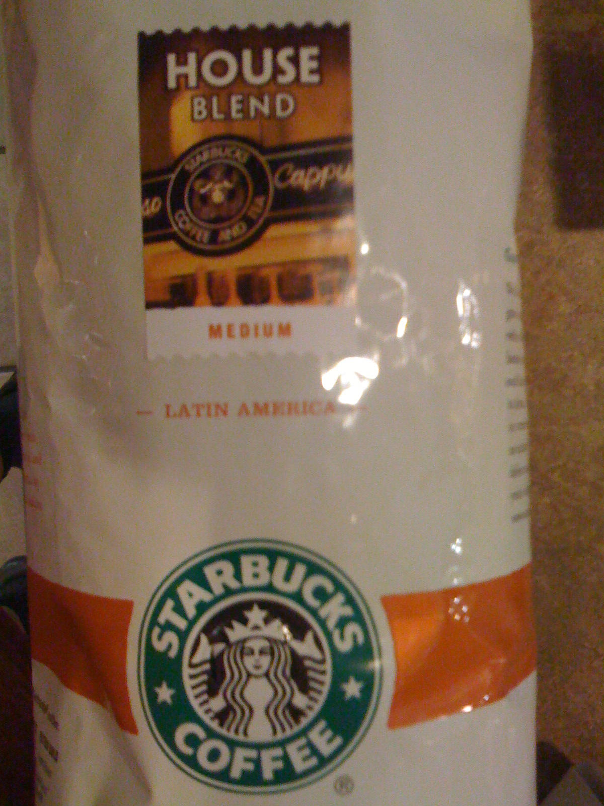
Starbucks uses Hypatia Sans for the titling on the label of its House Blend coffee.
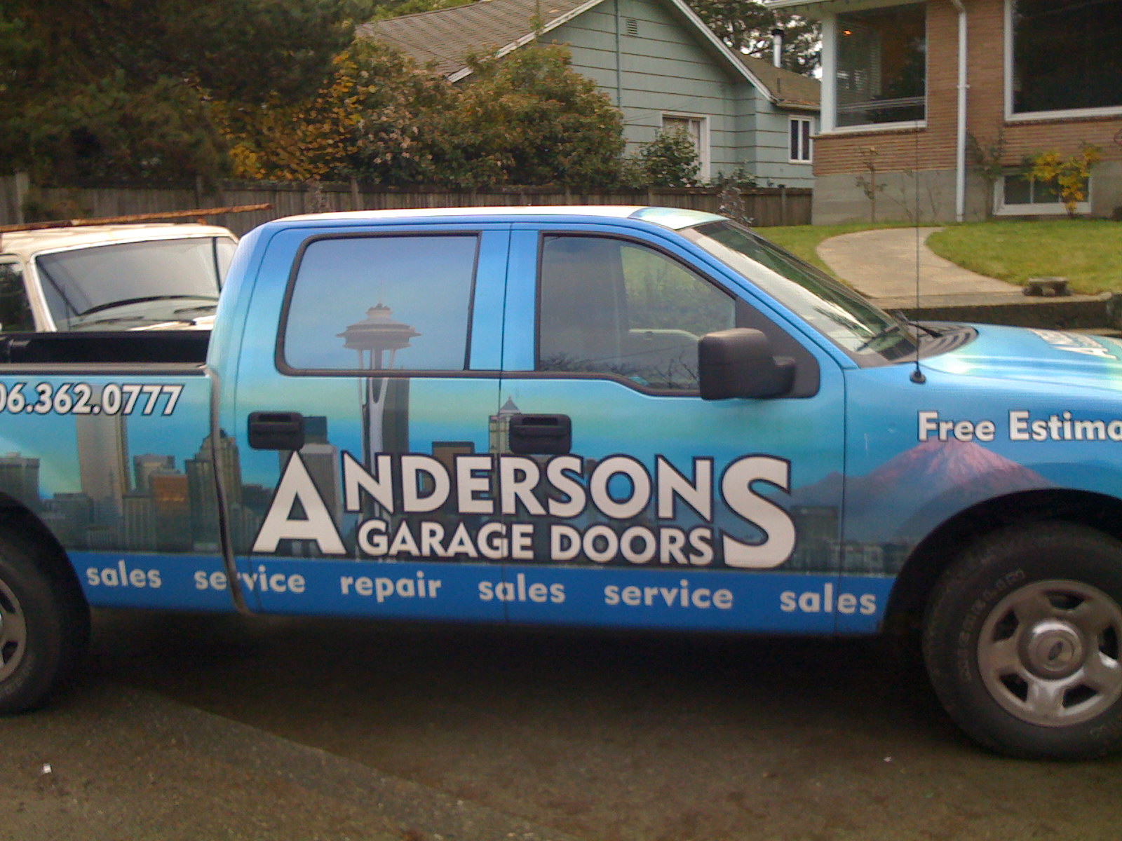
This Seattle garage door company uses Hypatia Sans… it’s not great typography, but their pickup truck was the first time I saw Hypatia Sans on a vehicle. (I drove by it several times over the course of a couple weeks before I stopped and took a picture. It was parked in between home and the hospital, and I was driving to the hospital every day for two months.)
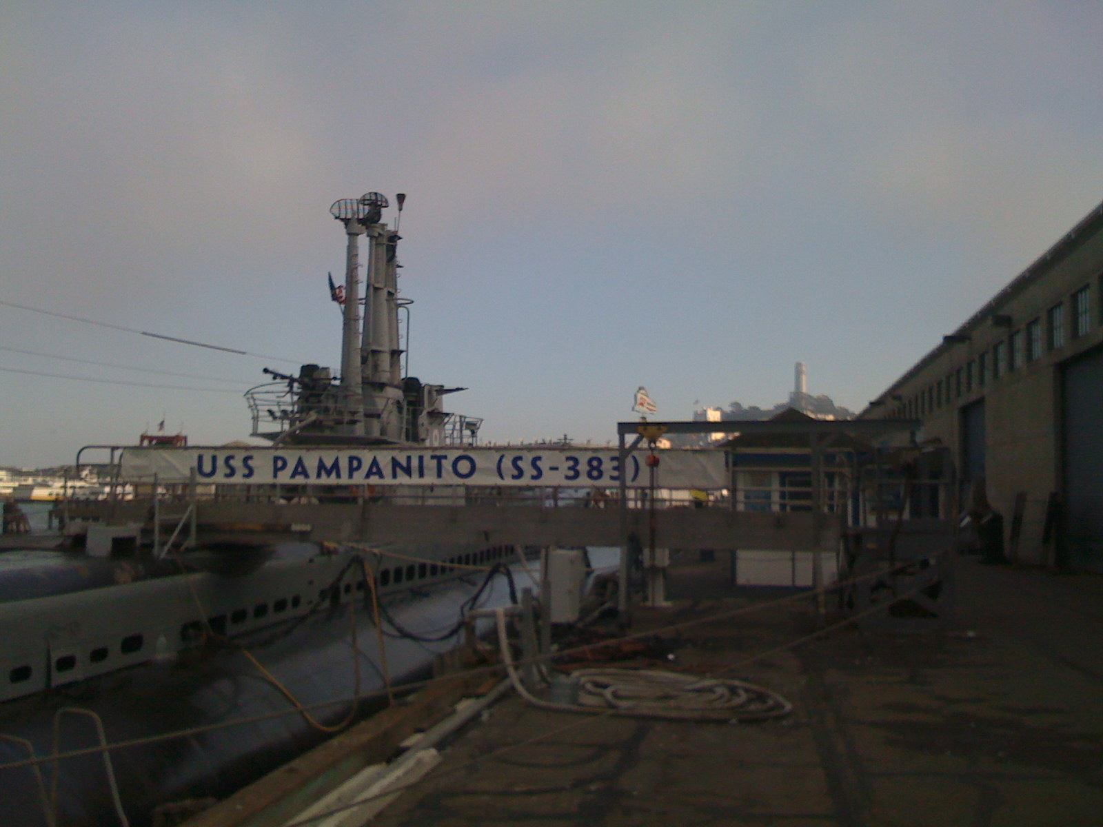
Here’s a more impressive vehicular use: a banner for the USS Pampanito, a WW2 submarine docked in San Francisco.
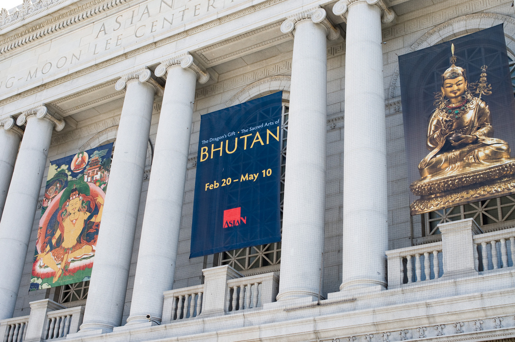
In the same city, the SF Asian Art Museum used Hypatia Sans to promote their exhibition of the art of Bhutan.
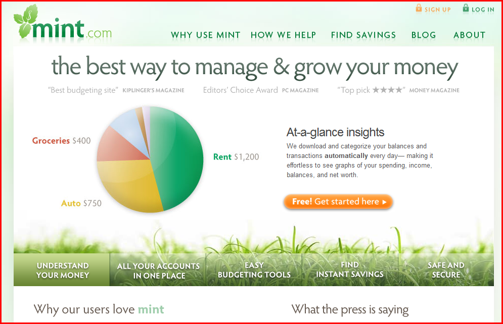
Finally, here are a couple of web sites that use Hypatia Sans. I was reminded of Mint.com in particular earlier this week when I saw their site used as an example in a talk at “An Event Apart” in Boston.
Mint.com uses Hypatia Sans throughout. Their logo uses it as well, but customized with modified serifs.
This dental site is a more basic use:

Intro Type Design Workshops in New York & Singapore »
I had so much fun doing this in Portland, that I am again joining Dave Crossland (pending sufficient registrations) to teach a 2-day intro type design workshop in New York City at Columbia University’s School of Journalism, July 20–21.
We have essentially a loose anarcho-syndicalist collective, organized by Dave under the “Crafting Type” banner. Doing this in a tag-team format turns out to be amazingly effective and fun. Dave comes from a very different perspective than I do in some respects, but we share our love of type and type design. Students really benefit from a variety of viewpoints and expertise.
The Singapore Crafting Type workshop is July 17–19, being taught by Eben Sorkin and Octavio Pardo. They too are knowledgeable instructors with varying perspectives, and it should be a great opportunity!
Here again is some of my own work:
Hypatia Sans poster on Adobe’s site, click for high-res PDF.
“Crafting Type” intro font design workshop in Portland »
I am joining Dave Crossland and other type designers (depending on registration levels) to teach a 3-day intro type design workshop here in Portland at the Pacific Northwest College of Art (PNCA). I am really looking forward to this, even if I don’t know that I can live up to the hype from the initial teaser post about it. But I love type, and I have spent a lot of time thinking about how to teach the basics of type design. I am looking forward to helping do that in a workshop environment, and doing so with other instructors so we can divide up the material, and even dynamically discuss things in front of the class. Dave comes from a very different perspective than I do in some respects, but we share our love of type and type design.
Thanks to Paul Platosh at PNCA for helping make this happen!
Here is some of my own work:
Hypatia Sans poster on Adobe’s site, click for high-res PDF.
Font Remix Tools (RMX) and Multiple Master Fonts in type design »
A little while back, Tim Ahrens asked me if I’d write a testimonial for his Font Remix Tools (“RMX Tools”), a set of plug-ins for FontLab Studio 5. I was more than happy to share my thoughts:
“The Font Remix Tools are an essential toolkit for anyone who wants to develop sophisticated typefaces with much greater efficiency. I can’t imagine willingly working without them. Type designers owe it to themselves and their sanity to check out RMX Tools.” — Thomas Phinney, Senior Fonts Product Manager at Extensis, designer of Hypatia Sans Pro for Adobe
(FontLab Studio is the primary type design application used by the overwhelming majority of professional type designers. FontForge and DTL FontTools (including FontMaster) are its fellow high-end alternatives, while TypeTool and Fontographer are the primary low to mid-range options.)
Tim has a interesting/useful demo version for free download, while the full version starts at €179 for one computer.
I think of the Remix Tools as having two sets of functions. First are several very useful things that work with just about any typeface:
- “harmonize” curves: this takes the “lumpiness” out of malformed curves. Very cool, even for moderately experienced type designers, though the experts may not need it.
- intelligent slant: slants glyphs while keeping vertical tangents straight. A useful step towards making italics, at least for sans serifs.
- tabular figures from proportional with only a couple of clicks
But the real power of RMX comes when you start with a font file that has a Multiple Master weight axis. Yeah, I know MM fonts are pretty nearly dead as a deliverable format for end users. Apple’s support for MMs is flaky enough that Extensis tech support has suggested Suitcase should warn people they won’t work reliably, and Windows has no reasonable native support (an ATM install can be hacked on Vista and probably Windows 7 to make them work well, or you can do manual registry entries for every single font).
Yet Multiple Master fonts are still very useful as a font development tool, even if what gets delivered is a bunch of separate fonts. Although Adobe hasn’t shipped a new MM font since the 90s, virtually all their internally developed type families use MM technology, and many other typeface designers use it as well. If you start with a font that has master outlines for two different weights, RMX can incredibly easily:
- create true condensed and extended versions (again, generally without distortion!)—or add a full “width” axis for infinite variation
- tune the width, height and weight of single letters interactively
- automatically generate small caps with the “right” weight and width (as determined by you, the designer, but with some very clever defaults)
- generate superiors, inferiors, numerators and denominators similarly
- make even better automatic tabular figures
Most of these functions still seem like magic when I see them working. Most of it works insanely well almost all the time. Of course it still needs to be checked by humans, and there can be problems on occasion, but dang….
What about Superpolator?
Aside from the Font Remix Tools, another insanely powerful option for working with font development using the power of MM space is Superpolator from Just van Rossum and Erik van Blokland, a.k.a. LettError. It has always looked great, but back when I was doing a lot of type design, my main box for doing so was Windows based, and Superpolator is a Mac-only tool, so I never really gave it a fair try. It’s available from €250.
More on MM fonts:
- Original Adobe article
- my oldarticle on font formats