Cristoforo $10K Promo: Free Dark Symbols Font »
With about 48 hours to go (midnight Sunday PDT), my Cristoforo font project on Kickstarter is at about $9,300 in pledges from backers who want to get cool fonts and other swag. As $10,000 is my final “stretch” goal (the point at which I add Cyrillic support to the fonts), I was trying to decide how to both celebrate and encourage the last few pledges I need. I settled on releasing a free font that might be of interest to some H.P. Lovecraft / Cthulhu fans: Dark Symbols icons designed by Brennen Reece and Graham Walmsley, fontified by me, released at no charge under the Open Font License 1.1.
Download Dark Symbols font (Zip archive of .otf).
What are the Dark Symbols? Graham explains them on his blog, but basically these are rough-edged hand-drawn symbols, intended for folks to mark up Cthulhu-related role-playing adventures.
I may also incorporate the Dark Symbols in my Cristoforo Symbols font; that’s TBD. But in any case, enjoy this free font, and consider supporting Cristoforo in its waning hours on Kickstarter!
Should Dyslexics Unite on a Typeface? »
The current issue of Communication Arts has an article I wrote on a couple of recent attempts to make special fonts for dyslexics, entitled “Should Dyslexics Unite on a Typeface.”
Although the print magazine reaches a huge audience (yay!) it does impose serious space limitations. It also has a big lead time. I thought I would add a couple of possibly relevant thoughts here, as well as a new research link. Also, the online version of the article makes the graphics a bit small—here is a PDF you can zoom in on.
Here’s some new research showing that more generous letterspacing and line-spacing together can make text easier to read for dyslexics.
My biggest criticism was that despite some valiant attempts at testing, there was no evidence that these fonts really were any more functional in terms of reading than other reasonably legible fonts. Heck, they couldn’t prove that these fonts were significantly better than freakin’ Arial, which is a fairly low bar to clear in terms of improved legibility. (Not a slam against Microsoft, btw. They have sponsored both highly legible fonts such as Verdana, and lots of research on legibility. But neither Arial nor Helvetica is a great legibility typeface.)
One thing I didn’t get into in the article was that they could have chosen other things to measure besides the traditional reading speed and comprehension measures. Those are easily measured, but they are not very subtle. One really has to have a very large sample size of readers, or hose the typography pretty seriously, to impact those measures to a statistically relevant degree. People can read gothic blackletter without all that large a decrease in reading speed, but they sure don’t like it for running text.
Perhaps I am a bit hasty to discount simple user preference as a factor. But I am more interested in the actual impact on the reading experience and on people’s lives rather than what people say if queried afterwards. Luckily, there are things one can measure that get at this more directly than stated preferences, while still being a bit more subtle than reading speed and comprehension. I covered these in a previous article for Communication Arts, “How to Explain Why Typography Matters.” Check out the last few paragraphs on the second page, where I talk about measures like corrugator muscle activity (how much people wrinkle their brow), tension of the orbicularis oculi muscles (used in blinking, squinting and frowning), and even performance on creative tasks following a reading experience (it improves with better typography, even if that typography doesn’t impact reading speed or comprehension).
Columbus typeface sightings, intern, Kickstarter »
My Kickstarter campaign for the Cristoforo typeface has passed half its $6400 target in the first week, with 16 days to go! That’s fabulous.
I will be making my intern decision no later than Sunday! I’ve been holding interviews, and I’ve only had a handful of serious applicants, but they have including some really awesome people. I’m still open to hearing from more people before I make my final decision, but I have at least a couple of great candidates. The absolute drop-dead deadline is tomorrow (Sat June 2) at 2 pm PST. Anybody else who applies at this point needs to be local or able to come out here, open to part-time internship, and ready to send me stuff right away to support their application, and to interview with me on Sunday (preferably in person).
I keep on seeing versions of Columbus (the source for Cristoforo) in interesting places. I was sitting having a coffee with one of my intern applicants in downtown Portland just this past Tuesday, next door to Portland landmark Voodoo Doughnuts, and realized that they use a hand-lettered version of Columbus for their slogan, “Good things come in pink boxes,” seen here on one of said boxes:
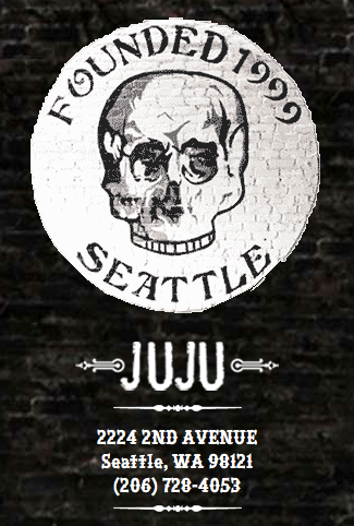
I’ve also in recent months seen it on the logo for Juju, a bar in downtown Seattle:
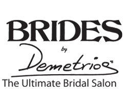
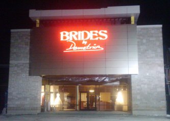
… and for the signage and logo of Brides by Demetrios, a wedding dress and bridal chain. I saw it in the upscale Buckhead suburb of Atlanta, but they have stores all over.
I believe the picture above is their Indianapolis location, but the Atlanta/Buckhead one had the same neon sign. I just couldn’t get a good picture of it with my cell phone at night.

 Thomas “my other car is a sans serif” Phinney on fonts, typography & text. Geeky troubleshooting and info for font developers and users. Consulting & expert witness for fonts & typography.
 9
-
9
- 


