As many folks in the font biz already know, a while back I designed a typeface called Hypatia Sans. The upright faces were made available as a registration incentive for Adobe Creative Suite 3, but the typeface wasn’t available at retail, awaiting the completion of italics to go with it. Three years (!) later, the italics are finally available, and Adobe has released the typeface as a regular retail item. The italics in particular are available at a heavy discount, for those who already have the upright faces as part of CS3 (something I had arranged when I was at Adobe, as I wanted there to be an inexpensive upgrade for existing users). The new version of Hypatia Sans also adds a few more characters, and corrects some minor bugs.

Hypatia Sans poster on Adobe’s site, click for high-res PDF.
All told, it took me five years part time to do the upright faces, and then a total of three years for first me and then Paul Hunt to finish the italics. Both Paul and I had considerable input from master type designer Robert Slimbach, and he and Miguel Sousa did the kerning of the upright faces when I ran out of time before the CS3 ship.
You can read about the design process of the italics and get some idea of why it took so long from Adobe’s type blog, or go to the Adobe store to buy the typeface (links to the US store, international stores should have it soon):
- Buy full family for $259.
- Buy the italics-only upgrade pack for $55.
- (Single fonts are also available for $35 each, and can be selected from within the family packs above.)
With the upright faces having been available for so long, it has already seen a fair bit of use, despite the lack of italics. Although I occasionally spot it myself, colleagues often send me examples of it in use. I’ve now seen it in plenty of documents, not only for headings, but even for body text in places ranging from a Sharper Image gadget catalog to $pread, a magazine by and for sex workers. I’ve seen it on business cards from graphic designers and in a visual identity for an architect. Besides those, here are a few of the other uses I’ve collected over the years (click on any one to get a bigger picture or go to a web site):
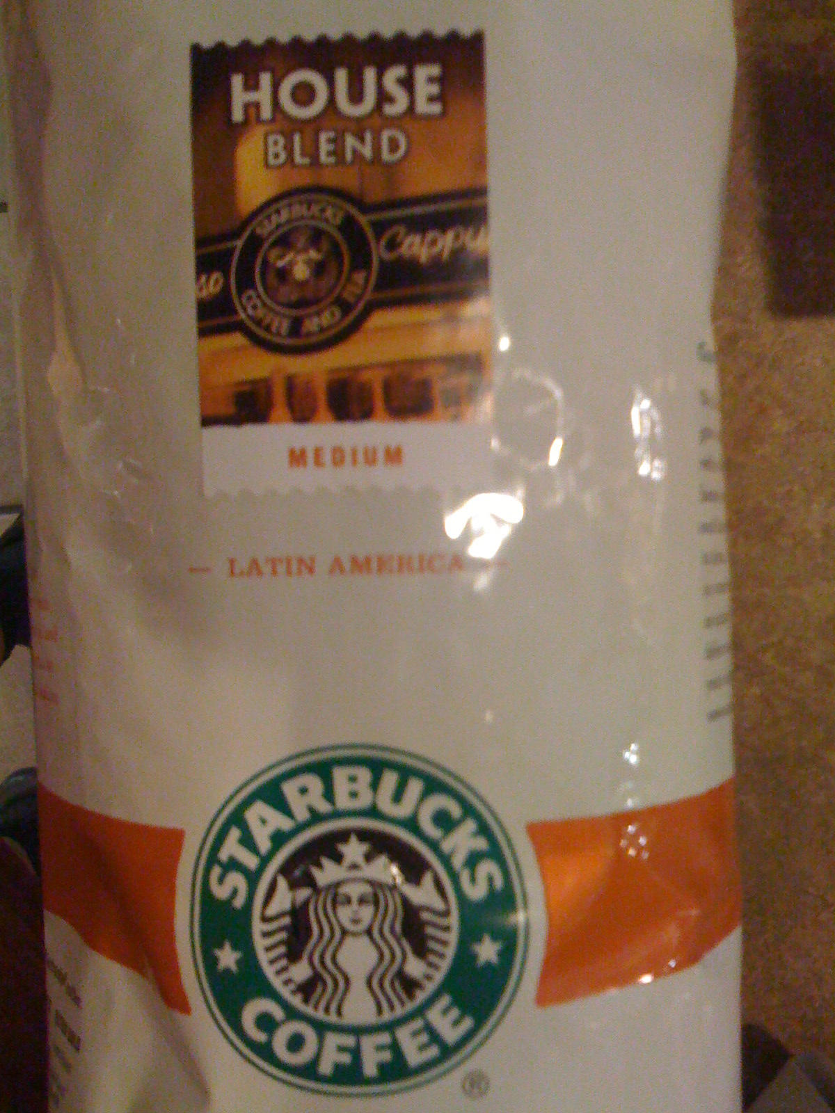
Starbucks uses Hypatia Sans for the titling on the label of its House Blend coffee.
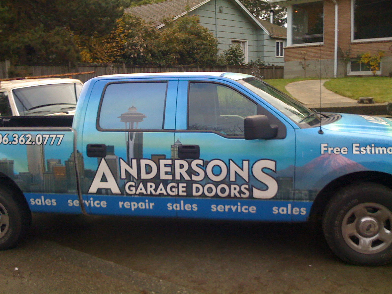
This Seattle garage door company uses Hypatia Sans… it’s not great typography, but their pickup truck was the first time I saw Hypatia Sans on a vehicle. (I drove by it several times over the course of a couple weeks before I stopped and took a picture. It was parked in between home and the hospital, and I was driving to the hospital every day for two months.)
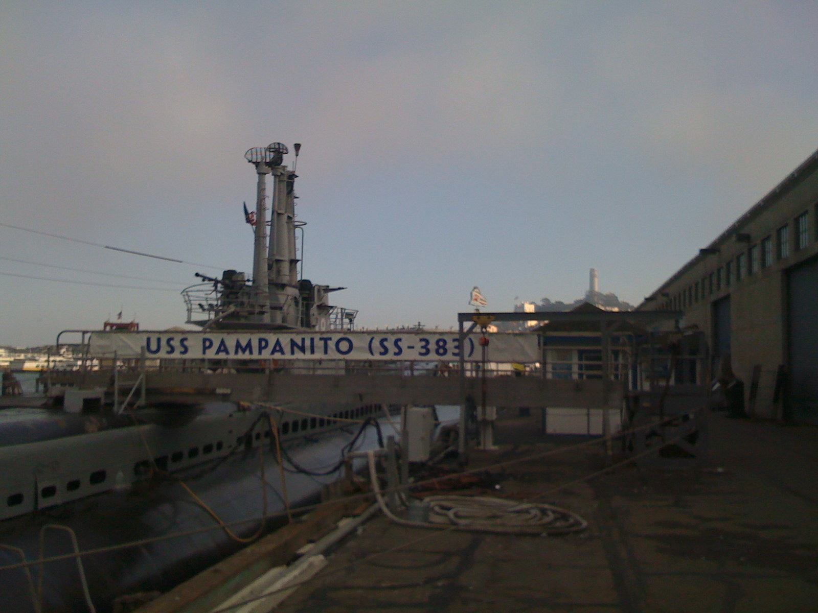
Here’s a more impressive vehicular use: a banner for the USS Pampanito, a WW2 submarine docked in San Francisco.
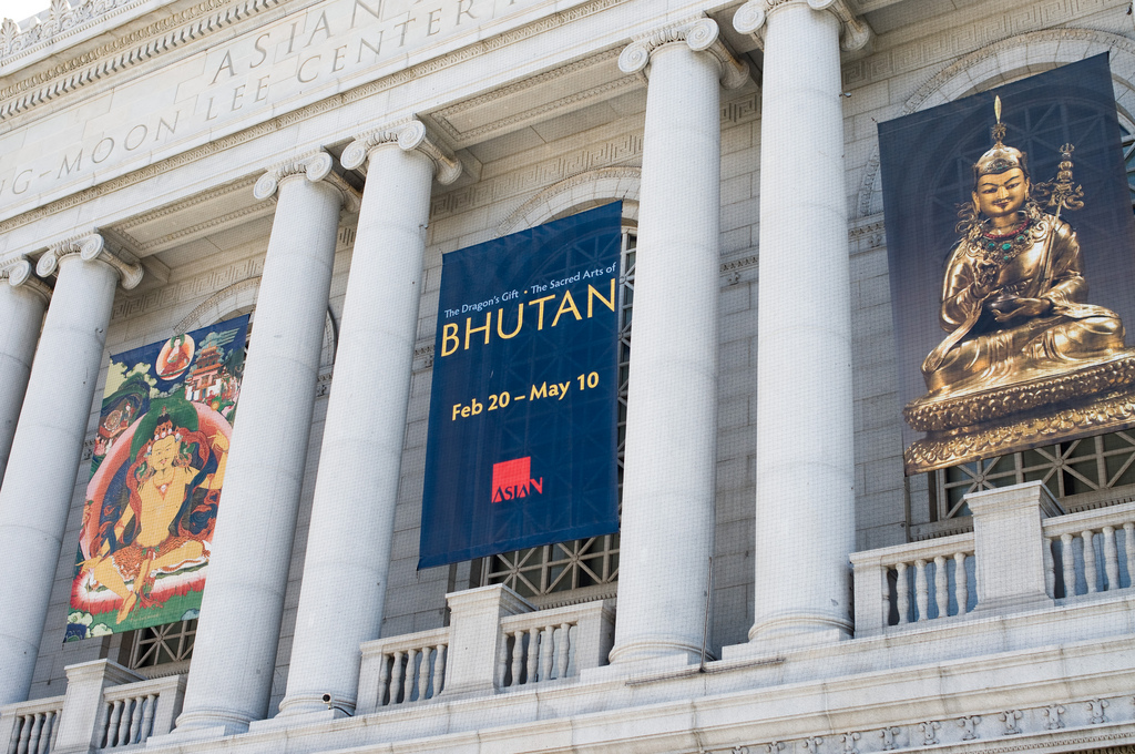
In the same city, the SF Asian Art Museum used Hypatia Sans to promote their exhibition of the art of Bhutan.
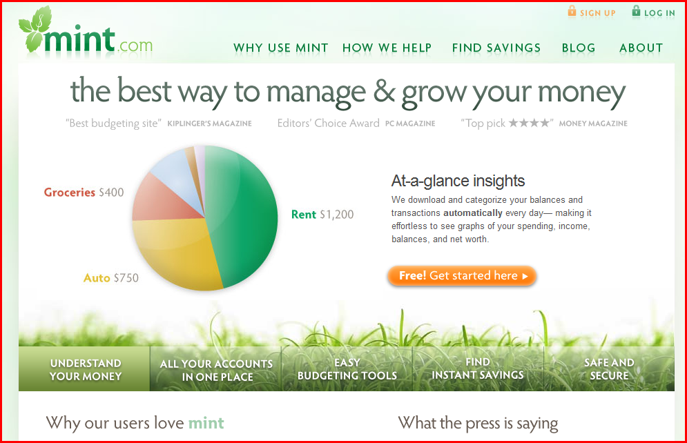
Finally, here are a couple of web sites that use Hypatia Sans. I was reminded of Mint.com in particular earlier this week when I saw their site used as an example in a talk at “An Event Apart” in Boston.
Mint.com uses Hypatia Sans throughout. Their logo uses it as well, but customized with modified serifs.
This dental site is a more basic use:

Leave a Reply